
TL;DR
The best AI design assistant does not replace the designer; it removes the blank canvas. For product teams, useful AI output should be editable, consistent across complete flows, compatible with design systems, and clear enough for stakeholder review and developer handoff. Pixel polish matters, but structure, states, usability, and implementation readiness matter more.
What is an AI design assistant?
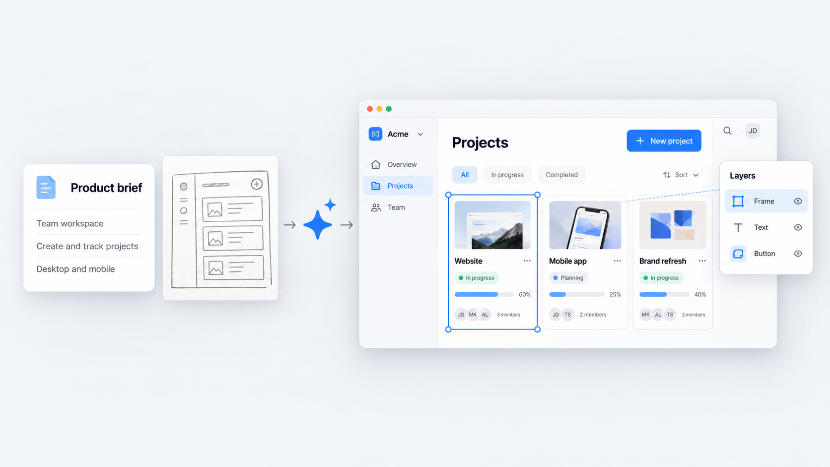 An AI design assistant turns product requirements, prompts, screenshots, sketches, or reference interfaces into editable UI. In a professional workflow, it helps us move from an idea or brief to wireframes, high-fidelity screens, connected flows, and prototypes.
That definition is narrower than the broader design AI category, which includes logo makers, background removers, image generators, poster tools, and general graphic design apps. Those tools create visual assets. An AI UI design generator must create structured product interfaces that teams can review, revise, and implement.
A useful assistant should support:
- Editable layouts, text, and components
- Multiple connected screens
- Loading, error, empty, success, and permission states
- Responsive behavior
- Design-system constraints
- Prototyping and team critique
- Developer handoff
A polished screenshot is not enough. We judge output by whether it survives iteration, stakeholder questions, changing requirements, and implementation.
Is there a ChatGPT for design?
Yes, in the sense that designers can describe an interface conversationally and receive generated output. But prompting is only the input layer.
Professional product design also requires structured frames, reusable components, responsive layouts, realistic content, state coverage, and editable output. A chatbot can discuss those requirements, while a focused AI UI generator should turn them into interface structures that designers can inspect and change.
An assistant can speed up routine production and suggest directions to explore. It cannot independently prove that a feature should exist, validate user demand, resolve business priorities, or decide whether a workflow serves the right need.
Why “AI designer” is a misleading label
“AI designer” suggests independent design judgment. Most tools are better understood as composition and production systems: they arrange interface patterns from instructions and established conventions.
That can save time, but visual composition is not the same as making defensible UX decisions. Designers remain accountable for:
- Task logic and information architecture
- User research and product assumptions
- Accessibility and inclusive interaction
- Content clarity
- Technical and business trade-offs
- Ethical consequences
- Success criteria
AI can propose a checkout screen. It cannot own the decision to require account creation or determine whether that requirement creates an avoidable barrier.
What an AI design assistant can generate
AI UI generation can begin with text, product requirements, screenshots, sketches, wireframes, or existing interfaces. Output may range from rough structural concepts to high-fidelity screens and interactive prototypes.
Common workflows include:
- Text-to-UI generation from a feature brief
- Requirements converted into a multi-screen flow
- Screenshot-to-UI reconstruction
- Sketch-to-UI exploration
- Editable wireframe generation
- High-fidelity website or app design
- Existing-screen refinement
- Responsive layout variations
The key distinction is structure. Editable layers, text, frames, and components support iteration; a flattened image does not.
The UXMagic feature set focuses on product-interface workflows rather than isolated graphic assets. That matters when the next step is critique, revision, prototyping, or implementation.
From product requirements to editable UI
A useful prompt should describe the product context, user role, goal, core tasks, required content, constraints, states, and acceptance criteria.
“Create an analytics dashboard” leaves too much undefined. A stronger brief identifies who uses it, which decisions they make, what data matters, which filters they need, and what happens when data is unavailable.
The assistant can translate those requirements into a screen or connected flow while preserving structure for revision:
- Information hierarchy
- Navigation
- Labels and supporting copy
- Component choices
- Spacing and layout
- Data density
- State behavior
For early exploration, an AI wireframe generator can expose structural choices before visual styling makes weak logic appear finished.
From screenshots and sketches to reusable interfaces
Screenshots communicate density, layout, hierarchy, and familiar interaction patterns quickly. A screenshot-to-editable UI workflow can reconstruct an interface so a designer can replace branding, reorganize content, normalize components, and improve hierarchy. The screenshot is an input, not proof that its UX is appropriate.
Sketches preserve intent without overcommitting to polish. Converting a rough sketch into a Figma-ready interface can accelerate exploration while leaving room to challenge the navigation, sequence, and component model.
In both cases, teams should reconcile imported ideas with their design system. Copying a visual pattern without normalizing its tokens, components, content, and behavior merely postpones the cleanup.
The benchmark that matters: complete flows, not isolated screens
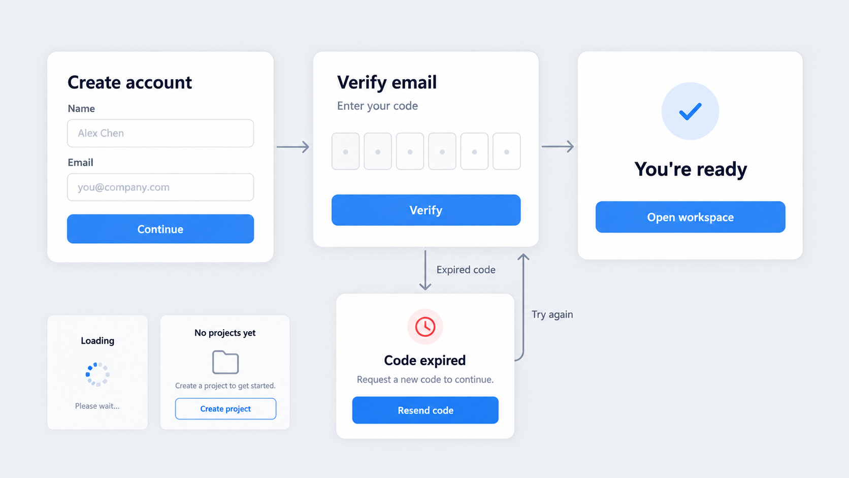 A common failure is a polished first screen followed by an incoherent journey. The dashboard looks plausible, but its detail view uses different controls, its edit form changes terminology, or its mobile version removes essential actions.
Complete flows require consistency across:
- Navigation and location
- Content terminology
- Data hierarchy
- User permissions
- Component behavior
- Interaction feedback
- Responsive layouts
Desktop, tablet, and mobile screens should express the same product logic. Responsive design is not simply a smaller desktop frame. It requires decisions about priority, reflow, progressive disclosure, navigation, and touch interaction.
Generate the happy path and the edge cases
A complete flow should connect every screen around a defined goal. Mobile onboarding, for example, may include account creation, verification, permission requests, personalization, completion, and recovery—not a collection of unrelated compositions.
We recommend generating the happy path alongside the states that make a product understandable and dependable:
- Loading and skeleton states
- Empty and first-use states
- Validation and error states
- Success and confirmation states
- Disabled controls
- Permission restrictions
- Interrupted-session recovery
- Network or data failures
These states determine whether people understand what happened, what they can do next, and how to recover when the ideal path breaks.
Review flow logic before pixel polish
Before refining shadows, gradients, or corner radii, confirm that the user can complete the task. Review the information architecture, hierarchy, navigation model, transitions, and decision points.
Ask:
- Is the next action clear?
- Is required information available at the right time?
- Can users reverse or recover from an action?
- Are system responses visible?
- Do labels remain consistent?
- Are permissions reflected throughout the journey?
Styling should refine a working experience, not conceal missing states or weak logic.
How to prompt an AI design assistant for better results
One-shot prompting may suit a demo, but it is not a dependable professional workflow. “Create a clean, modern SaaS app” offers taste adjectives and little product information.
A reusable prompt should include:
- Product context
- User role and goal
- Required screens
- Content and data
- Components and actions
- Interaction states
- Brand constraints
- Responsive requirements
- Output format
Focused critique works better than adding vague adjectives. Generate a direction, identify what is wrong, add constraints, and request a specific revision.
This iterative approach is central to an AI-assisted UX design workflow. We keep the designer in control of the brief, evaluation, and trade-offs while AI supports translation and exploration.
Prompt pattern for a landing page
A practical website prompt might read:
Create a responsive landing page for a B2B security platform used by IT leaders at mid-sized companies. The conversion goal is a demo request. Include a clear value proposition, customer proof, three capability sections, an integration section, security evidence, an objection-handling FAQ, and a final CTA. Use our approved typography, colors, spacing, and button styles. Prioritize message clarity on mobile and avoid placeholder testimonials.
This defines the audience, offer, proof, action, brand constraints, and responsive priority. During review, we would first assess whether each section supports the conversion goal, then refine imagery, motion, and visual details.
Prompt pattern for a SaaS dashboard
A dashboard prompt should define the decisions its user needs to make, along with the core metrics, filters, tables, actions, permissions, and data states.
Design an operations dashboard for a regional manager monitoring delivery performance. Include date and location filters, delayed-delivery alerts, trend metrics, a searchable table, bulk assignment actions, and links to delivery details. Generate loading, empty, error, and restricted-permission states. Keep components consistent across overview, detail, create, edit, and confirmation screens.
This provides a functional model and reduces the chance of receiving a generic collection of charts with no decision-making purpose.
Prompt pattern for a mobile app flow
A mobile prompt should describe the starting point, primary task, navigation model, required inputs, interruptions, and completion state.
Generate a mobile onboarding flow from first launch to completed profile. Include account creation, email verification, notification permission, preference selection, success, expired-code recovery, and returning-user states. Use bottom navigation after onboarding. Account for keyboard overlap, touch targets, inline validation, permission denial, and one-handed use.
We recommend requesting the connected flow in one workstream. Separate prompts for individual screens can produce inconsistent terminology, navigation, and component behavior.
Design systems turn AI output into shippable product UI
For teams shipping products, design-system compliance is usually more useful than visual novelty. New concepts can support exploration, but reusable rules make interfaces easier to review, modify, and implement.
Provide or reference:
- Typography and color tokens
- Spacing and grid rules
- Buttons and form controls
- Navigation patterns
- Content conventions
- Component variants
- Accessibility requirements
A shared Figma component library gives teams a clearer basis for evaluating generated work. The aim is not just visual similarity, but predictable use of approved components and variants.
Apply brand rules without rebuilding every screen
Generic prompts tend to produce generic interfaces. Explicit brand and system constraints reduce off-brand variations and limit manual reconstruction.
Before stakeholder review, we recommend checking:
- Token usage
- Component instances and variants
- Layer and component naming
- Spacing consistency
- Responsive behavior
- Unapproved exceptions
Exceptions may be justified, but they should be intentional. Generated novelty should not quietly become another pattern the team must maintain.
Measure the cleanup gap
The practical value of an assistant lies in the work saved after generation, not just the speed of its first output. Track the manual corrections required to reach review-ready and handoff-ready quality.
Useful measures include component replacements, spacing corrections, missing states, accessibility fixes, copy revisions, rebuilt layouts, and developer questions caused by ambiguity.
If an attractive result requires extensive structural repair, starting with established patterns may have been faster. Measuring the cleanup gap makes that cost visible.
From editable design to prototype and developer handoff
Editability matters because interfaces change through critique. Requirements shift, content expands, edge cases appear, and technical constraints reshape the solution.
Figma compatibility can support collaboration, but export alone does not guarantee a usable file. Teams still need structured layers, reusable components, sensible naming, coherent constraints, and clear screen relationships.
Prototypes should communicate screen connections, triggers, overlays, validation, loading behavior, responsive changes, and conditional states. These details turn static compositions into an experience the team can evaluate.
What designers need before stakeholder review
Before review, generated work should include a coherent flow, realistic content, key states, consistent components, and an explanation of major UX choices. Placeholder-heavy screens invite feedback on taste rather than product logic.
A prototype can also reveal gaps hidden by mockups. A button may lead nowhere, a modal may block a required task, or a form may lack error recovery.
Our team should be ready to explain why information is prioritized, how the flow supports the user’s goal, and which assumptions still require validation.
What developers need before handoff
A handoff package should clarify:
- Component mapping
- Responsive rules and breakpoints
- Interaction behavior
- State coverage
- Assets and icon usage
- Content rules
- Permission logic
- Acceptance criteria
Generated UI can look plausible while remaining structurally ambiguous. Missing edge cases and unsupported interactions shift design decisions into implementation, where they are harder to review.
How to evaluate the best AI design assistant
The best tool fits the team’s real workflow. A freelancer exploring marketing pages, a product team maintaining a SaaS platform, and an enterprise governing several design systems will have different requirements.
Use a scorecard covering output structure, flow consistency, editability, design-system support, prompt control, prototyping, collaboration, export quality, and handoff readiness.
Do not judge only the first generated screen. Test a realistic workflow that includes revisions, additional states, another device size, and a handoff requirement.
Seven quality checks for generated UI
- Hierarchy: Can users identify the primary information and action?
- Usability: Does the flow support task completion without unexplained steps?
- Consistency: Do terminology, navigation, and components remain stable?
- Accessibility: Are contrast, labels, focus behavior, targets, and states addressed?
- Editability: Can designers change content, layout, and components efficiently?
- State coverage: Are loading, empty, error, success, permission, and recovery states present?
- Implementation readiness: Can developers understand and build the intended behavior?
Test beyond the opening screen. Later screens often reveal whether the tool can preserve the logic and components it initially established.
Warning signs of demo-ready but unusable output
Watch for:
- Flattened image exports
- Generic or meaningless content
- Invented components with no system equivalent
- Missing error and empty states
- Inconsistent controls
- Unsupported interactions
- Ambiguous responsive behavior
- Layers that are difficult to edit
One attractive dashboard does not prove that an AI UX tool is dependable. The better test is whether it can extend that dashboard into details, actions, permissions, edge cases, and responsive variants without losing coherence.
Free, paid, and enterprise AI design assistants
AI design tools may provide free access, subscriptions, usage-based credits, team plans, or enterprise agreements. Access can vary by generation limits, exports, project capacity, collaboration options, usage rights, and available features.
We recommend evaluating AI design assistant pricing against total workflow value. Include prompting, cleanup, component replacement, review revisions, developer clarification, and rework caused by inconsistent UI.
When a free AI design assistant costs more
A free tool becomes expensive when its output must be rebuilt. Correcting generic layouts, recreating flattened screens, replacing components, and adding missing states can erase the initial saving.
Free access can still be useful for evaluation, learning, and lightweight exploration. To compare options fairly, run the same bounded project through each one and assess the path to review-ready and handoff-ready output.
What enterprise teams should evaluate
Enterprise teams should assess:
- Data retention and model-training policies
- Intellectual property terms
- Access controls and auditability
- Procurement requirements
- Support commitments
- Design-system governance
- Workspace administration
- Collaboration controls
- Usage and billing
Legal, procurement, IT, and security stakeholders should review the relevant policies. Product teams should also verify how components, brand rules, and generated assets are managed across workspaces.
Where UXMagic fits: describe, design & ship
We built UXMagic for people working on product interfaces. Our intended workflow is straightforward: describe requirements, generate editable UI, expand it into a consistent flow, apply constraints, prototype, review, and prepare for handoff.
This is the standard we believe an AI design assistant should meet. It should reduce routine translation work without removing the critique that gives product design its value.
A practical first project
Choose a bounded flow that is large enough to expose inconsistency but small enough to assess clearly, such as:
- Account setup
- Mobile onboarding
- Dashboard drill-down
- Checkout
- Subscription management
- Profile and security settings
Provide user goals, required screens, realistic content, edge states, and design-system rules. Then record the manual work needed to reach review-ready and handoff-ready output.
What AI changes—and what designers still own
AI can accelerate translation, reconstruction, variation, and exploration. It can help us turn requirements into tangible interface directions without manually producing every early screen.
Designers still own user understanding, product logic, accessibility, prioritization, critique, and trade-offs. They decide which generated direction deserves refinement and which should be discarded.
Turn a real product brief into editable UI
Test UXMagic with onboarding, checkout, account setup, or a dashboard drill-down. Define the users, states, components, and constraints, then use UXMagic to describe, design & ship a flow your team can critique, refine, and hand off.