Somewhere right now, a stakeholder is derailing a review meeting to debate the exact hex code of a primary button while the checkout flow underneath it is fundamentally broken - and everyone in the room thinks they're being productive. That's the false finality trap, and jumping straight into a wireframe vs mockup vs prototype decision by defaulting to high-fidelity work is exactly how you fall into it.
You already know the textbook definitions: grey boxes, then color and typography, then click-through behavior. What you're actually trying to figure out is which of these three steps you can skip in 2026, and which ones AI has genuinely made obsolete versus which ones AI just makes people think are obsolete.
Here's the operational answer, not the dictionary one.
What Is the Actual Difference? (Beyond the Textbook Definitions)
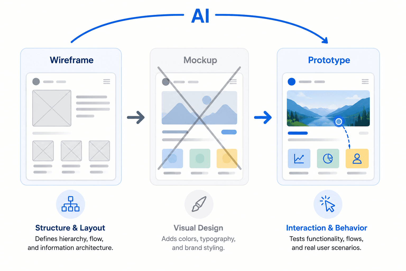
Wireframes: The Blueprint for Information Architecture
A wireframe's job isn't to look like anything - it's to answer specific structural questions. What information appears first? Where's the primary call to action? How many steps does this task actually require? Does the layout still hold up at a narrow viewport?
The moment brand colors, real typography, or high-resolution imagery show up in a wireframe, its entire purpose collapses. That polish invites subjective visual critique exactly when you need the conversation locked onto structure. The absence of visual polish isn't a limitation - it's the strategy, and it's worth reading why low-fidelity wireframes still matter in an AI-heavy workflow if you want the deeper case for this.
Mockups: Visual Polish and Brand Expression
A mockup takes a validated structure and answers a different set of questions: does this align with brand language? Are error and success states visually distinguishable? Is the typographic hierarchy actually legible? It's a static, high-fidelity render - nothing more.
The failure mode here is treating that static image as a comprehensive implementation contract. A mockup, by definition, omits accessibility behavior, hover states, z-index layering, and data-loading transitions - none of which show up in a picture.
Prototypes: Behavioral Validation and Logic
A prototype exists to answer one question mockups structurally cannot: does the software actually work? Can a user recover from an error? Does a multi-step flow preserve context when someone navigates backward? Do people understand what just happened after they clicked something?
This is behavioral testing, not visual testing. If you're not wiring up conditional logic and interaction states, you don't have a prototype - you have a mockup with extra steps.
Which Artifact Do You Actually Need?
| Your Situation | Start Here | Why |
|---|---|---|
| New product, unvalidated flow | Wireframe | Structure hasn't been tested—polish hides flaws instead of revealing them. |
| Mature design system, understood feature | Straight to prototype | The component library already enforces consistency; a mockup adds a step, not a decision. |
| Marketing site or brand-critical launch | Mockup, then prototype | Visual execution itself is what's being validated. |
| Complex conditional logic (checkout, onboarding) | Wireframe → Prototype (skip mockup) | The real risk is behavioral, not visual. |
| Investor demo under a tight deadline | AI-generated prototype from constraints | Structural thinking compresses into the prompt instead of three build phases. |
The Danger of High Fidelity
Wireframing isn't just a preliminary checkbox - it's a psychological tool that forces stakeholders to evaluate logic instead of aesthetics, and low fidelity is the entire mechanism that makes that possible. High fidelity implies completion; the moment a reviewer sees polish, their brain files the project as "almost done," and the conversation shifts to nitpicks instead of structural problems.
"A wireframe's low fidelity isn't a limitation of the tool. It's the only thing standing between your review meeting and forty-five minutes debating a corner radius."
This isn't a minor annoyance - it's the direct cause of wasted sprint cycles and rework when the architecture fails after the aesthetic debate already burned the meeting. It's the same mechanism behind some of the most expensive bad UX decisions on record.
Here's what it costs in real time: a B2B SaaS team spent three weeks in high-fidelity mockups debating chart gradients before anyone tested whether the layout held up. A greyscale wireframe test found the layout collapsed on smaller laptops with real data - in under a day. Three weeks of polish versus one afternoon of grey boxes, and the grey boxes are what caught the problem. Skipping this step doesn't save time - it defers the cost, paid later with interest by an engineer reconstructing missing logic mid-sprint.
When to Skip the Mockup Phase Entirely
For a team with a mature, coded design system, manually producing a static mockup is often a pure waste of resources. If the component library already enforces brand consistency, dragging in pre-built high-fidelity elements takes the same time as sketching gray boxes - so skip straight from wireframe to interactive prototype.
That said, mockups still do essential work in a few situations, and skipping them there is a mistake, not efficiency:
- Marketing sites and landing pages, where visual execution itself is what's being validated.
- Branding-heavy products, where color and imagery carry meaning a component library alone doesn't capture.
- Formal stakeholder or client approvals, where a polished static artifact is genuinely the sign-off artifact.
If inserting a mockup step feels like busywork rather than a checkpoint, your system is mature enough to skip it.
How AI Is Collapsing the Design Workflow
The industry is obsessed with AI tools generating interfaces from abstract "vibe" prompts. The contrarian truth: a beautiful interface built without rigorous prototyping of interactive states routinely fails usability and accessibility standards. Form without tested function is concept art with a Stripe integration.
Generic text-to-UI tools treat every screen as its own universe - brand colors vanish by page three, typography turns into a hallucinated mess, nothing ties screens into an actual flow. Fixing that output by hand often takes longer than designing from scratch.
"AI didn't remove the need for structural thinking. It just made it easier to skip, which is not the same thing as making it unnecessary."
The workflow that actually holds up - covered in more depth in how the UX methodology stack is adapting to AI - is a three-part Sandwich Method:
- Human input: define business logic, flow constraints, and context. AI cannot invent business context; it has to be injected.
- AI acceleration: the platform skips the manual mockup phase, generating structurally sound, brand-consistent, high-fidelity flows directly from those constraints.
- Human refinement: edit for edge cases, refine interaction logic, initiate handoff shifting from pixel-pusher to architectural reviewer.
This is where UXMagic's AI UI generator earns its place over a generic prompt-to-image tool: it enforces style consistency and design tokens across every screen, instead of treating each as an isolated universe.
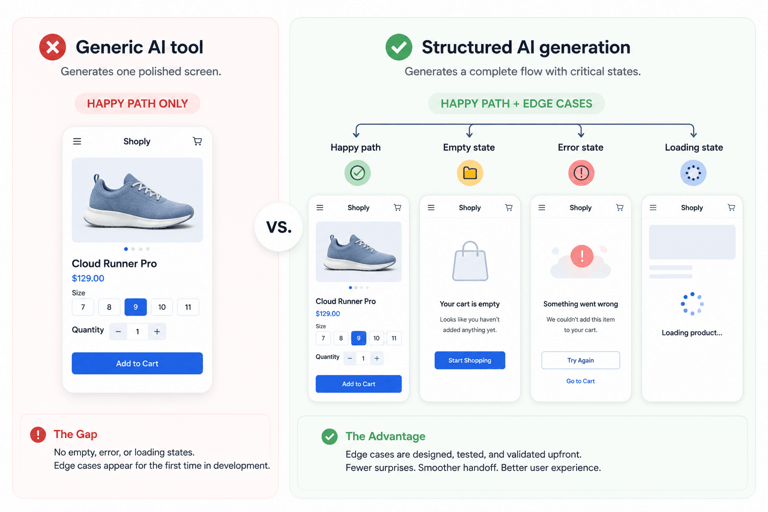
Edge cases matter here specifically - a generic tool asked for a checkout flow gives you the happy path only. It won't generate the declined-card state or the empty cart on its own, which is exactly what a real prototype needs to prove out and exactly what gets skipped when a tool only renders one polished screen at a time.
Wiring up 50 hand-designed screens into a working prototype is itself a multi-day bottleneck, a pain point covered in our comparison of the best prototyping tools for 2026. A Flow Mode that generates connected sequences automatically - rather than isolated screens still needing manual wiring - is the difference between AI making pictures prettier and AI actually closing the gap between text and a testable flow.
Choosing the Right Artifact for Developer Handoff
Never hand an engineer a static mockup and call it a spec. A picture can't communicate hover behavior, empty states, or API failure handling - engineers will guess, which is how UX debt gets baked into production without anyone deciding it should be there.
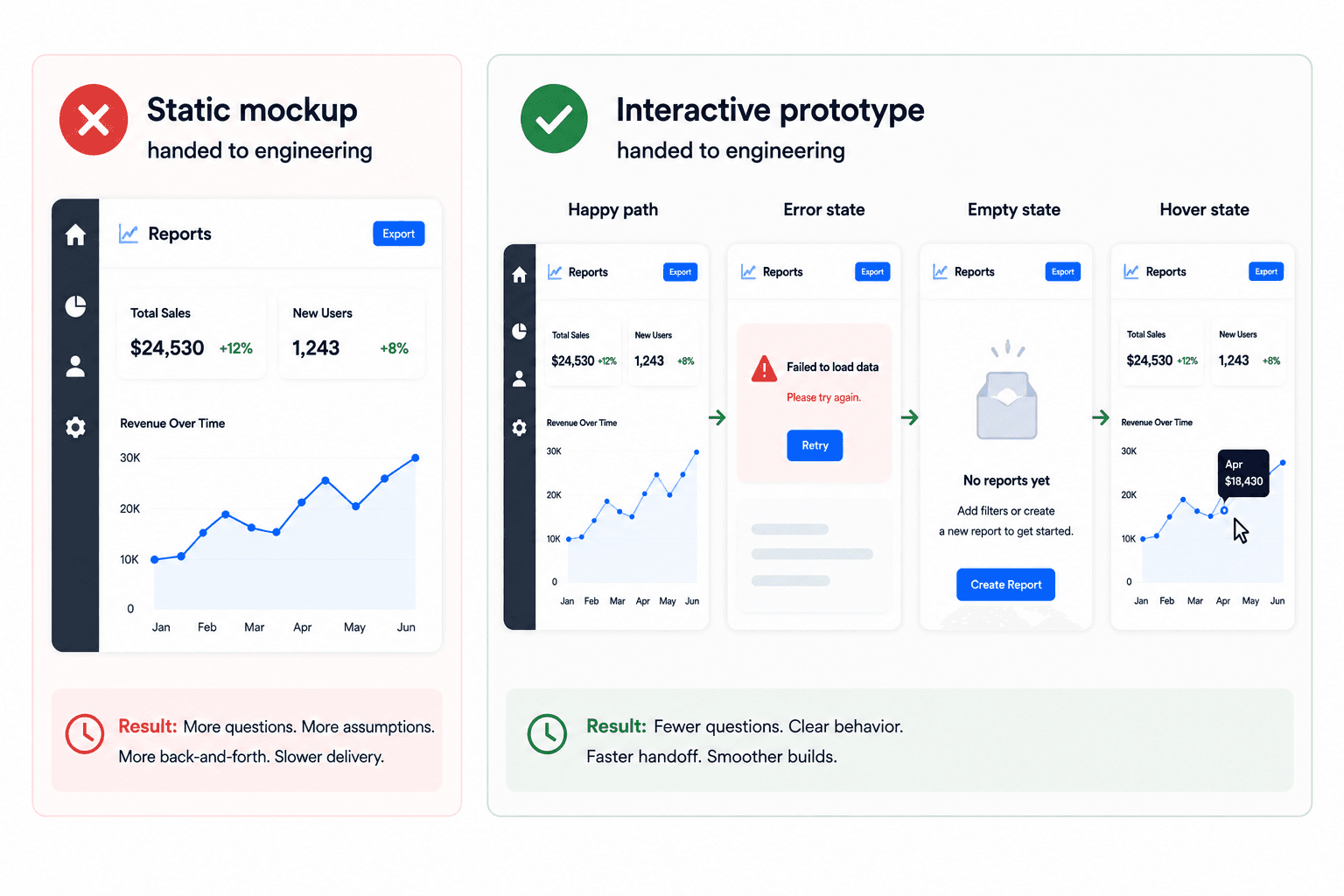
A concrete version: an e-commerce team ships a mockup of the successful checkout path and gets blindsided by questions about declined cards and expired sessions - none of which existed in the static file, because a picture can't represent conditional logic. The fix follows the same principle as prompting AI to handle accessibility and edge cases from the start: hand over an interactive prototype that already demonstrates the failure state, so engineers can click through the answer instead of asking for it in Slack.
Scaled to a deadline: a founder needing investor sign-off by Friday doesn't have three weeks for the full sequence. Defining structural logic in a prompt and generating a constrained, clickable prototype gets validation done in hours - without skipping the thinking that prevents UX debt, just compressing the execution around it, the same shift covered in how designers are actually using AI in real projects.
Skip the Artifact, Not the Thinking
Turn your next product requirement into a connected, testable prototype in minutes. Generate complete user flows from constraints and validate interactions before engineering starts.