TL;DR: Tesla's new Roadster can drive up a ramp upside down, fire cold-gas thrusters and hop over other cars. That creates interface problems no car designer has had to solve before: a gauge for "flight time", modes that must never be confused, a HUD that works upside down, a one-second glance at launch, and a thruster-arming flow that adds friction on purpose. Below are the five UX problems, plus five prompts you can paste into the UXMagic AI UI generator to design your own flying-car dashboard in seconds.
Last night Tesla showed off a car that can do things no interface designer has ever had to plan for.
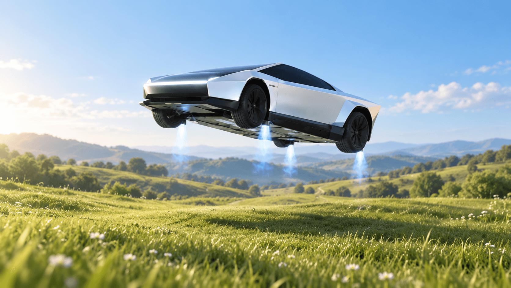
The new Roadster drove up a curved ramp, used underbody fans to stick to it until it was completely upside down, fired cold-gas thrusters to launch off, flipped in mid-air and landed. Later it hopped clean over five other Teslas. The top trim claims 0–60 mph in under 0.59 seconds.
Everyone online is asking "is it street legal?" and "what will it cost?"
We're asking a different question: what do you put on the screen?
Because every new kind of machine creates a new kind of interface problem. And a car that can fly, even for a few seconds at a time, creates a lot of them.
What's actually in the cockpit
Here's what Tesla has shown so far:
- A yoke instead of a wheel, built for steer-by-wire
- A centre touchscreen
- Two smaller displays in front of the driver
- A fixed seat and manual controls to save weight
- Magnesium, titanium and carbon fibre throughout
That's a very small amount of screen for a very large amount of information. Which is exactly what makes it a great design challenge.
5 UX problems a flying car creates
- You need a brand-new fuel gauge
The thrusters run on compressed gas stored in carbon-fibre pressure vessels packed into every usable void of the car. Tesla says more gas means more "flight time."
So the driver now needs to know two things at once: how much battery is left for driving, and how many seconds of thrust are left for everything else. Battery is measured in miles. Thrust is measured in... what? Seconds? Jumps? Percent?
Design question: how do you show a resource people have never had before, in a way they understand at a glance?
- Mode confusion gets dangerous
The Roadster has a Track Mode that lowers the car and deploys active wings, a suction system that pins it to the ground, and thrusters that do the opposite. That's at least three very different "states" of the same car.
Mode confusion is one of the oldest problems in cockpit design: the system is in one mode while the human thinks it's in another. On a road car, that's annoying. On a car that can launch itself into the air, it's a big deal.
Design question: how do you make the current mode impossible to miss, even in peripheral vision?
- Upside down changes everything
When the car is inverted on a ramp, "up" on the screen is no longer up in real life. Does the HUD flip? Does it stay locked to the horizon like a fighter jet's attitude indicator? Does it simplify down to one number?
Design question: what's the one piece of information a driver needs when the world is upside down?
- You have one second to read anything
At 0–60 in under a second, a driver doesn't read the screen during a launch. They glance. Anything that needs more than a fraction of a second to parse is noise.
Design question: what survives the "one-second glance" test, and what gets hidden until the car stops?
- Arming the thrusters needs real friction
The most dramatic trim, Rocket, isn't approved for public roads. That means the interface has to know where the car is, what it's allowed to do there, and make sure the driver really means it before anything fires.
Good UX usually removes friction. Here, the best UX adds it, deliberately, in the right place.
Design question: how do you design a confirmation flow that's fast for experts but impossible to trigger by accident?
5 prompts to design it yourself in UXMagic
This is the fun part. Copy any of these into UXMagic's Prompt to UI, hit generate, and you'll have an editable, Figma-ready screen in seconds. Then tweak it, remix it, and export to Figma, HTML or React.
We've used a fictional hypercar called "Apex One" so you're designing your own concept, not copying anyone's brand.
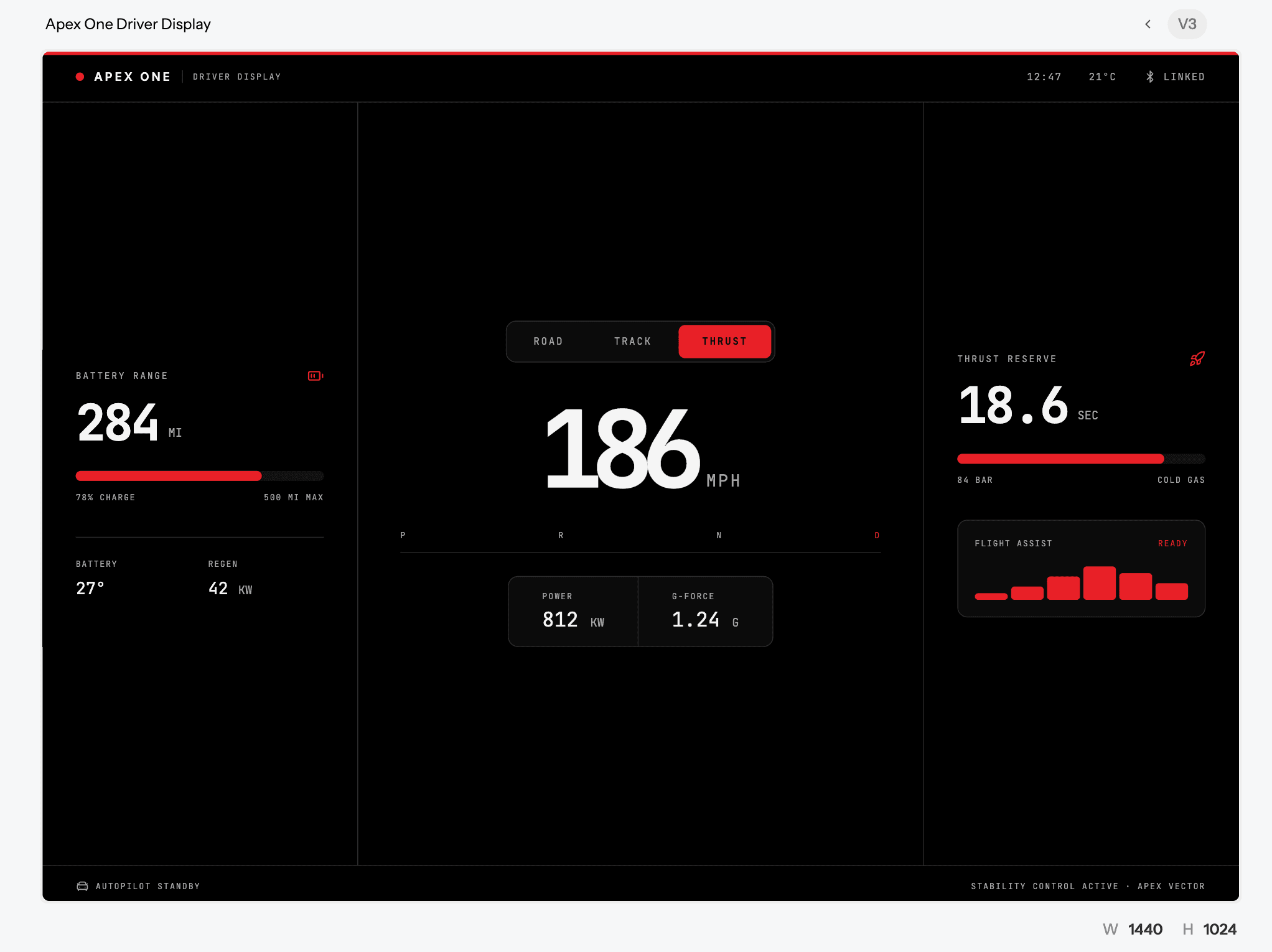
Prompt 1: The main driver HUD
Design a dark-mode, wide landscape driver display (1920×720) for a fictional two-seat electric hypercar called Apex One that has cold-gas thrusters. Show a large digital speed readout in the centre, a battery range bar on the left in miles, and a "Thrust reserve" gauge on the right measured in seconds of flight time. Add a mode indicator strip along the top with three states: Road, Track, Thrust. Aerospace aesthetic, matte black background, white UI with gold accents, monospaced numerals, minimal text.
One of our version:
Prompt 2: The thruster arming flow
Create a 3-screen mobile flow for arming the thrusters on a fictional hypercar. Screen 1: a locked state with a status message showing whether thrusters are allowed at the current location ("Track zone detected" vs "Public road: thrusters disabled"). Screen 2: a press-and-hold arming button with a circular progress ring and a clear warning. Screen 3: an armed state with a countdown and a large cancel button. High contrast, red and white, designed for use with gloves.
One of our version:
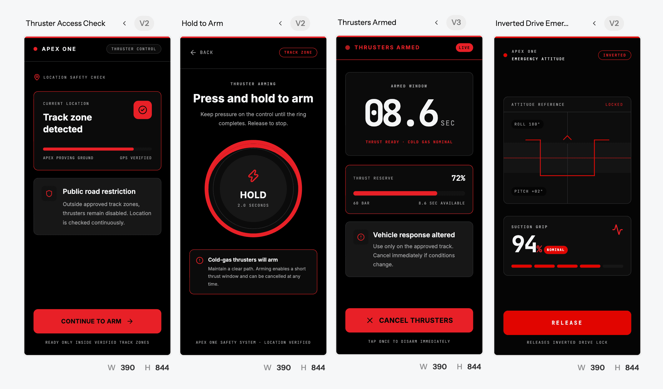
Prompt 3: The upside-down mode
Design an ultra-minimal emergency HUD for a car that is driving upside down on an inverted ramp. Show only three things: an attitude indicator like a fighter jet's artificial horizon, suction grip strength as a percentage, and a single "Release" control. Everything else hidden. Black background, one accent colour, very large type.
Prompt 4: The companion app
Design a mobile companion app home screen for a fictional flying hypercar. Include a hero image area of the car, a card showing thrust reserve and recharge time for the compressed air tanks, a card showing battery level and range, a "Track day" booking card, and a bottom tab bar with Home, Garage, Track, Profile. Clean, premium, white background with deep navy and gold accents.
Prompt 5: The aerospace style guide
Generate a UI style guide for an automotive brand with an aerospace aesthetic inspired by spy planes and spacesuits. Include a colour palette (matte white, black, visor gold, warning red), a typography scale with a geometric sans for headings and a monospace for numbers, button styles, gauge components, toggle switches and alert banners.
Use Prompt 5 first if you want every other screen to share the same visual system. UXMagic's style guide feature keeps your colours, type and components consistent across all of them.
Take the #FlyingCarUI challenge
Here's our challenge for the design community this week:
- Pick one of the five UX problems above.
- Generate your take in UXMagic (start from a prompt above or write your own).
- Refine it in Figma.
- Post it on X or LinkedIn with #FlyingCarUI and tag @UXMagic_ai.
We'll reshare our favourite designs, and the best upside-down HUD gets bragging rights (and a feature on our blog).
The bigger lesson for product designers
You probably won't design a flying car this year. But you will design for something new: a new AI feature, a new kind of data, a new state your product has never had before.
The questions are the same every time:
- How do you show a resource users have never seen before?
- How do you make the current mode obvious?
- What does the user need in the worst moment?
- What survives a one-second glance?
- Where should you add friction instead of removing it?
The fastest way to answer them is to stop thinking in the abstract and put five versions on a screen. That's what we built UXMagic for.
Start designing for free → 20 free credits every day, no card required.