
TL;DR
Long scrolling is not inherently a usability problem. It works when each section provides relevant information, keeps people oriented, and moves them toward a meaningful action. We ask one question when reviewing a long page: does every section earn its place?
What Is Long Scrolling?
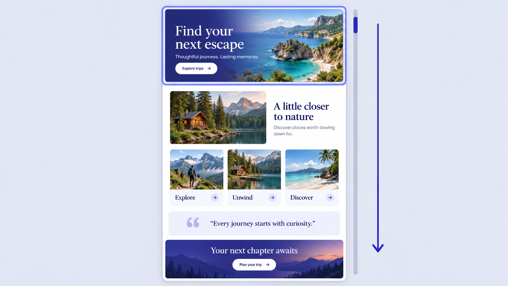 Long scrolling describes a page or screen that unfolds through a substantial vertical sequence. Common examples include marketing sites, editorial features, product pages, portfolios, feeds, and mobile flows.
Length alone does not determine whether the experience works. People are more likely to stop when content becomes repetitive, relevance fades, or the next step is unclear.
Long Scrolling vs. Continuous, Infinite, Parallax, and Single-Page Design
These terms describe different aspects of an experience.
| Pattern | Behavior | Endpoint | Typical use | Primary risk |
|---|---|---|---|---|
| Long scrolling | Content follows a substantial vertical sequence | Fixed | Landing pages, stories, product details | Fatigue or weak orientation |
| Continuous scrolling | Content continues vertically | Fixed or dynamic | Feeds, galleries, long pages | Unclear expectations |
| Infinite scrolling | New content loads near the end | No reliable endpoint | Discovery feeds | No completion cue |
| Parallax scrolling | Layers move at different speeds | Depends on the page | Brand and product stories | Motion and performance problems |
| Single-page design | Multiple sections share one page | Fixed | Focused sites or campaigns | Weak information architecture |
Infinite scrolling is a specific implementation of continuous scrolling. Parallax is a motion technique, while single-page design is an information architecture choice. A long page can still sit within a larger, multi-page website.
The Real Question: Does the Content Earn the Scroll?
Each section should answer a question or help someone progress. We assess it by asking:
- What uncertainty does this resolve?
- What evidence or meaning does it add?
- What action becomes easier afterward?
We remove modules that repeat benefits without increasing clarity or confidence. A useful long page is better than a short page that omits essential information.
When to Use a Long-Scroll Page—and When to Split It
Long scrolling suits information that forms one connected argument. Linear stories, focused campaigns, product explanations, and portfolios can benefit from remaining together.
Multiple pages are usually better when content serves separate tasks, audiences, products, or search intents.
Signals That One Long Page Will Work
A long page may be appropriate when:
- Information benefits from a deliberate order.
- One primary goal connects every section.
- Supporting content reduces friction around that goal.
- Navigation can remain simple.
- The content makes more sense together than separately.
For example, a software landing page might explain the problem, introduce the solution, demonstrate the workflow, provide evidence, address objections, and present an action.
Signals That the Page Should Be Split
We recommend separate pages when people need direct access to independent documentation, pricing, support, tools, or product categories. Separate URLs also make individual destinations easier to share, measure, and optimize.
If unrelated topics need extensive motion or aggressive compression to feel cohesive, the underlying information architecture probably needs attention.
Why Shorter Is Not Automatically Better
Removing context, proof, pricing details, or objection handling can shorten a page while making decisions harder. We optimize for comprehension and task completion. Page length should follow those requirements rather than become a target by itself.
Long Scrolling Examples, Explained Pattern by Pattern
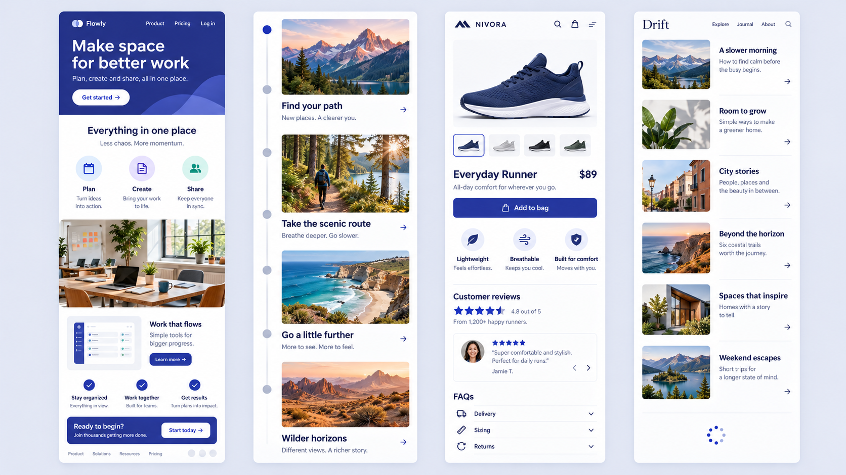 Screenshots show visual style, but they reveal little about usability. Our reviews consider the goal, sequence, navigation, calls to action, mobile design, performance, and accessibility.
Conversion-Focused Landing Page
A practical sequence moves from relevance and problem to solution, proof, workflow, objections, and action. Later sections should build confidence rather than restate the hero message.
We repeat the primary CTA when readiness changes, such as after meaningful proof or an explanation of value. The main risk is allowing the action to disappear after the opening screen.
Cinematic Product or Brand Story
Visible chapters help people understand their location and skip ahead. Parallax can clarify a relationship or transition, but it cannot rescue an unfocused story.
The central message and navigation must remain usable when motion is reduced or unavailable.
E-Commerce and Product-Detail Experience
A long product page can combine imagery, specifications, reviews, comparisons, delivery information, and FAQs because they support one purchase decision.
Price, availability, delivery details, and purchase controls should remain easy to find. This pattern differs from an infinite product feed, which has no dependable endpoint.
Mobile App Feed or Onboarding Flow
Infinite feeds support open-ended discovery. Onboarding should be finite, with visible progress, recovery options, and a clear completion point.
We avoid making a defined task feel endless. Feeds should also provide natural opportunities to pause or leave.
Structure the Story: Hierarchy, Pacing, and Visual Rhythm
We treat the page as a sequence of user questions, not a stack of stakeholder requests. Each section needs one clear job and a logical connection to the next.
Design the Section Sequence Before the Visuals
Map the questions, evidence, objections, and actions before choosing imagery or animation. An AI wireframe generator can help teams compare sequences without becoming attached to polished visuals too early.
Create Rhythm Without Manufacturing Length
Alternate explanation, demonstration, proof, and action. Repeated feature blocks create fatigue when they offer no new meaning.
Whitespace should establish groups and support reading—not make a thin argument appear more substantial.
Make the First Screen Establish Relevance and Direction
The opening should identify the audience, communicate the value, and offer a clear next step. It should also signal that useful information continues below.
We avoid forcing every benefit, trust signal, navigation item, and CTA into the first viewport.
Keep Users Oriented With Cues, Navigation, and CTAs
As opening context leaves the screen, navigation must help people retain their place. Depending on the page, that may require a continuation cue, anchor links, sticky navigation, or chapter progress.
Scroll Cues and Stopping Cues
Visible content continuation and restrained animation can indicate that more follows. These signals are most helpful near the opening or where a transition resembles the page ending.
The actual endpoint should provide a summary, next action, or destination.
Sticky Navigation, Anchor Links, and Progress
Use descriptive anchors such as “workflow,” “pricing,” and “accessibility.” Anchored headings should not disappear beneath sticky headers.
Progress indicators suit finite stories. We do not show completion percentages when the total amount of content is unknown.
Repeat CTAs When Readiness Changes
Place actions after sections that can change confidence, such as proof, pricing, or objection handling. Keep the CTA label and destination consistent so the outcome remains predictable.
Design Long Scrolling for Mobile, Accessibility, and Comfort
Mobile changes pacing, thumb reach, media impact, and the effort required to cross repetitive sections. We reduce unnecessary motion and repetition without removing essential information.
Reduce Mobile Scroll Fatigue
Lead with meaningful differences and shorten repeated patterns. Sticky controls should remain useful without consuming too much of the viewport.
Accordions can hold supporting details, but they should not conceal essential information. Avoid scroll hijacking and unfamiliar gestures.
Make Motion Optional and Purposeful
Respect prefers-reduced-motion and preserve meaning without animation. Navigation and actions must not depend on parallax or scroll-triggered effects.
We also give people control over nonessential video and avoid movement that interferes with reading.
Preserve Semantic Structure and Focus Order
Use logical headings, landmarks, descriptive links, and a document order that matches the visual sequence. Sticky controls must remain keyboard accessible, while overlays should not cover focused elements or essential content.
Build It Without Sacrificing Performance or SEO
Heavy media, animation, and client-side rendering can undermine an otherwise polished page. Essential headings, copy, and links should remain available in crawlable HTML.
Performance Guardrails
Set budgets for images, video, scripts, fonts, and animation before production. Deliver appropriately sized responsive assets and lazy-load nonessential media below the fold.
Reserve media dimensions to reduce layout movement, and pause off-screen animation where practical.
SEO and Information Architecture Trade-Offs
Give distinct search intents separate URLs. Combining unrelated topics on one page can weaken relevance and make individual subjects harder to find, share, and measure.
Substantial indexable information should not depend on interactions that visitors or crawlers may never trigger.
A Resilient Long Scrolling HTML Foundation
Start with semantic sections, real links, logical headings, and a usable no-motion state. JavaScript can enhance navigation, progress indicators, and measurement, but basic content access should not depend on it.
Run a Long Scroll Page Test Before You Ship
Scroll depth alone cannot show whether people understood the page or found the intended action. We combine section visibility, interaction, exits, CTA use, and downstream outcomes.
Measure Meaningful Section Exposure
Track whether key sections enter the viewport and whether visitors engage with them. Prioritize decision points such as proof, pricing, workflow, objections, and conversion actions.
Diagnose Drop-Off Without Blaming Length
Check transitions, headings, media performance, repeated modules, and CTA timing. A weak section may be the problem rather than the page’s total length.
Traffic source and intent also matter: someone seeking pricing behaves differently from a first-time visitor.
Test Alternative Structures
Compare a narrative long page, a compact landing page, and a multi-page structure. Assess comprehension, CTA discovery, task completion, and conversion rather than appearance alone.
Prototype Long-Scroll Layouts With UXMagic
Use an AI UI generator for Figma-ready designs to explore structures before committing to one visual direction. Define the audience, goal, sections, constraints, and primary action, then validate the output for accessibility, performance, and content quality.
Describe the Page as a Sequence of Decisions
Include the user goal, CTA, required proof, objections, navigation needs, and mobile constraints. Request finite sections and clear stopping cues instead of simply asking for a long, modern page.
Generate Three Concepts From One Brief
We recommend comparing:
- A narrative long-scroll page
- A compact landing page
- A multi-page structure
Review hierarchy, findability, CTA visibility, mobile effort, and alignment with search intent.
Describe, Design & Ship
Refine the strongest direction and add implementation notes covering responsive behavior, reduced motion, semantic structure, performance, and analytics.
Our UI and UX design features support rapid concept generation and handoff. Generated screens still need deliberate review before development.
Generate and Compare Your Long-Scroll Concepts
Use UXMagic to create long, compact, and multi-page concepts from the same brief, compare how each supports user intent, and move the strongest structure into your design workflow.