
TL;DR
Strong mobile wireframe design starts with structure, not polished screens. Define hierarchy, spacing, touch areas, navigation, realistic content, and edge states before creating a clickable prototype. We use AI-assisted exploration to compare structural directions, identify weaknesses, and refine the best flow before moving into editable UI.
Mobile wireframe design in UXMagic: Describe, compare, and refine
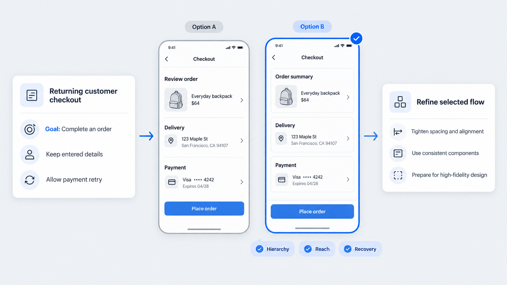 To begin in UXMagic, describe the product, target user, core task, required screens, platform, and constraints. Our AI wireframe generator can help turn that brief into initial layouts for review.
Our preferred workflow is simple:
- Define the product and user goal.
- Explore several structural directions.
- Compare hierarchy, reachability, navigation, and state coverage.
- Refine the strongest mobile app flow.
- Continue into editable interface design.
Low fidelity is deliberate. It keeps the discussion focused on structure and behavior before polished visuals make unresolved decisions appear final.
What a useful mobile wireframe must prove
A useful wireframe should demonstrate that:
- Content hierarchy works with realistic copy and data.
- Primary actions appear at the right moment.
- Navigation and task actions are clearly distinguished.
- Back behavior remains consistent.
- Loading, empty, error, offline, and interrupted states fit.
- Longer content and compact screens do not break the layout.
A tidy canvas is not enough. Controls must also be reachable, distinct, and consistent across screens.
From product brief to first directions
Start with the user, task, success event, platform, constraints, and required screens. Add business rules, permissions, interruptions, and content conditions.
We recommend exploring multiple directions from the same brief. An onboarding flow, for example, can vary in permission timing, action hierarchy, screen sequence, and recovery behavior without introducing visual polish.
Build the mobile wireframe design grid first
A mobile grid makes alignment easier to explain and maintain. Viewport width, safe areas, outer margins, gutters, and columns should work as one system.
Test that system with compact screens and long labels early. Layouts often appear stable only because placeholder content and the initial canvas are unusually forgiving.
Choose margins, gutters, and columns
Begin with platform and viewport constraints rather than copying measurements from a template. A template may look plausible without explaining why its dimensions work.
Use columns for structural alignment and spacing rules for relationships. Separate component padding, gaps between related controls, and space between major sections. Document optical adjustments so they do not become unexplained inconsistencies.
Test breakpoints, safe areas, and system bars
Check status bars, notches, home indicators, system gestures, and orientation changes. Fixed controls should remain visible without colliding with system interfaces.
Do not simply shrink the original canvas. Confirm that labels wrap cleanly, cards adapt, and sticky actions leave room for both content and system gestures.
Create a spacing scale that survives real content
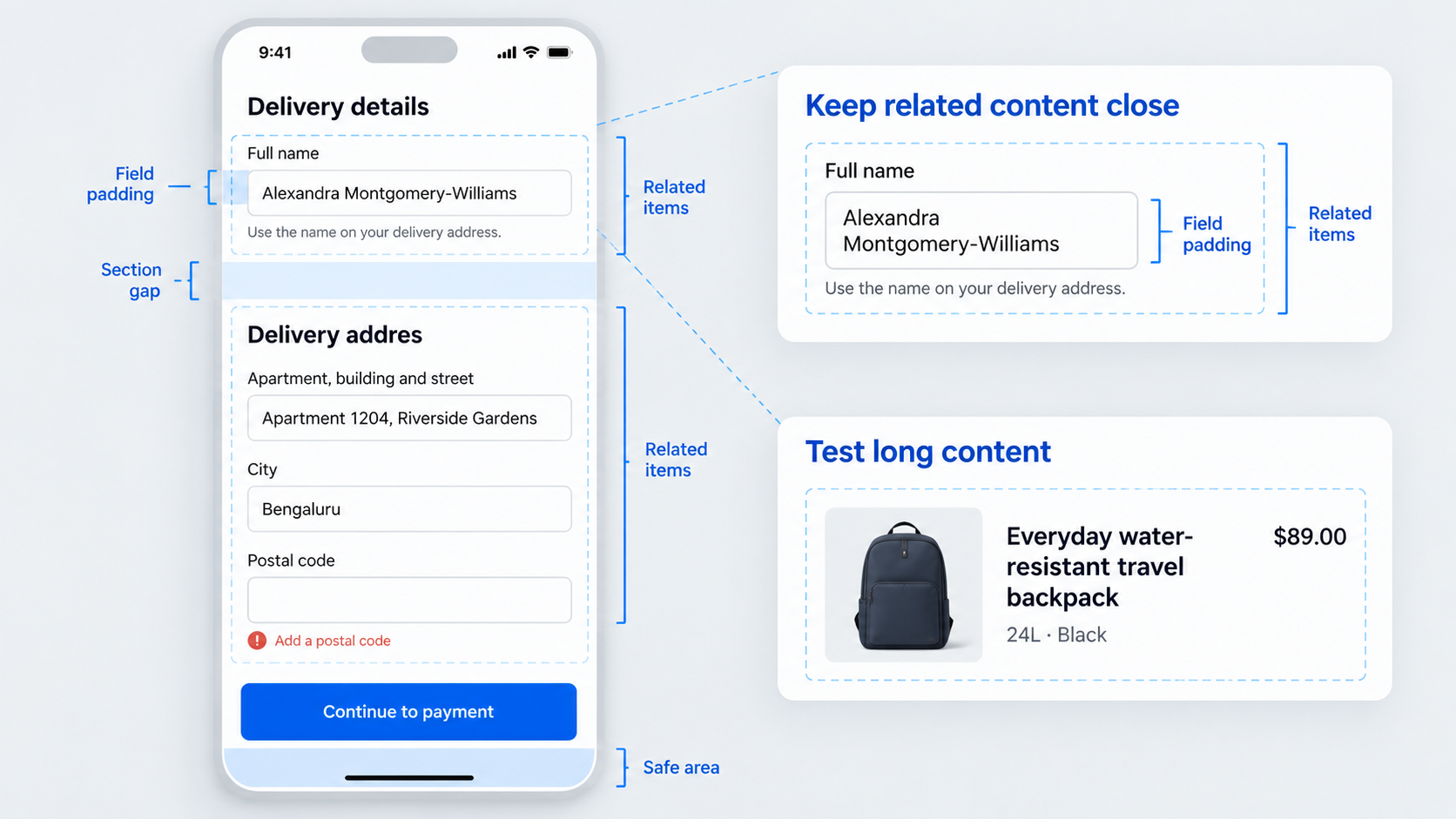 Define spacing rules for component insets, related vertical stacks, inline controls, and major content sections. Then test them with realistic names, prices, labels, validation messages, and descriptions.
Placeholder text hides the problems a responsive wireframe should expose. Our practical framework for evaluating interface design can help teams assess hierarchy and consistency without relying on taste alone.
Assign spacing by relationship, not appearance
Keep labels close to their fields. Helper text and validation messages should remain connected to the relevant control, while unrelated groups need clearer separation.
Distinguish internal padding from spacing between components and sections. Optical balance may justify exceptions, but those exceptions should be intentional.
Stress-test the wireframe
Replace ideal content with difficult cases:
- Long translated labels
- Multiline names and descriptions
- Larger text settings
- Missing images
- Empty results
- Validation messages
- Narrow viewports
If actions disappear or related information separates, revise the layout rules rather than patching one screen.
Design for thumbs, taps, and one-handed use
A balanced wireframe can still be awkward to operate. Controls may have small interactive areas, insufficient separation, or poor placement for one-handed use.
Current platform and accessibility guidance should inform touch areas. We also consider task frequency, error cost, motor accessibility, and nearby controls instead of applying one measurement without context.
Map touch targets and spacing
Overlay complete interactive areas on the wireframe. This reveals controls that look separate but compete once their actual hit regions are visible.
Give destructive actions enough distance from common or high-frequency controls. Thumb-zone overlays can also expose hard-to-reach actions, although they should be treated as diagnostic guides rather than universal maps.
Place primary actions by frequency and context
Compare possible locations such as the top bar, main content, sticky bottom area, floating control, or bottom navigation.
Review reach, persistence, scrolling, keyboard behavior, and safe-area conflicts. A checkout confirmation may suit a sticky action, while an infrequent command may belong in a contextual menu.
Choose navigation and action patterns deliberately
Choose navigation according to information architecture, destination frequency, and context. Bottom navigation, tabs, drawers, and hierarchical navigation solve different problems.
Navigation changes location. Persistent actions advance a task. Contextual actions appear when a state or selection makes them relevant. Validate that model before adding transitions.
Bottom navigation, tabs, drawers, or hierarchy?
Use each pattern with a clear purpose:
- Bottom navigation: Frequent, peer-level destinations
- Tabs: Related views within one context
- Hierarchical navigation: Movement from collections to details
- Drawers: Lower-frequency destinations where reduced visibility is acceptable
Document the selected destination, back destination, preserved state, and behavior after interruptions or deep links.
Persistent vs. contextual actions
Keep an action persistent only when it remains useful throughout the screen. Reveal contextual actions after a relevant selection or state change.
For sticky controls, specify their behavior during scrolling, keyboard display, loading, modal presentation, and safe-area changes.
Wireframe the whole system, not only the happy path
Loading, empty, error, offline, permission, interrupted, success, and keyboard-open views all affect hierarchy and available space. They are part of the design, not development cleanup.
Define what happens to navigation, input, retries, and recovery in each relevant state.
State checklist for every critical screen
Review these states where applicable:
- First use
- Populated
- Empty
- Loading
- Partially loaded
- Failed
- Offline
- Completed
For each one, identify available actions, preserved information, navigation status, and the recovery path. Recoverable errors should not erase completed input without a clear reason.
Interruptions, permissions, and keyboards
Request permissions when their purpose is clear, then design both denial and recovery paths.
Check that the keyboard does not cover focused fields, validation messages, or primary actions. Also define behavior after cancellation, app switching, timeout, interrupted authentication, and expired sessions.
Mobile app wireframe example: From brief to tested flow
Consider checkout for a returning retail customer. The user needs to review an order, confirm delivery and payment details, and place it without unnecessary re-entry.
Rather than producing isolated screens, we would compare complete checkout directions using the same content and constraints.
Example brief and required screens
The flow might include cart review, delivery details, payment, order review, processing, success, validation failure, payment failure, and offline recovery.
It should preserve the cart and entered information after recoverable errors while accommodating long product names, unavailable items, promotional messages, and keyboard-open states.
Compare directions before prototyping
One direction may place actions inside each screen. Another may use a sticky bottom action, while a third may use expandable sections.
Compare them using consistent criteria:
- Hierarchy
- Reachability
- Navigation burden
- Content flexibility
- Safe-area behavior
- Edge-state coverage
Reject options that depend on short labels, hide essential information, or make recovery unclear.
Validate before adding transitions
Walk through the task on representative screen sizes. Test long content, payment failure, keyboard display, app switching, and return to a partially completed order.
Add clickability only after screen order, actions, back behavior, and recovery logic are stable.
Use AI to move from wireframe to editable UI
AI can speed up exploration by suggesting alternatives, reorganising layouts, and identifying additional states. In our discussion of an AI design assistant for shippable UI, we focus on output that remains editable and open to review.
Designers still need to judge platform conventions, accessibility, product logic, content behavior, and interaction geometry.
What AI should generate—and what designers must verify
AI can assist with:
- Alternative screen structures
- Reordered flows
- Additional states
- Content variations
- Reusable component suggestions
We then verify hierarchy, navigation, safe areas, touch areas, accessibility, platform fit, and state completeness. A convincing structure is not automatically a usable one.
Prepare the approved direction for handoff
Name screens, states, and components consistently. Document responsive behavior, persistence, validation, loading, errors, keyboard interactions, and navigation rules.
Editable output helps product and design teams refine approved wireframes into reusable interface patterns instead of disconnected screens.
Templates, free tools, and app-selection questions
Choose tools and templates by workflow coverage, not library size. A large component collection does not guarantee realistic content behavior, coherent navigation, or complete system states.
Desktop website templates may also overlook mobile navigation, gestures, system bars, keyboards, permissions, and touch behavior.
What is the best app for wireframe design?
The best app fits the team’s workflow. We assess how well a tool supports initial briefs, alternative layouts, mobile states, editing, collaboration, and handoff.
UXMagic is designed for teams that want AI-assisted exploration connected to continued interface design rather than an isolated screen output.
Can AI create wireframes?
Yes. AI can turn a clear brief into starting structures, suggest alternative flows, and expand missing states.
Teams must still inspect platform conventions, interaction geometry, accessibility, content resilience, navigation logic, and product rules.
Is there a free wireframe tool?
Free access varies by product and plan. Limits may affect projects, exports, collaborators, AI use, or editable output.
Check the current UXMagic pricing and access details rather than relying on an older plan description.
What should a mobile wireframe template include?
A useful template should include:
- Grid and safe-area guides
- Navigation alternatives
- Touch-area guidance
- Form and keyboard behavior
- Loading, empty, error, and offline states
- Realistic content capacity
- Responsive rules
Judge a template by how it behaves with difficult content and compact screens, not by the size of its gallery.
Turn your mobile brief into a tested wireframe
Define the user, task, constraints, required states, and success event, then explore directions with the AI UI design generator. Compare the interaction trade-offs and refine the strongest option into editable UI.