
TL;DR
An app prototype template should do more than provide polished screens. It should define the states, transitions, failures, and recovery paths needed to test a product assumption. We recommend starting with one critical task, building the smallest credible flow around it, and recording what success looks like. Use this framework to scope, generate, test, and hand off a clickable prototype.
What an app prototype template should help you test
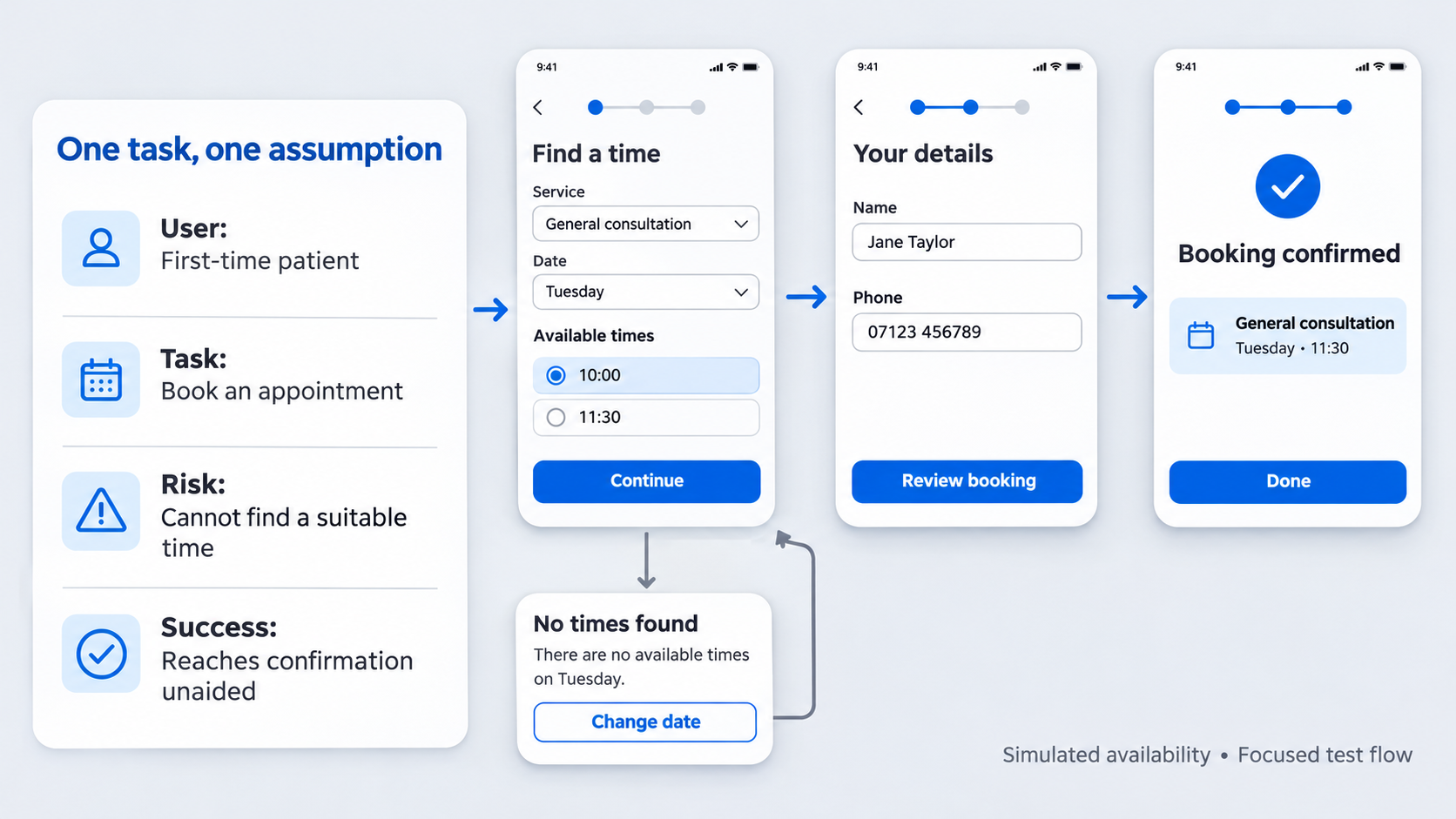 Inspiration galleries such as Dribbble and Behance are useful for exploring visual directions. A testable prototype needs more context: an objective, entry point, alternate paths, expected outcome, and observable success signal.
Our reusable framework covers:
- Objective
- Target user
- Critical task
- Entry point
- Core path
- Alternate path
- Outcome
- Observable success signal
A prototype does not need to represent the entire app. It needs to make a risky product assumption observable.
UI kit vs. prototype template
A UI kit standardizes buttons, fields, cards, colors, and typography. A prototype template structures an interaction from entry to outcome.
Teams can use both, but consistent components cannot compensate for unclear back behavior, missing error states, or a user becoming trapped after a failed action.
The one-assumption rule
Before selecting screens, write the riskiest assumption as a testable statement:
We believe [target user] can [complete task] from [entry point] without [known risk], demonstrated by [observable behavior].
For example: “We believe first-time patients can find and book an appropriate appointment without assistance, demonstrated by selecting a suitable time and reaching confirmation.”
That statement determines what participants attempt and what evidence matters. Our guide to an MVP prototype built around assumption validation explains how we keep this scope disciplined.
Scope the prototype before designing screens
We recommend starting with a brief, not a canvas. Define the user, task, context, entry point, expected outcome, alternate path, and success signal.
Set clear boundaries too. Record whether authentication, saved data, permissions, payments, notifications, and device conditions are real, simulated, or excluded. For review or fundraising, our framework for a clickable startup prototype shows how to present one credible flow without implying that the whole product exists.
Copy-ready prototype brief
- User: [Who is attempting the task?]
- Scenario: [What happened immediately beforehand?]
- Critical task: [What must the user accomplish?]
- Risky assumption: [What do we believe but not know?]
- Start state: [Where does testing begin?]
- Expected outcome: [What visible result completes the task?]
- Evidence: [What behavior supports or challenges the assumption?]
- Included paths: [Core and selected alternate paths]
- Excluded features: [Functions intentionally unavailable]
- Simulated data: [Payments, messages, availability, or accounts]
- Unresolved questions: [Decisions the prototype should inform]
Turn a broad product idea into one critical task
Replace broad concepts with observable tasks:
- Marketplace: compare two providers and select one.
- Travel app: book a room for specific dates.
- Health platform: find and confirm an appointment.
- Finance app: verify an identity after a failed attempt.
- Creator tool: create and publish one item.
“Explore the marketplace” is vague. “Compare two available providers and request one for Friday” exposes the decisions, information, and possible failures involved.
Build the core screen inventory
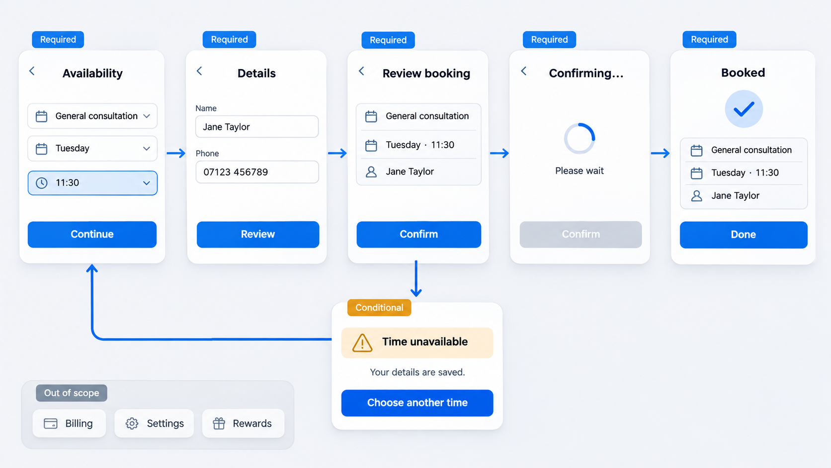 Map only the screens needed to enter, understand, complete, and confirm the task. Label each one:
- Required: Needed to test the assumption.
- Conditional: Shown after a choice or system response.
- Out of scope: Unnecessary for this test.
Every screen should support a user decision or system response. If it contributes no useful evidence, remove it.
The minimum viable screen set
A focused flow may include:
- Task entry point
- Decision screen
- Required input
- Review or confirmation
- Visible outcome
Simplify onboarding, home, and global navigation unless finding the task is part of the assumption.
Screen-to-screen flow worksheet
| Screen | User goal | Primary action | Destination | Alternate action | Exit path |
|---|---|---|---|---|---|
| Availability | Find a suitable slot | Select time | Details | Change date | Cancel |
| Details | Provide required data | Continue | Review | Edit slot | Back |
| Review | Verify booking | Confirm | Success | Edit details | Cancel |
Flag screens that cannot be reached, exited, or reset. Those gaps can become dead ends during testing.
Design the state matrix, not just the happy path
Pair critical actions with relevant failure and recovery behavior. Consider loading, empty, disabled, validation, error, permission-denied, interrupted, and success states. Prioritize states that could invalidate the test or strand a participant.
| Screen or action | State | Trigger | Message | Available action | Recovery destination |
|---|---|---|---|---|---|
| Search results | Empty | No matches | No times found | Change date | Search |
| Booking form | Validation | Missing phone | Explain requirement | Edit field | Same form |
| Confirmation | Error | Slot expired | Time unavailable | Choose another | Availability |
Essential UI state checklist
Ask:
- Loading: Does the participant wait, retry, or leave?
- Empty: Is it clear why nothing appears?
- Validation: Can invalid input be found and corrected?
- Error: Does the message explain what happened?
- Disabled: Is the requirement for continuing clear?
- Permission denied: Is another route available?
- Interrupted: Are progress and entered data preserved?
- Success: Is completion unmistakable?
Authentication needs the same treatment. Our login form wireframe guide covers errors and recovery beyond a default form.
Pair failure with recovery
Every failure needs a next action: retry, edit, choose another option, grant access, or return safely. Where possible, recovery should preserve entered data. If data will be lost, communicate that before the user commits.
Map one critical app flow from start to recovery
Combining onboarding, search, checkout, account management, and settings creates scope without necessarily improving the evidence. We start with one flow:
- Entry
- Decision
- Input
- Review
- Completion
- Failure
- Recovery
- Exit
Example: booking a time slot
Happy path: Search availability → select a time → enter details → review → confirm → view success.
Edge case: The slot expires before confirmation, so the app displays a conflict message.
Recovery: Preserve the details, explain that the slot is unavailable, return to availability, and show alternatives. Restore the entered information after a replacement is selected.
This tests whether participants can recover from changed availability, not just follow an ideal sequence.
Flow-specific coverage prompts
- Onboarding: Skip, validation, permission denial, interruption, and resume.
- Search: Loading, no results, misspelling, network failure, and reset.
- Checkout or booking: Changed availability, declined payment, duplicate submission, retry, and receipt.
- Account setup: Duplicate email, invalid code, resend, and successful entry.
Select prompts that relate to the assumption rather than forcing every task into a generic pattern.
Choose the right prototype fidelity
We define fidelity by the decision it supports. Use the lowest level that makes the assumption believable and testable.
Low fidelity for structure and sequence
Use low fidelity to test information order, navigation, task logic, and missing steps. Keep components clear without suggesting that visual decisions are final.
Mid fidelity for interaction and comprehension
Use realistic labels, content hierarchy, controls, and system states when participants need context to make credible decisions. Final imagery, branding, and refined motion can wait.
High fidelity for confidence and implementation detail
Use high fidelity when native behavior, motion, accessibility, implementation detail, branding, or stakeholder approval affects the decision. Polish cannot repair an unsupported task sequence.
Make the app prototype clickable and test-ready
A clickable prototype is more than primary buttons linking screens. We check back behavior, overlays, scrolling, keyboard coverage, field focus, dismissal, transitions, and reset routes.
Clickable interaction checklist
Verify:
- Primary, secondary, back, cancel, close, and retry actions
- Overlay opening and dismissal
- Keyboard coverage and field focus
- Selected, disabled, loading, and submitted states
- Scrolling and fixed controls
- Duplicate taps and delayed responses
- Reset behavior
Visible controls should work or appear clearly noninteractive.
User-testing readiness checklist
Write neutral prompts. Instead of “Tap Filter and choose Tuesday,” use “Find an appointment available next Tuesday.”
Observe where participants hesitate, backtrack, misread labels, trigger errors, attempt unsupported actions, recover, or believe they have finished. Before each session, verify the starting state, realistic data, completion signal, and reset route.
Describe, generate, and refine with UXMagic
We use AI to accelerate initial screen systems and state coverage, not to make product decisions. With the UXMagic AI UI generator, teams can describe a flow, generate an initial direction, refine screens, and prepare the interaction for validation.
A stronger generation prompt
Design a [fidelity] [iOS/Android] app prototype for [product context]. The target user is [user] attempting to [task] from [entry point]. Include [critical path], plus [alternate or recovery path]. Create consistent default, loading, empty, validation, error, permission, and success states. The successful outcome is [visible result].
For stronger output, follow our approach to generating AI UI that is actually shippable.
Review the generated flow like a designer
Remove redundant screens, replace generic patterns, and challenge unsupported assumptions. Check the hierarchy, accessibility, platform conventions, content, failures, and recoveries before adding polish.
Adapt, share, and hand off the template
A useful free app prototype template provides reusable scope, screen, and state worksheets. Keep the task and interaction logic shared across platforms, then adapt conventions that materially affect behavior.
One flow, two platform conventions
Across iOS and Android, review:
- Navigation placement
- System back behavior
- Pickers and dialogs
- Permission requests
- Keyboard behavior
- Native component conventions
Document shared logic separately from platform-specific presentation.
Figma, PowerPoint, or a copy-ready worksheet?
Use the worksheet for scope and evidence. Use PowerPoint for a noninteractive walkthrough, not as a substitute for usability testing. Choose a clickable environment when navigation, recovery, overlays, scrolling, or transitions matter.
For editable delivery, our AI-to-Figma workflow explains how to move generated UI into review-ready designs.
Stakeholder handoff checklist
Include:
- Objective and tested assumption
- Included paths and excluded scope
- Simulated data and known limitations
- Testing observations
- Start link and reset instructions
- Expected success signal
- Screen-and-state matrix
- Prioritized next decisions
Ask stakeholders to review product logic before visual preference.
Build your testable app prototype
Start with one user, one critical task, and one risky assumption. Use UXMagic to generate the minimum screen system, add failure and recovery states, and turn it into a clickable flow ready for testing.