
TL;DR
Many lists of Figma design system examples show polished components but not the structure behind them. We assess systems by foundations, tokens, properties, states, accessibility, governance, and code alignment. The aim is to borrow sound architecture without copying another brand’s interface or importing complexity our product does not need.
What makes a Figma design system example worth studying?
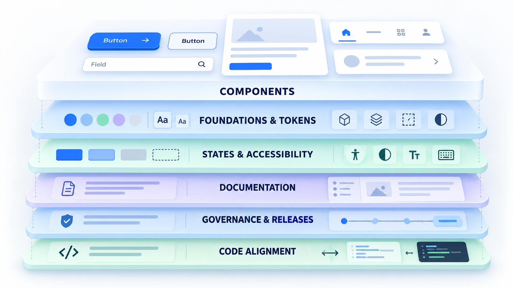
A design system combines foundations, reusable UI, guidance, governance, and links to production code. A polished Figma file may be only a component library or UI kit.
We recommend evaluating examples by structure, scalability, accessibility, documentation, governance, adoption effort, and product fit. Study their assumptions rather than their visual style.
Component library vs. design system
Buttons, colors, and typography are only the visible layer. An operational system also needs owners, contribution rules, review criteria, versioning, release notes, deprecation procedures, implementation guidance, and code equivalents.
Without these elements, a team has reusable assets but no dependable way to maintain them.
Why more components do not mean a better system
Large inventories often reflect product cases and organizational complexity that smaller teams do not share. Importing everything creates unnecessary decisions, dependencies, and maintenance.
We prefer to start with frequent, validated flows. Extract repeated decisions, then expand when real usage justifies it.
Figma design system examples compared by structure, not style
Material, Carbon, Fluent, Polaris, Atlassian, Pajamas, and USWDS come from different product and governance contexts. We treat them as references to investigate, not as a ranking.
Figma asset availability and publisher status can change. Before adopting a file, confirm its publisher, permissions, update history, and current documentation. Open-system directories can support discovery, but they do not replace verification.
Comparison matrix criteria
This matrix identifies the questions we would ask when reviewing each system. It does not certify that a particular Figma file is official, complete, or current.
| System | Context to investigate | Structural question | Adoption question | Figma verification |
|---|---|---|---|---|
| Material | Multi-platform products, including Android | How are shared roles adapted across platforms? | Which layers are relevant to our product? | Confirm the current publisher and version |
| Carbon | Enterprise product interfaces | How are dense workflows composed? | Can our team support its architecture? | Confirm access and update history |
| Fluent | Web and native products | How are themes and platforms related? | Which platform assumptions apply? | Confirm the current version |
| Polaris | Commerce workflows | How does the system encode task-specific patterns? | Do those workflows resemble ours? | Verify official availability |
| Atlassian | Collaborative software | How are foundations connected to product patterns? | What enterprise assumptions can we remove? | Public listings include ADS Foundations; verify the source |
| Pajamas | Application and DevOps workflows | How are application patterns documented? | Does its contribution model fit our team? | Verify publisher and access |
| USWDS | Public-service websites | How are content, services, and accessibility addressed? | Which requirements match our environment? | Verify official or community status |
What different system structures reveal
Cross-platform systems may prioritize shared language across environments. Enterprise systems often account for dense workflows, while commerce and public-service systems reflect their own tasks and constraints.
A small web product should not inherit enterprise-scale abstractions unless its workflows and release process require them.
Inside a well-structured Figma design system file
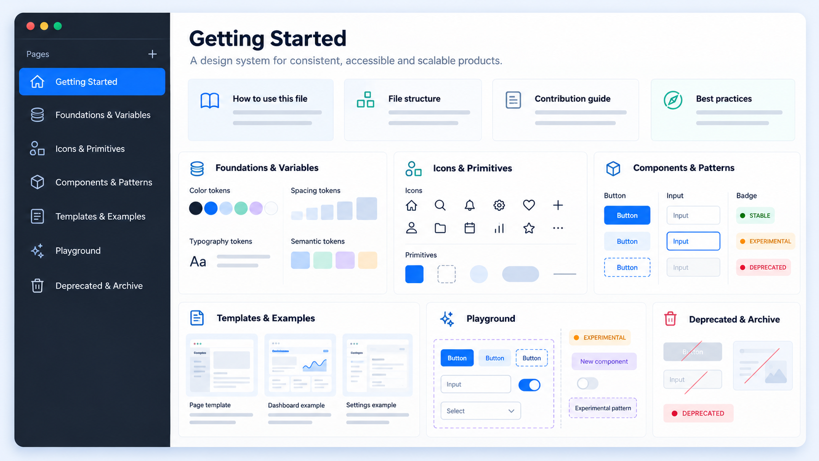
A useful file makes approved assets easy to find and outdated assets difficult to use. Its hierarchy should move from guidance and foundations to components, patterns, examples, and templates.
This structure supports onboarding while separating production assets from experiments.
Recommended page architecture
We suggest a predictable sequence:
- Cover, scope, ownership, releases, contribution rules, and getting started
- Foundations and variables for color, type, spacing, radius, elevation, grids, breakpoints, and motion
- Icons and primitives
- Composite components and patterns
- Templates and implementation examples
- A playground for experiments
- Deprecated assets and archives
Label stable, experimental, deprecated, and archived work clearly. Our Figma component library guide offers another practical reference for organizing reusable UI.
Naming conventions teams can scan
Names should remain consistent across pages, frames, components, properties, variables, modes, and statuses. We favor product language such as Action/Button/Primary or Filter/SelectionChip over names such as “blue button.”
Keep hierarchies short and searchable. A name should communicate purpose, not list every visual attribute.
Component properties vs. variants: build the smallest useful API
Every component is an interface that designers must understand and edit safely. Its options should represent meaningful behavior rather than every imaginable permutation.
A giant variant matrix shifts complexity from system maintainers to every designer using the library.
When to use each component property
- Boolean: Show or hide an optional element.
- Text: Expose labels, values, helper text, or supporting copy.
- Instance swap: Replace approved icons, avatars, illustrations, or nested controls.
- Variant: Represent finite axes such as size, emphasis, orientation, or interaction state.
If an option changes the component’s core purpose, we usually separate it into another component.
How to prevent variant explosion
Use primitives, nested instances, slots, and narrow variant axes. Avoid combining content, layout, state, theme, and platform choices in one exhaustive matrix.
For example, compose a form from fields, labels, help text, validation, groups, and submission feedback. One overloaded form component is harder to edit, test, document, and map to code.
Variables, modes, and semantic tokens that connect design to state
Components should reference semantic roles instead of raw colors or arbitrary spacing values. Teams can then change presentation without rewriting the intended meaning.
Variables store values, tokens express decisions, properties configure components, and states describe behavior. These layers are related but not interchangeable.
A practical token hierarchy
We use three levels:
- Primitives: Raw palettes, spacing scales, type values, radii, and base measurements
- Semantic tokens: Roles for text, surfaces, borders, actions, feedback, focus, and disabled UI
- Component tokens: Local decisions that cannot be expressed cleanly through global semantics
Component tokens should handle genuine exceptions rather than duplicate the semantic layer.
Modes are not the same as states
Modes represent coherent contexts such as light and dark themes, brands, platforms, or density settings. States describe behavior such as hover, focus, selected, disabled, loading, error, and success.
Using a mode for one isolated component variation hides behavior inside the theme structure and complicates implementation.
Inspect states, responsiveness, and accessibility before visuals
Strong examples remain useful under realistic content and interaction pressure. We test long labels, localization, empty data, narrow containers, errors, and loading instead of reviewing only pristine default states.
Visual consistency has limited value if the interface is inaccessible or too rigid for production.
Required interaction and feedback states
Inspect relevant default, hover, focus, active, selected, disabled, loading, error, and success states. Differences should not depend on color alone.
Document impossible combinations rather than building them. A disabled control, for example, may not need every interactive permutation.
Responsive component behavior
Review Auto Layout direction, wrapping, gaps, padding, alignment, and nested resizing. Sizing choices should be deliberate and tested with realistic content.
Document whether a component reflows, truncates, stacks, scrolls, or changes composition. For application layouts, our dashboard design decision framework explains how structure can support the next action.
Accessibility checks
Check contrast, visible focus, target size, text scaling, keyboard implications, and reduced-motion behavior. Add annotations for semantics and focus order where needed.
Figma communicates intent, but runtime keyboard behavior, screen-reader output, and motion preferences must also be implemented and tested in code.
How to assess free Figma design system templates and Community files
Free Figma design system examples should remain reference material until their quality, rights, and maintenance have been verified. A polished cover does not prove accessibility or production readiness.
Our community design inspirations can support exploration, but every external file still needs an independent audit.
The maintenance and completeness audit
Check:
- Publication and update history
- Active maintainers and release notes
- Compatibility with the Figma features our team uses
- Detached instances, unresolved fonts, broken assets, and hidden dependencies
- Missing states, deprecated pages, and inconsistent naming
- Representative components under realistic content
We test a form, modal, navigation pattern, and data-heavy component rather than trusting showcase screens.
The licensing and implementation audit
Confirm the rights to reuse, modify, distribute, attribute, and apply the work commercially. Public visibility does not establish permission.
Look for accessibility guidance, code references, token exports, and evidence that designed and coded components correspond. Verify any claim of official or open-source status at its current source.
From design system inspiration to an original product screen
Public systems should teach architecture, not supply a brand identity to copy. Generated UI should also remain exploration material until its values, states, behavior, and accessibility have been normalized.
Define, explore, and extract
Define the product, platform, users, content, accessibility obligations, and engineering constraints. Explore several original directions, then choose one for workflow clarity rather than decoration.
At uxmagic.ai, we use AI-assisted exploration to surface possible layouts quickly. Our AI-to-Figma workflow shows how editable designs can enter structured review without being mistaken for a finished system.
Normalize, test, and document
Turn repeated values into primitives and semantic tokens. Extract components when repetition and meaningful behavioral boundaries become clear.
Before publishing, test responsive behavior, extreme content, interaction states, and accessibility. Document usage, exceptions, maturity, ownership, releases, and code mapping.
Teardown exercise: dashboard filters to reusable patterns
Rebuild a filter bar with original content and branding. Identify its container, controls, trigger, removable chips, count badge, clear action, empty selection, loading feedback, and responsive behavior.
The normalized version should contain fewer arbitrary values, clearer component boundaries, and documented behavior without representing every combination as a variant.
Choose a reference system that matches your team
There is no universal best system. We choose references that fit the product, platform, team, codebase, and release process.
A focused local pattern library may provide more value than an enterprise system whose abstractions require constant explanation.
Reference-system decision criteria
Evaluate:
- Product: Site, SaaS, commerce, internal tool, mobile product, or multi-platform ecosystem
- Team: Ownership, contribution model, engineering capacity, and release cadence
- Technology: Framework, token pipeline, platforms, accessibility obligations, and legacy code
- Adoption: Training, migration, dependencies, governance overhead, and assumptions to remove
The strongest reference minimizes irrelevant complexity while exposing useful architectural decisions.
Signs the system is production-ready
Look for named maintainers, contribution rules, review criteria, releases, and a deprecation policy. Figma components, semantic tokens, coded components, and documentation should have traceable relationships.
Teams should be able to adopt and update the system without relying on undocumented knowledge.
Measure whether the design system is working
Success extends beyond visual consistency. We look for evidence that the system supports delivery, reuse, accessibility, and UI quality.
Practical adoption and quality metrics
Track:
- Component adoption across eligible screens and flows
- Design-to-development time for comparable work
- UI defects and inconsistencies found during review or QA
- Accessibility coverage across components and required states
- Duplicate components in design and code
These measures connect system work to product delivery instead of rewarding library size.
Metrics need context
Pair quantitative measures with feedback and documented exceptions. An instance count cannot show whether a team selected the right component or detached it immediately.
Review results by release and product area so legacy surfaces do not conceal progress or make valid exceptions appear to be failures.
Describe, design, and ship a stronger system
Use UXMagic’s AI UI/UX design features to explore original interfaces and move promising directions into editable work. Generate a screen, then normalize, test, document, and ship the patterns that deserve to become part of your system.