
TL;DR
A high fidelity wireframe is not automatically better than a rough one. We recommend increasing fidelity only when realistic content, components, states, or interactions will answer a specific product question. Otherwise, extra polish increases revision effort, distracts reviewers, and can make weak UX look more convincing than it is.
What Is a High Fidelity Wireframe?
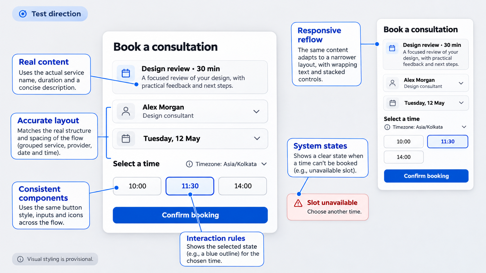 A high fidelity wireframe is a realistic representation of an interface’s layout, content, hierarchy, components, states, and interactions. It gives a team enough specificity to evaluate how an experience could work under believable conditions.
Our guiding principle is simple: increase fidelity only when realistic detail will answer a specific question. High fidelity is a decision tool, not a mandatory project milestone.
What “high fidelity” means depends on the decision being tested. It may require accurate content and data density for a dashboard, realistic validation for a checkout, or detailed permission rules for an enterprise settings screen.
It does not necessarily mean:
- Final colors and typography
- Approved visual design
- Complete product requirements
- Production-ready component specifications
- Fully functional interactions
- Proven usability
A high fidelity diagram can resemble a finished product while still containing unresolved assumptions. That realism helps stakeholders understand the proposal, but it can also create false confidence.
Polished screens feel authoritative. Reviewers may assume that the flow has been validated, the underlying logic is settled, or engineering can begin immediately. If navigation, task sequence, data rules, or recovery paths remain untested, visual polish may make those weaknesses harder to challenge.
The Six Signals of High Fidelity
High-fidelity wireframes typically use several forms of realistic detail. A wireframe does not need maximum fidelity in every category. Its specificity should match the evaluation goal.
- Realistic content Labels, headings, instructions, data, button text, errors, and confirmations resemble what people will encounter in the product. Real copy exposes comprehension problems that placeholder text can conceal.
- Accurate layout Spacing, alignment, density, grouping, and hierarchy are deliberate. The composition represents the likely screen dimensions rather than a rough collection of boxes.
- Recognizable components Inputs, tables, navigation, dialogs, cards, filters, and controls follow recognizable interface patterns. Components may come from an existing design system or be represented consistently enough to evaluate their use.
- Interaction behavior The wireframe shows what happens after a click, tap, selection, submission, or keyboard action. It may include transitions, conditional disclosure, validation, confirmation, and recovery.
- System states The interface represents more than the ideal path. Loading, empty, disabled, error, success, permission-restricted, and partial-data states appear where they affect the experience.
- Responsive or platform-aware rules The design reflects relevant device conventions, breakpoints, input methods, and content reflow. A realistic mobile wireframe, for example, may account for keyboard obstruction, touch interaction, and narrow-screen wrapping.
These signals describe functional specificity, not decorative finish. A grayscale account-permissions flow with real roles, dependencies, errors, and keyboard behavior may be more useful than a beautifully branded screen that shows only the default state.
What a High-Fidelity Wireframe Is Not
A high-fidelity wireframe is not automatically an approved visual design. It may use coherent styling to clarify hierarchy without settling brand expression, final imagery, or production typography.
It is also not a complete specification. A screen can show an error without documenting the service response, logging behavior, retry rules, or technical implementation behind it.
Most importantly, it is not proof of usability. Stakeholders understanding a realistic screen is different from representative users completing a realistic task successfully.
We recommend labeling every realistic wireframe with:
- Purpose: The decision the artifact supports
- In scope: What reviewers should evaluate
- Tested assumptions: What available evidence supports
- Open assumptions: What still requires validation
- Out of scope: What feedback should be deferred
- Status: Exploratory, test direction, selected direction, or approved
A label such as “Test direction: review hierarchy, terminology, and recovery; visual styling is provisional” can prevent a detailed wireframe from being mistaken for final UI.
Low Fidelity vs. Mid Fidelity vs. High Fidelity Wireframes
The difference between low-fidelity and high fidelity wireframes is not simply the number of details on the canvas. Fidelity affects what reviewers can understand, what researchers can test, how quickly designers can revise, and which assumptions the artifact may unintentionally communicate.
A practical comparison looks like this:
| Dimension | Low fidelity | Mid fidelity | High fidelity |
|---|---|---|---|
| Content | Labels and placeholders | Representative headings and structured content | Realistic copy, data, errors, and variable values |
| Layout | Rough regions and sequence | Clear hierarchy, grids, and grouping | Accurate spacing, density, and responsive behavior |
| Components | Generic boxes and controls | Recognizable component patterns | Consistent, realistic components and variants |
| Interaction | Basic links between screens | Key paths and simple transitions | Detailed behavior, feedback, validation, and recovery |
| Production effort | Lower | Moderate | Higher unless reusable systems or AI reduce repetitive work |
| Best suited to | Concepts and structure | Comprehension and hierarchy | Realistic tasks, states, and implementation questions |
| Cost of change | Usually lower | Moderate | Potentially higher because decisions are interconnected |
These are not rigid categories. Content, visual, interaction, and technical fidelity can move independently.
One team might use real copy in a visually simple layout. Another might apply an established component library while leaving interactions disconnected. Both artifacts combine different fidelity dimensions.
Premature polish raises revision effort because each change may affect components, spacing, copy, variants, annotations, and connected screens. It also changes the feedback reviewers are likely to provide.
Rough structure invites discussion about structure. Polished typography and color can shift the review toward visual preferences, even when the team still needs to resolve the flow.
Mixed fidelity is often the more responsible choice. If a familiar sign-in screen leads to a novel account-recovery process, we can keep sign-in lightweight and detail recovery at high fidelity. The risky interaction receives the effort, while the predictable part remains cheap to change.
When Low Fidelity Is Enough
A low fidelity wireframe is enough when the team needs to explore:
- Information architecture
- Screen sequence
- Navigation models
- Rough hierarchy
- Competing concepts
- Feature grouping
- Alternative task flows
Low fidelity supports breadth. Designers can compare several approaches without creating unnecessary attachment to one polished direction.
It also makes unresolved thinking visible. A rough screen communicates that major changes remain acceptable, which can encourage stronger early critique.
We would not rely on low fidelity when a test depends on realistic content length, complex state changes, data density, platform behavior, or nuanced interactions. Placeholder boxes cannot reveal whether a localized heading wraps awkwardly, whether a chart label makes sense, or whether error recovery is understandable.
When Mid Fidelity Is the Smarter Bridge
Mid fidelity uses structured layouts, recognizable controls, and representative content without implying that the visual direction is final. It can bridge rough exploration and realistic evaluation.
We use it when stakeholders struggle to interpret sketches but the team is not ready to invest in complete states or detailed styling. It can clarify page structure, component choices, navigation, and primary actions without making the artifact feel approved.
Mid fidelity is particularly useful for:
- Reviewing hierarchy with cross-functional teams
- Comparing layout directions
- Confirming content requirements
- Mapping common components
- Identifying missing states
- Preparing a focused usability test
The goal is not to add a compulsory middle phase. It is to introduce only the specificity required for better decisions.
When High Fidelity Earns Its Cost
High fidelity earns its cost when realism improves the evidence or decision. Common reasons include:
- Testing a task with realistic copy and data
- Evaluating complex interactions
- Examining validation and recovery
- Clarifying high-risk states for engineering
- Checking responsive behavior
- Assessing dense enterprise workflows
- Aligning stakeholders who cannot interpret abstract screens
- Exploring accessibility-sensitive behavior
Detail only the screens and behaviors needed to resolve the current uncertainty. A six-screen flow does not require six equally polished screens when the research question concerns one complex interaction.
High Fidelity Wireframe vs. Mockup vs. Interactive Prototype
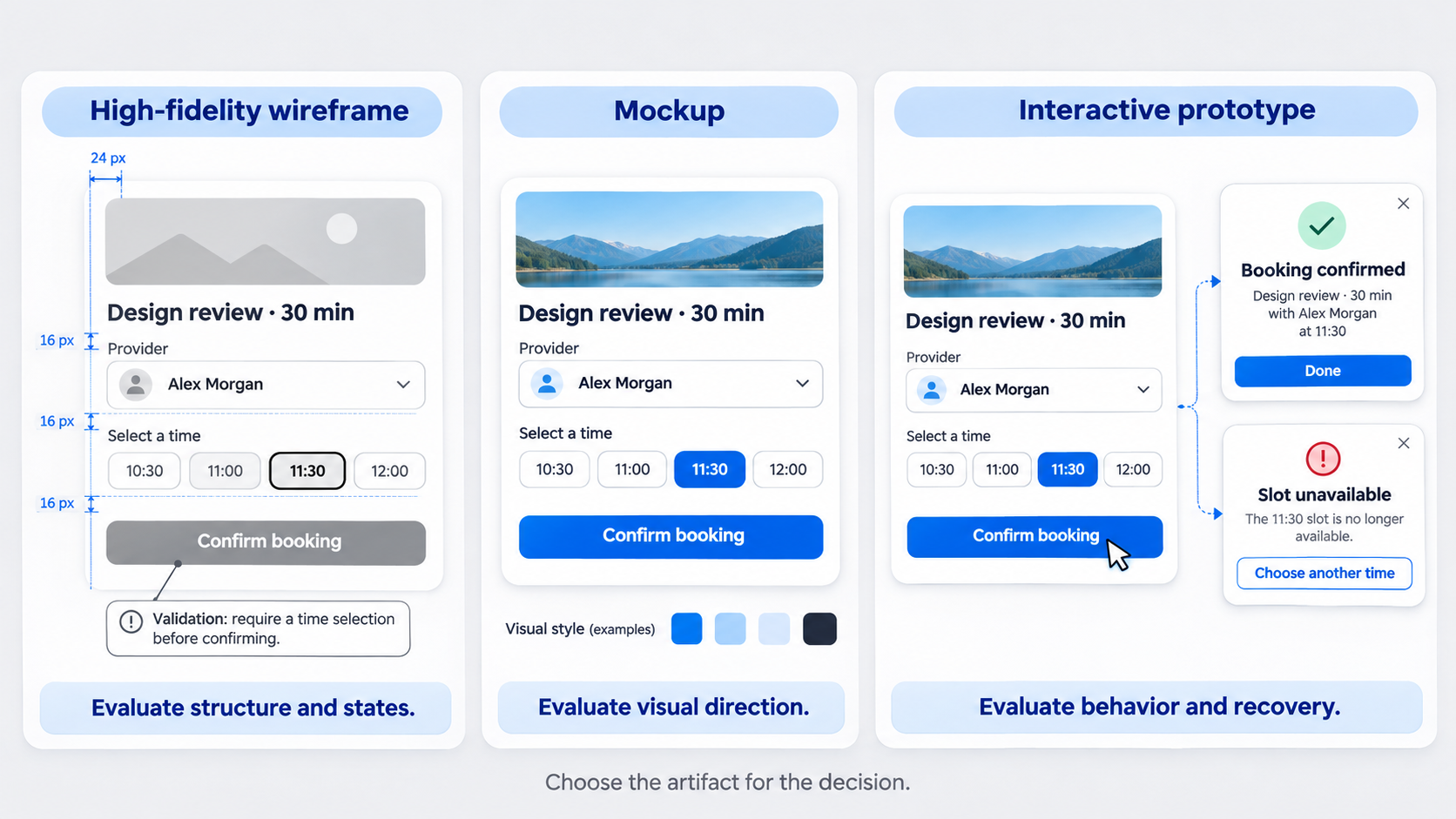 The most useful distinction between a high fidelity wireframe, mockup, and interactive prototype is the decision each artifact supports. File names and visual polish are unreliable definitions.
A wireframe primarily evaluates structure and behavior. Reviewers should focus on hierarchy, content, navigation, components, states, and task logic.
A mockup primarily evaluates visual direction. It helps teams judge typography, color, imagery, brand expression, composition, and aesthetic consistency. High fidelity mockups may look production-ready even when they are static.
An interactive prototype simulates behavior or task completion. It lets someone take actions, receive feedback, move between states, and experience part of a flow.
These categories overlap. A realistic wireframe can be clickable, while an interactive prototype can use rough grayscale visuals.
A pixel-perfect “wireframe” is usually better described as a mockup when the review centers on visual styling. Calling it a wireframe will not stop stakeholders from judging color, typography, and imagery.
Likewise, a series of polished static screens is not a useful interactive prototype when participants cannot perform the interaction being tested.
A Simple Artifact Test
Before naming an artifact, we ask what reviewers should judge:
- Flow: Can people move through the correct sequence?
- Hierarchy: Do they notice and understand the right information?
- Visual identity: Does the interface express the intended brand?
- Interaction behavior: Do controls, transitions, and feedback work as expected?
- Implementation detail: Are rules, states, dependencies, and responsive changes clear?
Name the artifact according to the primary decision, then state which feedback is out of scope.
For example: “This is a high fidelity wireframe for evaluating checkout hierarchy, validation, and error recovery. Brand imagery and final typography are not under review.”
That sentence is more useful than debating whether the file is technically a wireframe or mockup.
What Is a High Fidelity Simulation?
A high fidelity simulation is an interactive representation that combines realistic interface detail with enough behavior to approximate a real task. It allows a participant or reviewer to act rather than merely inspect screens.
The simulation does not need to reproduce the entire product. Its fidelity should match the test objective.
For a checkout test, address entry, shipping selection, payment validation, declined-card recovery, and confirmation may need to work. Footer links, promotional carousels, and unrelated account controls can remain inactive.
Selective functionality reduces production effort without weakening a focused test. The simulation only needs to be convincing where participant behavior matters.
When Should We Create a High Fidelity Wireframe?
We create a high fidelity wireframe when realism improves the quality of a decision, not merely because the project has moved from “discovery” to “design.”
We use six factors to choose fidelity:
- Uncertainty: Which assumptions could invalidate the direction?
- Audience: Can reviewers interpret abstract representations?
- Testing goal: Does participant behavior depend on realistic content or interaction?
- Development risk: Which states or rules could cause implementation problems?
- Timeline: How much detail can the team create and revise responsibly?
- Cost of change: How stable are the flow, requirements, and constraints?
Stakeholder confidence should not be confused with usability evidence. Realistic screens can improve comprehension, but they may also conceal flawed logic by making a weak flow feel finished.
We preserve low-cost exploration until the key task and requirements are stable enough to justify detail. Stability does not mean every decision is final. It means the remaining uncertainty requires more realism to resolve.
Fidelity Decision Matrix
| Context | Recommended fidelity | Add realism when | Avoid |
|---|---|---|---|
| Discovery | Low | Real content or constraints determine whether the concept works | Styling one direction before comparing alternatives |
| Stakeholder review | Mid or selective high | Abstract screens prevent meaningful alignment | Presenting polished screens without identifying open decisions |
| Usability testing | Selective high | Copy, data, states, or interactions influence participant behavior | Treating preference as proof of usability |
| Engineering clarification | High around risky behavior | Components, responsive rules, dependencies, or edge cases need precision | Treating the wireframe as the complete specification |
During discovery, stay at low fidelity unless realistic constraints determine whether the concept is viable. A dashboard concept may need representative data earlier than a simple marketing page because density and comparison are central to the experience.
For stakeholder review, mid fidelity may provide enough clarity. Raise selected screens to high fidelity when reviewers need realistic context to understand workflow consequences.
For usability testing, include the content, tasks, states, and interactions that affect participant decisions. Visual polish is optional unless it directly affects hierarchy, trust, comprehension, or accessibility.
For engineering handoff, document component choices, responsive rules, state transitions, edge cases, and unresolved questions. The wireframe should not replace acceptance criteria, data contracts, design-system documentation, or technical specifications.
Use Uncertainty to Choose Fidelity
Before opening the design tool, list the assumptions the team needs to test. Typical assumptions include:
- Users understand the terminology
- The hierarchy supports the primary task
- The proposed sequence matches users’ mental models
- Required data is available
- Permissions allow the intended action
- Users can recover from errors
- The layout handles realistic content
- The pattern works on target devices
- Engineering can implement the proposed behavior
Then increase the relevant type of fidelity.
If terminology is risky, increase content fidelity. If a conditional workflow is risky, increase interaction fidelity. If density and scanning are risky, increase layout fidelity.
This approach prevents us from polishing every dimension simply because one dimension requires precision.
What to Include—and What to Leave Out
A useful high fidelity wireframe contains enough realism to support its stated decision. It does not contain every detail the finished interface might eventually require.
We use this practical high fidelity wireframe checklist:
- Real headings, labels, instructions, and button text
- Representative data and realistic value lengths
- Accurate layout, grouping, spacing, and density
- Reusable, consistently applied components
- Primary and secondary navigation where relevant
- Input rules and inline validation
- Empty, loading, success, and error states
- Disabled and permission-restricted actions
- Responsive or platform-specific behavior
- Relevant transitions and recovery paths
- Annotations for assumptions and unresolved decisions
- Accessibility requirements that affect structure or behavior
Realistic content should take priority over decorative polish. Placeholder text hides hierarchy, truncation, localization, and comprehension failures.
A heading that fits as placeholder text may wrap once real or translated content is introduced. A generic “Submit” button may fail to communicate whether someone is saving a draft, sending an invitation, placing an order, or deleting data.
Leave out details that do not support the current decision, such as:
- Decorative imagery
- Exhaustive brand styling
- Final illustration or photography
- Motion unrelated to task comprehension
- Nonessential destinations
- Fully functional secondary navigation
- Production-level specifications outside the test scope
Annotations should distinguish validated decisions from assumptions and placeholders. Without that distinction, tentative choices may become accidental requirements.
Include the States That Change the Experience
The default screen is rarely enough. Include states that alter what people can understand or do:
- Default
- Hover, active, or focus where relevant
- Disabled
- Loading
- Empty
- Success
- Inline validation
- Permission restricted
- Partial data
- System error
- Offline or interrupted
- Unsaved changes
Prioritize transitions and recovery paths over a gallery of ideal screens. The important question is not only what an error looks like, but what caused it, what information remains preserved, and what the person can do next.
For example, a payment error should clarify whether the order total changed, whether entered address information remains, whether another payment method can be selected, and what will happen if the customer retries.
Use Real Copy Before Perfect Color
Real copy tests product logic. It reveals whether people understand labels, instructions, status messages, errors, and next steps.
Use realistic examples for:
- Navigation labels
- Field labels and helper text
- Button text
- Table headings
- Chart legends
- Empty-state guidance
- Validation messages
- Permission explanations
- Confirmation messages
- Destructive-action warnings
Test long names, large values, missing data, localization expansion, and small-screen wrapping. Variable content is part of the interface, not material to add after approving the layout.
Visual hierarchy still matters, but color can remain provisional when brand expression is not under review. Teams can apply the principles of design for interface evaluation without pretending every aesthetic choice is final.
Set an Explicit Stopping Rule
Stop adding detail when the artifact can answer the stated research, review, or implementation question.
A stopping rule might read: “The wireframe is complete when participants can compare plans, select one, resolve a payment error, and identify the confirmation status without assistance.”
This prevents open-ended polishing and makes omissions deliberate rather than accidental.
Record unresolved decisions instead of resolving them cosmetically by default. A short assumptions log can identify provisional styling, pending data rules, unsupported edge cases, and technical questions that require engineering input.
Four High Fidelity Wireframe Examples
Useful high fidelity wireframe examples show content, components, interactions, and edge states working together. Generic grayscale screens rarely provide enough context to demonstrate why fidelity matters.
For each example, identify:
- The decision being tested
- The realism required
- Essential states
- Details intentionally omitted
Different screens within each flow can use different fidelity levels.
SaaS Analytics Dashboard
Decision being tested: Can users interpret a performance change, locate its likely cause, and choose an appropriate next action?
The wireframe should use real metric names, plausible values, date ranges, chart legends, comparison periods, filters, and table labels. Generic boxes cannot show whether the information hierarchy supports interpretation.
Required realism includes:
- Revenue, conversion, retention, or product-specific metric labels
- Current values and period comparisons
- Date and segment filters
- Chart legends and tooltips
- Role-based data access
- Loading and partial-data behavior
- A no-data state
- Links or actions for further investigation
Useful states include a dashboard loading with a delayed chart, a user lacking access to one metric, and a filter combination returning no results. These conditions reveal whether the product explains what happened and offers a productive next step.
Final chart colors, decorative illustrations, and polished motion can remain unresolved unless they affect comprehension or accessibility.
Mobile Checkout
Decision being tested: Can a customer complete payment and recover from validation or payment failure without losing progress?
The realistic flow should include address entry, shipping selection, payment details, order totals, discounts, taxes, disabled actions, inline validation, and order confirmation.
Relevant states include:
- Missing required address information
- Unsupported postal code
- Updated shipping cost
- Expired or invalid card details
- Declined-card response
- Preserved customer information after failure
- Alternative payment selection
- Successful order confirmation
A high fidelity simulation might let a participant enter believable details, select shipping, submit payment, encounter a decline, correct the problem, and confirm the order.
Final product imagery and decorative branding can remain out of scope when the test concerns completion and recovery. The cart summary should still use realistic names, quantities, prices, and totals because those details affect comprehension and decision-making.
Appointment Booking Flow
Decision being tested: Do users understand availability, timing, and booking rules, and can they recover when their preferred option disappears?
Required realism includes service names, durations, provider schedules, time zones, unavailable slots, appointment details, and confirmation copy. Availability should behave like variable system data rather than a static calendar illustration.
Relevant states include:
- No providers available on the selected date
- A slot becoming unavailable before confirmation
- Time-zone differences
- A service requiring additional preparation
- Successful booking
- Cancellation restrictions
- Rescheduling with changed availability
The novel availability and recovery interactions should be high fidelity. Familiar account details or basic navigation can remain at mid fidelity if they are not under test.
Final provider photography, branded calendar styling, and unrelated profile features can be omitted. We should invest in the rules that determine whether booking succeeds.
Enterprise Settings Screen
Decision being tested: Can administrators change permissions safely, understand dependencies, and recover from conflicts or errors?
The screen should show realistic role names, permission groups, inherited access, dependencies, destructive actions, audit context, and unsaved changes. Enterprise settings become risky when a simple-looking toggle has consequences elsewhere.
Relevant states include:
- Insufficient permission to make a change
- A dependent permission being enabled automatically
- A destructive change requiring confirmation
- Unsaved modifications
- Concurrent updates
- Save success or system failure
- Audit information showing who changed what
- Keyboard focus through grouped controls
Use selective high fidelity around role changes, permission dependencies, and destructive actions. Keep predictable navigation and account information lighter unless they contribute to the test.
The objective is not to make every settings screen visually complete. It is to expose the rules, consequences, and recovery paths before implementation makes them harder to revise.
How to Test High-Fidelity Wireframes Without Inviting the Wrong Feedback
Test high-fidelity wireframes with realistic tasks and content. Asking whether someone likes the screen produces preference data, not reliable evidence about task performance.
Before any review, state:
- The decision being made
- The assumptions being tested
- The fidelity dimensions that matter
- The unresolved visual direction
- The feedback that is out of scope
Stakeholder approval provides alignment evidence. It does not prove that users understand terminology, notice the correct action, complete the flow, or recover from failure.
Accessibility checks should begin while the structure can still change. Waiting until styling is finished turns accessibility into a late audit rather than a design input.
Keep Reviews Focused on Flow and Hierarchy
Label the artifact as a test direction. Specify whether reviewers should assess sequence, hierarchy, terminology, states, interaction logic, or implementation risk.
Ask decision-based questions:
- What information will users notice first?
- What action will they expect to take next?
- Which requirement is not represented?
- Where could the sequence break?
- What happens if the user lacks permission?
- Can the user recover without restarting?
- Which state is missing?
- What would engineering need clarified?
Capture cosmetic feedback separately unless it affects comprehension or accessibility. A comment about button color may be irrelevant during flow review but useful if the provisional treatment makes the primary action difficult to identify.
Clear facilitation does not eliminate visual feedback. It helps us classify and defer that feedback responsibly.
Run Realistic Usability Tasks
Give participants believable goals, data, constraints, and error conditions. Avoid coaching them through the interface or naming the control they should use.
For a dashboard, ask someone to determine why performance changed and recommend a next action. For checkout, ask them to complete an order after their preferred payment method fails.
Observe:
- Task completion
- Hesitation
- Misinterpretation
- Backtracking
- Missed information
- Error recovery
- Unnecessary actions
- Confidence in the result
Preference can supplement those observations, but it should not replace them. A participant may like a polished screen while misunderstanding the central task.
Check Accessibility Assumptions
Review accessibility before final visual design by checking:
- Heading hierarchy
- Form labels and instructions
- Target sizes
- Focus order
- Keyboard behavior
- Dialog focus management
- Error identification
- Status announcements
- Content order at different breakpoints
- Alternatives for information conveyed visually
When colors are provisional, record contrast as an open assumption. Verify it when the visual direction is selected rather than promising to address accessibility later.
Accessibility also affects interaction logic. If a permission error appears only through color or a loading update is never announced, visual polish alone cannot solve the problem.
Create High Fidelity Wireframes Faster With AI—and Keep UX Control
The best high fidelity wireframe tool is not necessarily the one that produces the most polished first screen. It is the tool that helps a team answer its design question while retaining control over the result.
Evaluate tools based on:
- Editability and controllability
- Realistic content generation
- Reusable component support
- State and variant coverage
- Iteration speed
- Team collaboration
- Export options
- Design-system consistency
- Handoff readiness
AI can reduce repetitive interface production. It cannot replace requirements, product logic, research, accessibility work, or validation.
An AI wireframe generator can turn a structured prompt into a concrete direction quickly. Designers still need to decide whether the generated hierarchy, patterns, states, and assumptions fit the product.
The same principle applies to an AI UI generator with Figma-ready output: speed is valuable when the result remains editable and reviewable. Plausible-looking UI should begin a design decision, not silently finish one.
What Is the Best Tool for Wireframe Design?
The best tool fits the decision being made and the team’s workflow. Low-cost concept exploration, realistic usability testing, and engineering clarification place different demands on a wireframing tool.
Design and product teams should assess whether a tool supports:
- Fast structural iteration
- Precise editing
- Consistent reusable components
- Realistic copy and data
- Multiple states and variants
- Interactive task flows
- Responsive behavior
- Comments and collaboration
- Export to the team’s design environment
- Clear developer handoff
Visual output alone is not enough. A tool that generates attractive default screens but makes edge states difficult to create may shift effort rather than reduce it.
We recommend checking the complete AI UI/UX design feature set against the team’s actual process. The right choice should support revision and control after generation, not only an impressive first result.
The UXMagic Workflow
Our workflow is direct: describe, design, and ship.
- Describe the interface State the user, goal, platform, constraints, critical task, content requirements, and risky conditions. A precise prompt should describe behavior and context, not merely request a “modern dashboard.”
- Generate a realistic direction Produce enough interface detail to make structure, content, and assumptions concrete. This gives the team something specific to challenge.
- Refine the experience Adjust hierarchy, copy, reusable components, navigation, interactions, and edge states. Remove generated elements that do not support the task.
- Validate the flow Run a focused review or usability task based on the original uncertainty. Separate task evidence from visual preference.
- Prepare the selected direction Resolve relevant states, responsive rules, annotations, and handoff questions. Clearly mark what remains provisional.
Teams using UXMagic can accelerate production without surrendering design judgment. Our guidance on using an AI design assistant for shippable UI explains why generated output still needs systematic refinement and validation.
What Designers Must Still Decide
Designers remain responsible for:
- Requirements
- Information architecture
- Navigation logic
- Feature prioritization
- Data rules
- Roles and permissions
- Validation behavior
- Error recovery
- Accessibility
- Design-system alignment
- Research interpretation
- Final product decisions
AI may suggest a familiar pattern, but familiarity does not prove suitability. A generated permissions table can look convincing while omitting inheritance, bulk actions, audit history, or irreversible consequences.
We review generated patterns critically. The goal is to accelerate the creation of evidence-ready artifacts, not allow polished defaults to become untested product logic.
Turn Product Intent Into a Testable Interface
Use UXMagic to describe the user, task, constraints, and critical states, then generate an editable UI direction for focused review. Start with the decision, add only the fidelity that earns its cost, and keep control of the UX from prompt to handoff.