TL;DR
Moving Figma Make to Figma Design can preserve a screen’s appearance, but it may not preserve native layers, components, variables, Auto Layout, interactions, or application logic. We recommend testing one representative screen before committing to a full transfer. Audit the result, retain usable assets, and rebuild weak structural elements. Until the destination file proves maintainable, we treat Figma Make output as an interactive specification rather than the design source of truth.
Can you move Figma Make to Figma Design?
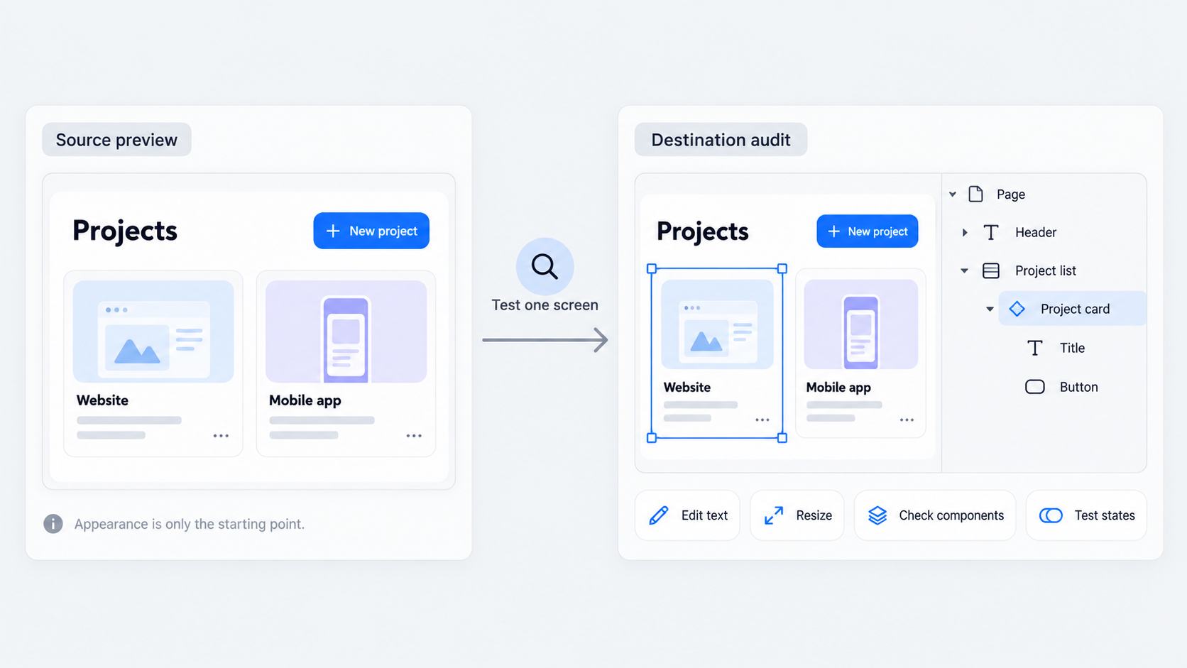 You may be able to transfer or reproduce Figma Make output in Figma Design, depending on the tools and account options currently available. However, visual similarity does not guarantee a clean, native Figma Design file.
Figma describes Figma Make as a way to turn designs into functional, editable code. Its published materials do not establish that the reverse workflow converts generated code and behavior into equivalent native Design objects.
A transfer can produce several outcomes:
- Visual reference: A screenshot or rendered screen guides reconstruction.
- Editable objects: Some text, vectors, images, or frames remain selectable.
- Native reconstruction: The interface is rebuilt with intentional frames, Auto Layout, components, and variables.
- Production-ready design: The file follows the design system, resizes predictably, supports required states, and is ready for handoff.
We do not consider “editable” sufficient. A team-ready file also needs clear hierarchy, useful naming, responsive behavior, token bindings, approved components, and a structure other designers can safely revise.
What counts as a successful conversion?
We consider a conversion successful when:
- Text remains editable and wraps correctly.
- Layout responds predictably to new content and frame sizes.
- Approved components and variables replace arbitrary values.
- Repeated elements use reusable components.
- Designers can add states without rebuilding the screen.
- Developers can understand the intended behavior.
The same standard applies to any AI-to-Figma conversion workflow. Destination structure matters as much as visual fidelity.
Visual fidelity versus maintainability
A screen can look accurate while hiding flattened layers, excessive wrappers, absolute positioning, or disconnected duplicates. These weaknesses surface when someone changes copy, resizes a frame, or adds a state.
We judge conversion quality by revision speed, consistency, and handoff clarity. A visually accurate transfer that breaks during routine edits is not production-ready.
How to move Figma Make to Figma Design
The available sources explain how Figma Make creates functional experiences from designs, but they do not verify a universal reverse-conversion command for clean native layers. Test any copy, import, or export method in the current product before relying on it.
Our verification-first workflow is simple:
- Inspect and reduce the source.
- Test the available transfer command.
- Place the result on a sandbox page.
- Audit the structure before cleaning it.
Confirm permissions, account restrictions, selection behavior, destination file type, and the actual result. Do not assume generated code or application logic will become native design objects.
Step 1: inspect the source before transferring
Identify approved screens, responsive versions, states, assets, and interactions. Record the typography, spacing, color, hierarchy, and behavior that must survive.
Remove rejected experiments and unnecessary generated variations. A smaller approved set is easier to audit and less likely to introduce prototype debt.
Step 2: test the current copy, import, or export path
Use only commands visible and reproducible in the current interface. Older announcements and tutorials may describe creation workflows without confirming reverse conversion.
Choose a representative screen with text, images, icons, repeated elements, and a responsive container. Check whether the result contains native objects or a flattened visual.
Step 3: paste or place the result in a sandbox page
Keep transferred content away from production pages and shared libraries. Compare source and destination at matching viewport dimensions.
Duplicate the untouched result before making repairs. This baseline shows what transferred successfully and what required reconstruction.
Step 4: audit before committing to cleanup
Test copy changes, resizing, component replacement, and state creation before promising a clean handoff.
Compare the effort required for cleanup with the effort required for reconstruction. A fresh build can be more reliable than repairing a complicated, fragile layer tree.
What actually transfers—and what may not
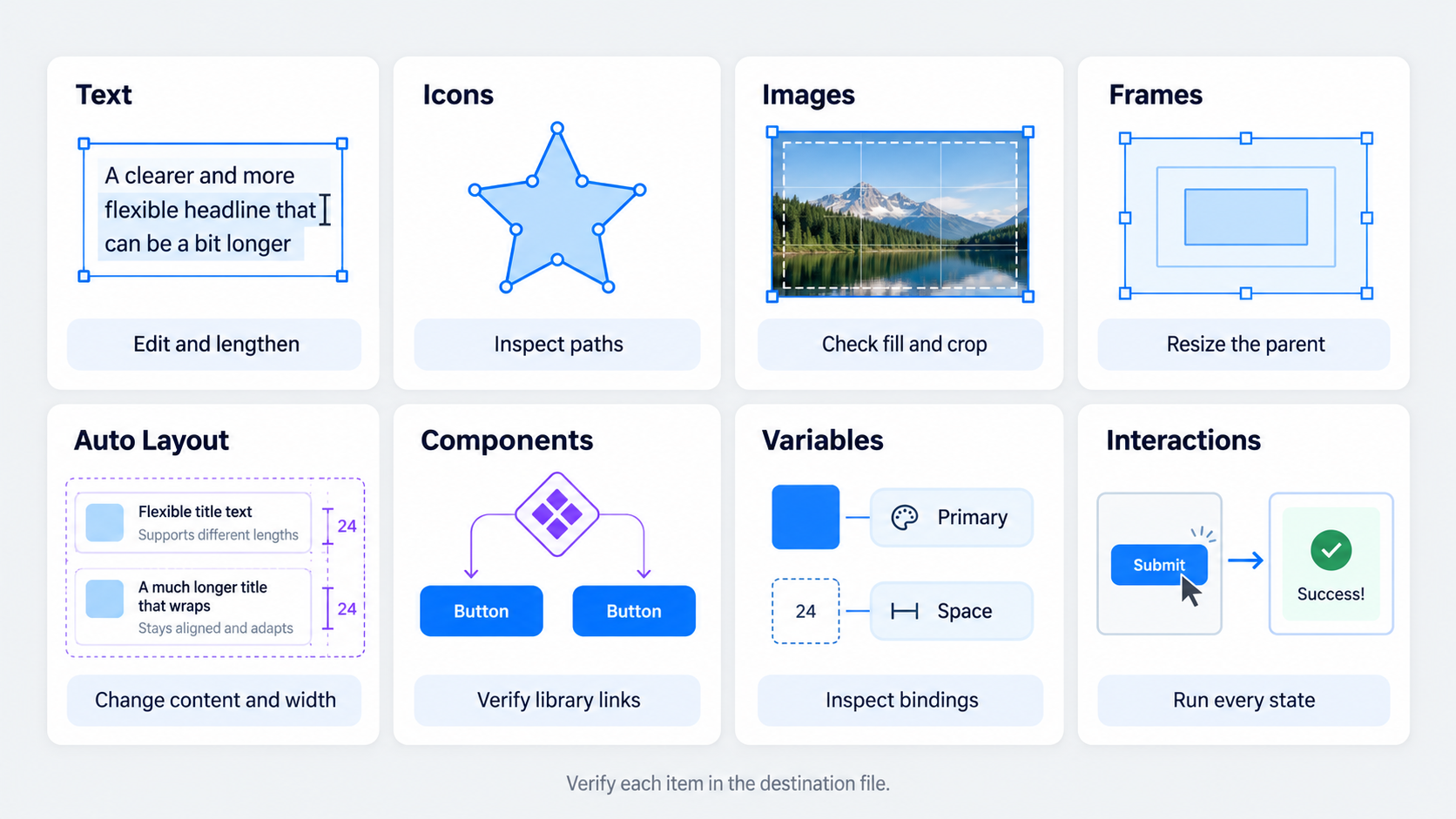 Preserved appearance is not preserved design semantics. We verify each element in the current product and account configuration.
| Item | Test | Possible issue | Fix |
|---|---|---|---|
| Text | Edit and lengthen copy | Flattening or broken wrapping | Recreate and apply text styles |
| Icons | Resize and edit paths | Rasterization or distortion | Use approved icon assets |
| Images | Inspect fill and crop | Flattened composition | Reapply the source asset |
| Frames | Resize parent frames | Weak hierarchy | Rebuild frame structure |
| Auto Layout | Change content and width | Overlap or fixed positioning | Reconstruct Auto Layout |
| Components | Inspect library links | Detached duplicates | Replace with instances |
| Variables | Inspect bindings | Hard-coded values | Map approved variables |
| Interactions | Run each state | Missing behavior | Reconnect and document |
Content and visual assets
Check text editability, fonts, wrapping, vectors, masks, images, gradients, effects, and icons. Assets should remain separately selectable. A visible image is not necessarily a reusable image fill.
Layout structure and responsive behavior
Inspect hierarchy, constraints, padding, alignment, clipping, absolute positioning, and Auto Layout. Resize parent frames and test longer labels. One accurate viewport does not prove responsive behavior.
Components, variants, and variables
Repeated UI can resemble a component while remaining disconnected. Check library links, variant properties, naming, modes, and variable bindings.
Strong Figma design system examples demonstrate why reusable semantics and token alignment matter more than surface resemblance.
Interactions, states, and logic
Test prototype connections, overlays, transitions, forms, and navigation separately. Document validation, permissions, data handling, and application logic outside the visual file when necessary.
Copy or rebuild? Use this decision matrix
We assess visual complexity, structural complexity, state count, responsive requirements, design-system dependence, and expected revision volume.
Copy and clean when the structure is simple and inspectable. Rebuild when the design depends on reusable patterns, multiple states, breakpoints, or strict system standards.
Copy and clean when
Choose this route when text and assets remain editable, resizing works, the screen has few states, and repeated elements are easy to replace.
Rebuild when
Rebuild flattened or deeply nested files, layouts dominated by arbitrary positioning, and screens that require synchronized states, enterprise libraries, or frequent revisions.
Use a hybrid approach when
Retain reliable copy and assets while replacing fragile structure. We often recommend this approach when some sections map cleanly to approved components but custom sections need reconstruction.
Clean transferred layers into a production-ready file
We clean in this order: hierarchy, layout behavior, variables, components, naming, visual details, then interactions. Structural problems should be fixed before shadows or pixel-level alignment.
Restore hierarchy and naming
Use meaningful names for pages, sections, frames, and layers. Remove redundant wrappers and separate navigation, content, overlays, and reusable patterns.
Rebuild with Auto Layout
Reconstruct repeated rows, cards, controls, and sections with deliberate padding, gaps, alignment, wrapping, fill, and hug settings. Test longer labels, missing data, localization, and narrower frames.
Replace arbitrary values with variables and styles
Map color, spacing, radii, typography, and elevation to approved tokens. Flag values with no approved equivalent rather than silently expanding the system.
Our guide to AI interfaces that are actually shippable explains why generated output must meet real product constraints.
Swap generated elements for approved components
Replace buttons, inputs, navigation, cards, and icons with library instances. Map visual states to existing variants. Review any proposed new component with the design-system owner.
Three transfer scenarios: from simple screen to complex flow
These examples show how our decision changes with structural complexity.
Simple marketing card: transfer and clean
Retain editable copy and assets, then rebuild a clear Auto Layout hierarchy. Apply tokens, replace the button with an approved component, and test longer copy.
Responsive dashboard: preserve the concept, rebuild the structure
Use the generated dashboard as a specification. Reconstruct its grid, navigation, cards, data modules, and responsive behavior. Test long labels, empty states, dense data, and smaller viewports.
Multi-state checkout: reconstruct the component model
Transfer only approved states. Rebuild fields, buttons, summaries, and progress indicators as controlled component variants. Keep validation, payment logic, dependencies, and recovery behavior in separate documentation.
Preserve intent without importing prototype debt
A maintained file should contain approved screens and states, not every generated experiment. We archive rejected concepts separately and document triggers, conditions, transitions, dependencies, and edge cases.
Clone-and-customize checklist
Preserve information hierarchy, spacing rhythm, typography intent, approved assets, essential states, and accessibility requirements. Replace temporary content without erasing the interaction concept.
Interaction documentation checklist
Document entry points, state changes, success and failure paths, recovery behavior, data dependencies, and differences between Figma Make behavior and the Figma Design prototype.
Handoff readiness check
Confirm library connections, variables, resizing, state coverage, annotations, and permissions. Ask another designer to revise copy and layout without guidance. Any confusion signals a maintainability problem.
Common Figma Make-to-Design mistakes
Most failures begin with the assumption that matching appearance proves matching structure.
Tracing screenshots as if they preserve structure
Screenshots contain pixels, not components, variables, responsive rules, or behavior. Use them as references and reconstruct the design model independently.
Assuming generated code maps directly to native layers
Code and design-tool structures serve different purposes. Inspect text, hierarchy, Auto Layout, variables, components, and resizing instead of inferring layer quality from editable code.
Polishing visuals before fixing structure
A polished screen can still break after a copy or viewport change. Repair hierarchy and resizing first, then apply tokens and visual refinements.
Copying every generated variation
Moving every experiment into the maintained file creates duplicate states and contradictory patterns. Transfer only reviewed, approved work.
Where UXMagic fits in the workflow
UXMagic supports controlled recreation when manual rebuilding would slow the team down. We use the audited screen as a specification, generate a cleaner direction, and align the result with approved components and variables.
This follows our approach to an AI design assistant for shippable UI: generated visuals remain subject to structural review.
Use UXMagic for controlled recreation
Before using an AI UI generator, define the viewport, hierarchy, components, required states, and responsive expectations. Then audit the generated result as rigorously as transferred or manually reconstructed work.
Teams can also review the features an AI-powered UI design platform needs, including output control, collaboration, consistency, and revision quality.
Verify integration claims before publication
Test current import, export, file-format, and Figma-related capabilities. Confirm availability, ownership rules, asset handling, and resulting layer structure. We do not claim direct import or one-click conversion unless we can reproduce it.
Turn the specification into a maintainable design
Use UXMagic to recreate your approved Figma Make direction, then validate the result against your components, variables, responsive rules, and handoff standards.