
TL;DR
An app design system is more than a polished Figma library. It is a maintained contract connecting mobile components, platform behavior, accessibility, content, app states, and production code. We recommend standardizing product meaning and brand expression across iOS and Android without forcing identical interfaces where native conventions work better.
What is an app design system?
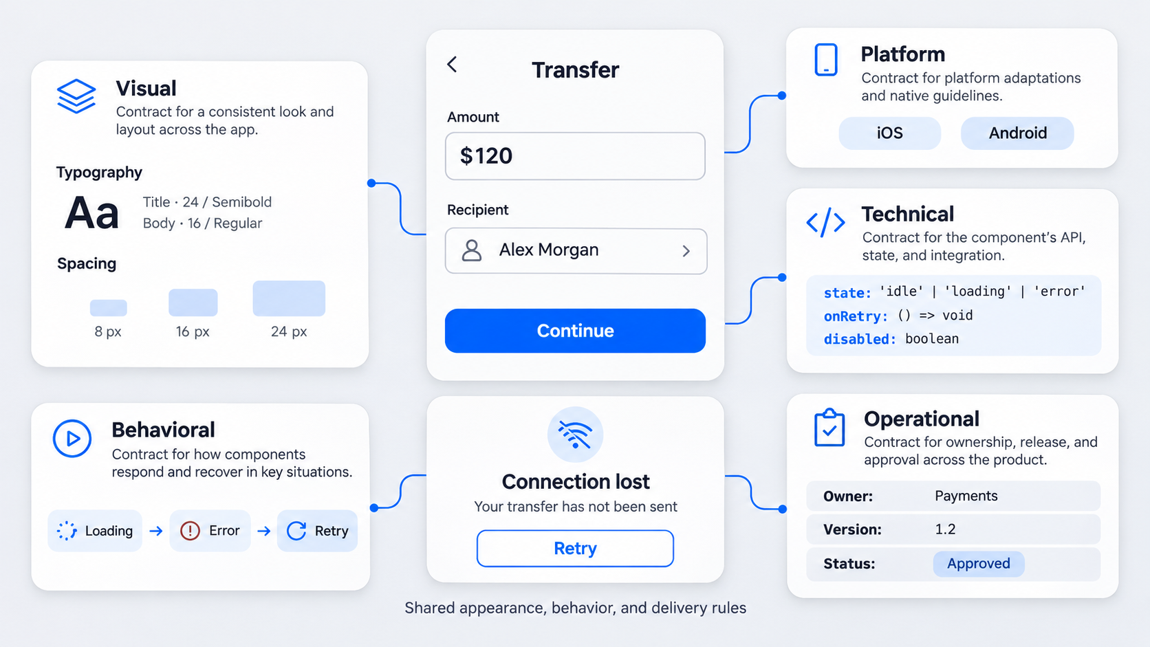 An app design system is a shared source of truth for designing and building mobile experiences. It connects foundations, components, content, accessibility, native behavior, app states, documentation, and code across iOS and Android.
The goal is consistent product meaning, not pixel-perfect parity. A primary action can retain the same role and brand hierarchy while using platform-appropriate placement, feedback, typography, and accessibility APIs.
A system that covers only the happy path is incomplete. Consistency often breaks during loading, keyboard interactions, permissions, offline use, accessibility settings, and other exceptions.
App design system vs UI kit, style guide, and component library
A UI kit supplies design assets. A style guide defines visual and editorial rules. A component library provides reusable design or code elements.
A complete design system explains why, when, and how to use those assets. It also defines behavior, supported states, accessibility requirements, code mappings, ownership, and governance.
Figma can hold system assets, but a file cannot govern runtime transitions, screen-reader output, keyboard handling, or implementation quality by itself. When reviewing Figma design system examples, we look beyond visual organization to see whether each library supports real product decisions.
When does a product team need one?
Common warning signs include:
- iOS and Android drifting from approved designs
- Several variants serving the same purpose
- Repeated questions during engineering handoff
- Missing loading, empty, error, offline, or permission states
- Inconsistent navigation, keyboard, or native-control behavior
- Figma properties that do not map to code
Small teams do not need to document everything at once. We recommend starting with frequently used components and critical flows, implementing them, and expanding from proven needs.
The anatomy of a production-ready app design system
We organize a production-ready system into five connected layers:
- Foundations and design tokens
- Components
- Product patterns and flows
- States and transitions
- Implementation guidance
Together, these layers define what an element means, how it behaves, where it belongs, and whether it can be implemented reliably.
Foundations and mobile design tokens
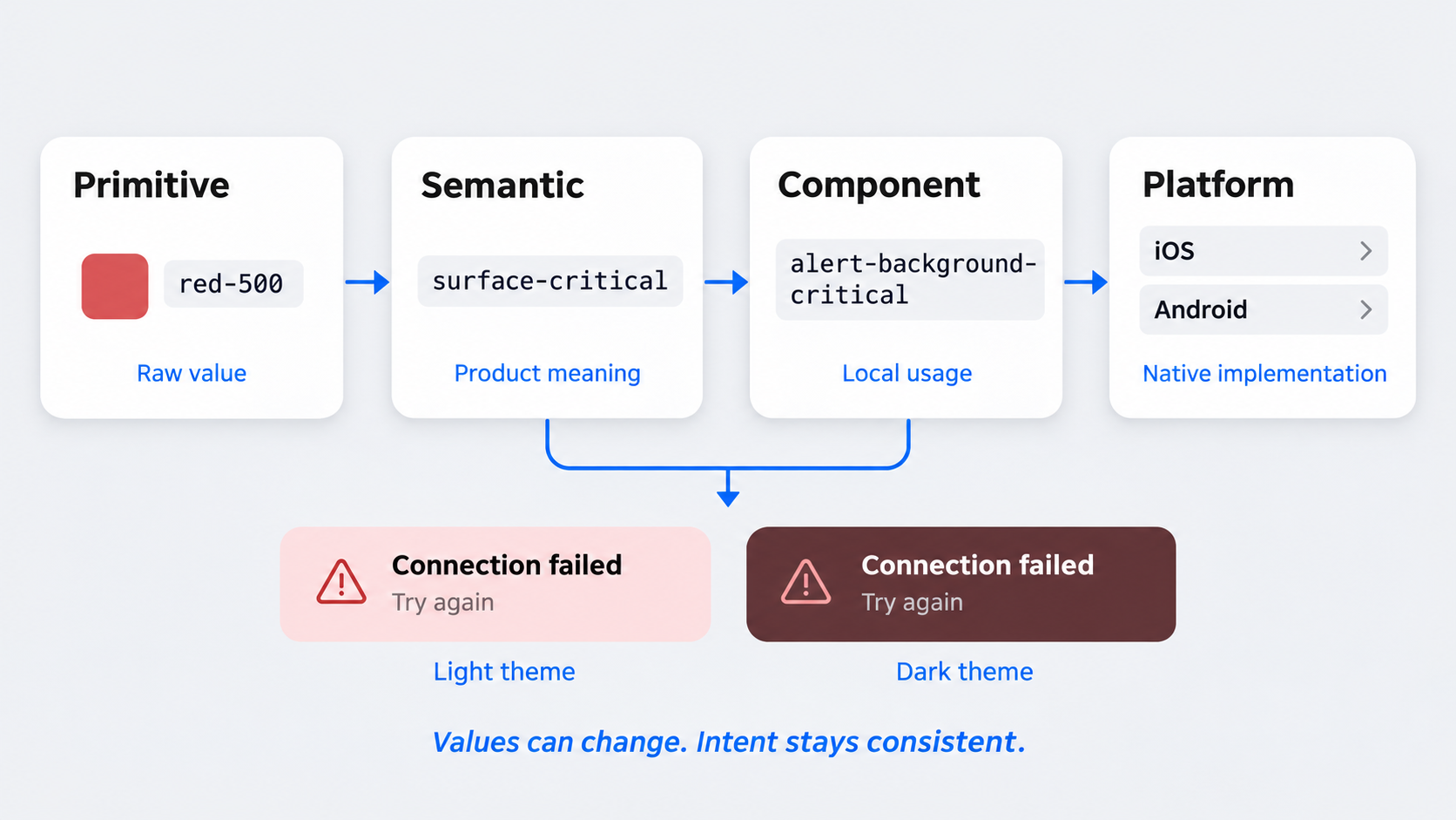
Foundations cover semantic color, typography, spacing, shape, elevation, motion, themes, and density. Tokens turn those decisions into reusable names that can connect design tools with iOS and Android code.
Mobile tokens should account for:
- Light and dark themes
- Text scaling
- Safe-area spacing
- Touch-target requirements
- Reduced-motion preferences
- Platform-specific typography
- Device and layout adaptations
We prefer semantic aliases such as surface-critical or text-secondary over literal names such as red-500. Semantic naming lets each platform use suitable values while preserving shared intent.
Components, patterns, and flows
A button is a component. Authentication, search, checkout, onboarding, and permission recovery are product patterns combining components, content, behavior, and state transitions.
Rigid atomic layers are not always the clearest structure for mobile products. Organizing around behavior and product patterns helps teams answer practical questions: How does this flow recover? What happens after an interruption? Which navigation container owns it?
During early exploration, a mobile wireframe flow system can model complete journeys before every screen becomes a reusable component.
States and implementation guidance
Each component specification should cover:
- Anatomy and slots
- Variants and properties
- Supported states and transitions
- Interaction and content rules
- Accessibility requirements
- Design-to-code mapping
Implementation notes belong in the contract. If a field requires a specific keyboard, validation timing, autofill value, and screen-reader announcement, those requirements should sit beside its visual specification.
Audit the existing app before building the system
We audit production code and design files together. Screenshots reveal visual duplication but can hide gesture handling, validation logic, analytics, accessibility support, and platform-specific behavior.
 Items should be grouped by semantic purpose rather than appearance. Similar-looking controls may perform different jobs, while visually different controls may represent the same action. External examples can offer useful references, but they cannot expose a product’s actual constraints.
Create a mobile component inventory
For each component, record:
- Name and semantic purpose
- Product location and owner
- iOS, Android, or shared status
- Supported and missing states
- Accessibility support
- Production-code counterpart
Flag duplicates, one-off patterns, platform mismatches, inaccessible implementations, and unsupported Figma configurations. The inventory should expose risk rather than merely count assets.
Prioritize by reach, risk, and reuse
Start with navigation, actions, inputs, feedback, overlays, and important flows. We prioritize components with broad adoption, costly inconsistencies, or significant accessibility and safety implications.
A payment confirmation usually deserves attention before a decorative card. Likewise, a widely reused form field may create more value than several low-use components.
Define the minimum viable system
Select foundations, components, and patterns that teams can implement and govern immediately. Define owners, states, code mappings, and release expectations from the start.
Avoid a speculative library packed with untested combinations. Validate APIs and patterns through real product work before scaling them.
Decide what stays shared and what stays platform-native
A cross-platform system should not force identical UI. We standardize product meaning, brand decisions, content rules, data structures, and business logic, then adapt interactions where operating-system conventions affect usability.
We use four categories:
- Shared: The same semantics and substantially similar behavior
- Branded: Product-specific expression across platforms
- Platform-adapted: Shared identity with documented behavioral differences
- Native: Operating-system-owned controls and experiences
Use shared components for stable product semantics
Shared components work when product meaning remains stable. Teams can reuse semantic roles, token names, validation language, content hierarchy, analytics events, and business rules.
A status indicator, for example, can represent success consistently across platforms even when its typography or animation differs.
Adapt components when behavior differs by platform
Document differences in back behavior, navigation placement, gestures, sheets, menus, feedback, keyboards, and safe-area spacing.
Bottom navigation can retain shared destinations and analytics while adapting labels, icons, spacing, and back behavior. Keep one component identity, with explicit iOS and Android implementations.
Keep operating-system interactions native when conventions matter
System permissions, authentication prompts, sharing, and pickers should usually remain native. A permission flow may use a branded explanation before opening the operating system’s dialog.
Apple and Material conventions are constraints, not substitutes for a product system. The product still needs its own semantics, state logic, content standards, and governance.
Specify every component as a design-to-code contract
A repeatable specification replaces screenshots and scattered messages with a stable contract. It maps design properties to code APIs, documents platform differences, and blocks unsupported combinations.
More variants do not necessarily show maturity. Variant sprawl often signals unresolved product decisions.
Document anatomy, variants, and properties
Name required slots, optional elements, layout constraints, and supported configurations. Clarify which elements can coexist and which combinations are prohibited.
Use semantic properties such as intent, emphasis, state, and leadingAction. Visual names such as blue, big, or leftIcon encode the current appearance rather than lasting purpose.
Define behavior and content rules
Specify triggers, gestures, transitions, persistence, validation timing, truncation, localization, and keyboard behavior. Include correct use, misuse, and prohibited combinations.
A useful form-field contract covers labels, help text, validation, keyboard type, autofill, disabled behavior, error recovery, and screen-reader output—not just visual variants.
Map Figma components to production code
Connect every supported Figma property to a code prop, token, or platform implementation. If intent=critical exists in design, engineering should know how it maps to SwiftUI and Android code.
Clearly mark unsupported combinations. This prevents designers and AI tools from creating polished states that the approved library cannot build.
Editable output also requires structured review. Our AI-to-Figma conversion workflow shows how generated UI can become review-ready without turning into disconnected artwork.
Control variant and naming sprawl
Use one naming grammar across design and engineering. Add platform suffixes only when behavior differs, such as Sheet/iOS and Sheet/Android.
Replace rarely used combinations with focused components or documented patterns. Deprecate obsolete names with migration guidance rather than silently breaking existing work.
Build a state matrix for real-world app behavior
A component without relevant non-happy-path states is unfinished. Loading, empty, error, offline, disabled, success, permission-denied, interrupted, and stale-data conditions may all affect release readiness.
Do not treat these as isolated screenshots. Define each trigger, response, available action, transition, and recovery path.
Create the platform state matrix
For each component or flow, record:
- State and trigger
- Visible response and available action
- Persistence rules
- Accessibility announcement
- Platform differences
- Owning component or flow
Ownership matters. A button may display loading, but the surrounding payment flow should determine what happens after interrupted authentication.
Design recovery, not just failure messages
Every recoverable failure needs an action such as retry, cancel, resume, choose an alternative, or escalate. Preserve entered data and context where possible.
“Something went wrong” is not a complete state. Explain what failed, what remains saved, whether retry is safe, and what happens next.
Test interrupted and asynchronous flows
Test backgrounding, connectivity loss, session expiry, delayed responses, payment interruption, and permission changes. Also document return behavior from deep links, notifications, and the task switcher.
The contract should state whether the app resumes, refreshes, restores, or safely restarts the flow.
Define navigation, system UI, responsiveness, and accessibility
System constraints and accessibility are component inputs, not final-review tasks. Specifications should account for different screen sizes, orientations, keyboards, enlarged text, and assistive technologies.
Document navigation and deep-link behavior
Define destination hierarchy, back behavior, tab persistence, modal ownership, and invalid-link recovery. Clarify what happens when a deep link targets expired, inaccessible, or deleted content.
Platform adaptations should not create unrelated information architectures. Destinations can remain shared even when controls behave differently.
Account for system UI and device boundaries
Document status bars, safe areas, home indicators, keyboards, notches, hinges, and edge-to-edge layouts. Components need rules for system changes rather than fixed mockup coordinates.
Specify whether a container resizes, scrolls, repositions, or dismisses when the keyboard appears.
Specify responsive behavior across device classes
Define responsiveness by available space and layout capability, not particular device names. Show when navigation changes, columns appear, sheets become panels, or content density increases.
Tablets and foldable layouts may require structural adaptation rather than enlarged phone screens.
Make accessibility testable
Document touch targets, contrast, focus order, screen-reader names, text scaling, reduced motion, and focus restoration. Add acceptance criteria to each component so engineers can test a defined result rather than interpret a broad guideline.
Structure Figma, AI generation, and governance around one source of truth
Neither Figma nor code is sufficient alone. The source of truth is the reviewed contract connecting tokens, behavior, accessibility, content, platform adaptations, and implementation.
At UXMagic, we generate editable screens while giving teams a structured route for reviewing components, patterns, and platform rules.
Organize the Figma library for mobile teams
Separate foundations, shared components, platform adaptations, product patterns, and approved templates.
Publish only supported assets. Keep experiments, proposals, and deprecated work outside the production library so availability never implies approval.
Constrain AI-generated screens to the system
Give the AI UI design generator approved components, token aliases, target platforms, product patterns, required states, and accessibility rules. Unsupported ideas should enter an exception process rather than quietly becoming one-off UI.
This principle underpins generating interfaces that are actually shippable: constrain creation before polishing the output.
Version and release design with code
Use release notes, ownership, migration instructions, deprecation dates, and semantic versioning where practical. Coordinate Figma publishing with iOS and Android package availability so designers do not adopt components before engineers can implement them.
Create a contribution and exception process
Before adding a component, require evidence of need, likely reuse, platform implications, state coverage, and accessibility. Record approved exceptions with an owner, reason, scope, and review date.
Enterprise teams should also assess AI UI generator security, privacy, governance, and scalability before connecting internal libraries or product data.
Evaluate examples, software, and free starter kits without inheriting the wrong system
The best app design system is connected to the team’s platforms, codebase, behavior, accessibility requirements, and governance model. Examples and starter kits can accelerate foundations, but they cannot make product decisions.
What to learn from app design system examples
Evaluate state completeness, platform adaptation, accessibility, design-to-code links, governance, releases, and evidence of adoption. A smaller implemented system is more useful than a large gallery of disconnected components.
How to assess app design system software
Check support for tokens, Figma and code synchronization, documentation, permissions, versioning, analytics, and multiple platforms. Updates should be reviewable, releasable, migratable, and deprecable.
The UXMagic AI UI generator produces Figma-ready designs, but we still recommend validating every generated screen against the approved system.
When a free app design system is useful
Free kits can support exploration, prototypes, and baseline primitives when licensing and accessibility are clear. Before production use, align their naming, semantics, states, native behavior, tokens, accessibility, and code APIs.
Otherwise, the kit imports someone else’s assumptions.
Measure whether the app design system is working
Measure outcomes rather than component totals. We use adoption, implementation parity, exceptions, accessibility defects, and delivery performance to judge system health.
Track adoption and implementation parity
Track how often supported components appear in new work and whether shipped implementations match reviewed specifications. Review iOS, Android, Figma, and AI-generated output separately so platform-specific drift remains visible.
Monitor exceptions and system debt
Record one-off components, overrides, unsupported variants, and unresolved platform differences. Repeated exceptions may reveal a missing pattern or an API that is too rigid to adopt.
Measure delivery and quality outcomes
Compare handoff questions, implementation time, regression defects, accessibility issues, and migration effort. Use the findings to prioritize fixes rather than expanding the library by default.
A strong design system case study connects system decisions to adoption and measurable impact, not just polished components.
Describe, design & ship with system-ready UI
Generate editable mobile interfaces with UXMagic, then validate every screen against approved components, platform rules, accessibility requirements, and real-world states before shipping.