
TL;DR
A design system across multiple frameworks should not force React, Vue, and Angular to share component code. We recommend sharing design decisions, tokens, behavioral contracts, accessibility requirements, and tests while letting each framework implement them idiomatically. Build one portable specification, generate framework-ready outputs, and test user outcomes rather than internal code.
What a design system across multiple frameworks actually shares
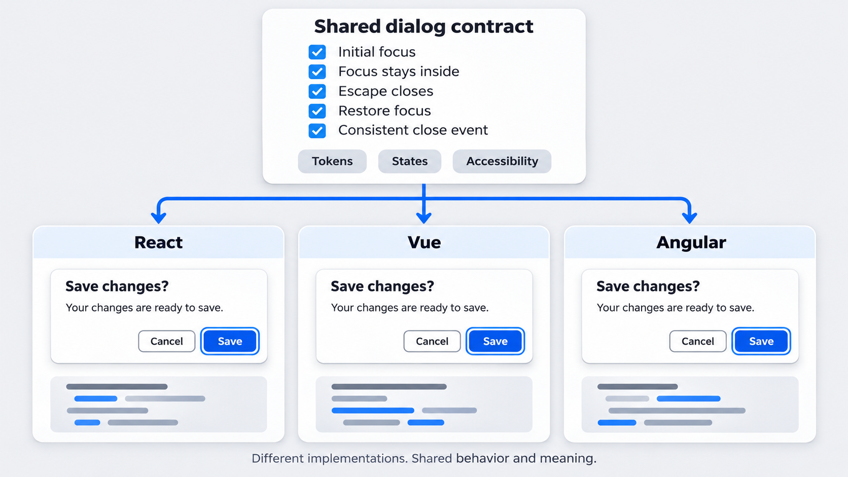 A design system across multiple frameworks shares specifications and contracts, not necessarily component source code. We aim for one source of truth for what components mean and how they behave, rather than a universal implementation stretched across incompatible ecosystems.
The system governs several connected assets:
- Component libraries deliver executable UI.
- Figma libraries support design and prototyping.
- Token packages distribute design decisions.
- Documentation explains correct usage.
Consistency requires aligned anatomy, states, behavior, accessibility, and API meaning. Matching screenshots or token names is not enough when focus treatment, validation, events, or keyboard behavior differ.
One contract does not mean one codebase
We separate required outcomes from implementation details. A dialog contract might define initial focus, focus trapping, Escape behavior, focus restoration, and close events.
React, Vue, and Angular can use different state tools, directives, DOM structures, or rendering strategies. Those differences are acceptable when the public contract and user experience remain consistent.
Define parity before choosing architecture
We prioritize parity in this order:
- Behavior
- Accessibility
- Semantics
- Visual presentation
Pixel similarity can hide meaningful fragmentation. Two buttons may look identical while handling accessible names, loading, disabled states, or events differently.
Build the system in five portable architecture layers
We organize a portable architecture into five layers:
| Layer | Source of truth | Output | Validation |
|---|---|---|---|
| Foundations | Primitive definitions | Color, type, spacing, motion | Schema and contrast checks |
| Semantic tokens | Intent-based decisions | Themed token sets | Theme validation |
| Component tokens | Component specifications | Scoped styling decisions | Story and visual tests |
| Behavior contracts | Versioned specifications | States, events, interactions | Contract and accessibility tests |
| Framework adapters | Framework repositories | Installable packages | Framework test suites |
Changes should flow through generated artifacts. Product-specific workflows should stay outside the core until they become stable, recurring patterns.
Foundations and semantic tokens
Foundations contain raw primitives such as blue-600 or space-200. Semantic tokens express intent, such as action-primary-background or surface-danger-subtle.
That separation allows values to change without changing their meaning. These Figma design system examples illustrate how foundations, components, and documentation can support one coherent system.
Component tokens and behavior contracts
Component tokens cover local decisions such as button backgrounds, dialog padding, and input error borders. Behavior contracts define anatomy, states, interactions, events, accessibility rules, and edge cases.
We treat these contracts as versioned assets. Teams may use interactive prototypes to define behavior, states, and transitions, but approved outcomes must also appear in testable documentation.
Framework adapters
Adapters translate shared contracts into idiomatic APIs. React may use callbacks and children, Vue may use emits and slots, and Angular may use outputs and content projection.
We document intentional differences. Undocumented differences are drift.
Create a token pipeline that changes every framework once
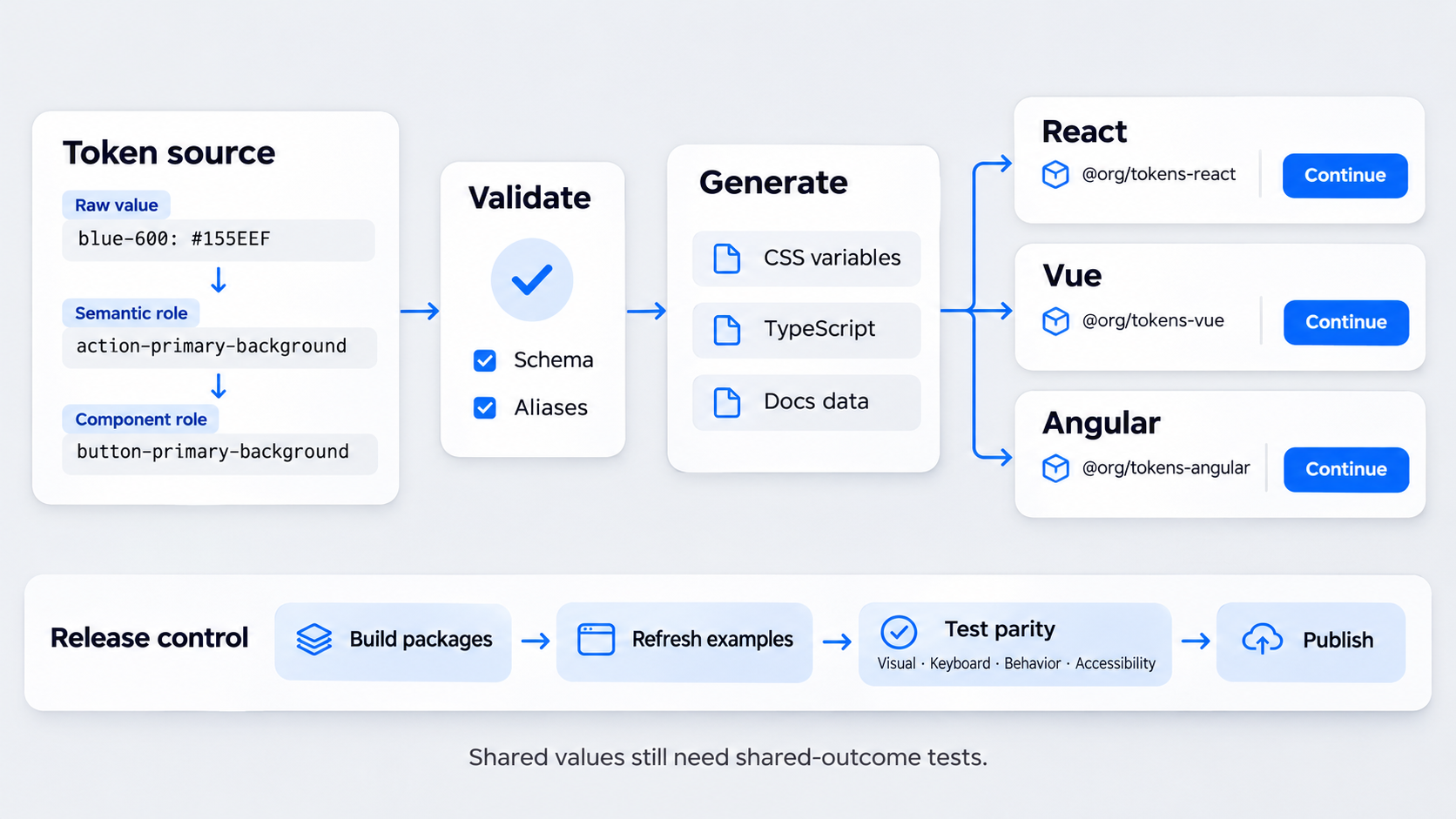 We recommend starting with platform-neutral JSON validated against a schema:
{
  "color": {
    "blue-600": { "value": "#155EEF", "type": "color" }
  },
  "action": {
    "primary": {
      "background": {
        "value": "{color.blue-600}",
        "type": "color"
      }
    }
  }
}
The pipeline can generate CSS custom properties, TypeScript constants, documentation data, and other platform outputs. Every framework then consumes the same generated values.
Shared values do not guarantee shared rendering. Cascade, inheritance, typography, browser defaults, and state logic can still create differences.
A practical token hierarchy
We use four levels:
- Primitive:
blue-600 - Semantic:
action-primary-background - Component:
button-primary-background - Product theme: optional brand or product overrides
Names should describe intent rather than leak framework details into the portable layer.
The change-propagation workflow
For a primary-color change, we recommend:
- Update and validate the token source.
- Generate framework-ready outputs.
- Build each component package.
- Refresh documentation examples.
- Run visual, interaction, keyboard, and accessibility tests.
- Publish compatible releases.
CI should reject stale or manually edited generated files.
Define canonical component anatomy and API contracts
We specify anatomy before implementation. Each contract covers content, inputs, events, states, keyboard behavior, validation, errors, and accessibility.
The goal is consistent meaning, not identical syntax. A loading state should produce the same outcome in every framework even when its declaration differs.
What every component specification should contain
Our specifications include:
- Purpose and prohibited uses
- Anatomy and content rules
- Variants, sizes, and states
- Interaction and keyboard models
- Accessibility criteria
- Token dependencies
- Event semantics
- Edge cases
- Testable acceptance criteria
This makes reviews about declared outcomes rather than personal preferences.
Equivalent APIs, not copied APIs
Canonical concepts such as pressed, loading, and invalid should remain recognizable across documentation. Their syntax can follow each framework:
- React: props, callbacks, and children
- Vue: props, emits, and slots
- Angular: inputs, outputs, and content projection
Framework-native conventions usually support adoption better than copied React syntax.
Choose native components, Web Components, wrappers, or a headless core
No delivery model fits every component. We evaluate accessibility control, server-side rendering, hydration, theming, forms, content projection, framework ergonomics, and maintenance.
| Model | Strongest fit | Main trade-off |
|---|---|---|
| Native implementations | Forms and deep framework integration | More implementations to govern |
| Web Components | Self-contained, presentational UI | Integration and rendering constraints |
| Framework wrappers | Idiomatic APIs over shared runtime code | Another maintenance layer |
| Headless primitives | Shared behavior with custom rendering | Unclear ownership risk |
| Governed duplication | Maximum native control | Demands rigorous shared tests |
Native framework implementations
Native components suit cases where forms, rendering, or ecosystem integration matter most. The cost is stronger governance: shared tests, coordinated deprecations, and compatibility rules become essential.
Web Components and framework wrappers
Web Components can extend runtime reach, while wrappers expose familiar framework APIs. Before adopting them, we test events, forms, accessibility, styling, content projection, server rendering, hydration, and maintenance requirements.
Headless primitives
Headless primitives can share interaction concepts while preserving framework-native rendering. They work well for overlays, selection models, and composite widgets, provided ownership and contracts remain explicit.
Example: one button contract in React, Vue, and Angular
A button contract connects tokens, anatomy, states, accessibility, implementation, and testing. It can define variants, sizes, icon arrangements, and states such as focus-visible, disabled, and loading.
The shared button specification
The anatomy includes a button control, optional icon, visible label, and loading indicator. Icon-only buttons require an accessible name.
Loading should prevent repeated activation and preserve an understandable label. Disabled behavior must remain consistent and cannot rely on styling alone.
Framework-specific API mappings
Equivalent APIs might look like this:
<Button variant="primary" loading={saving} onPress={save}>
  Save changes
</Button>
<AppButton variant="primary" :loading="saving" @press="save">
Save changes
</AppButton><app-button variant="primary" [loading]="saving" (pressed)="save()">
Save changes
</app-button>The syntax differs, but each API communicates the same event and state.
What the implementations may do differently
Implementations may use native state tools, directives, dependency injection, rendering optimizations, or different private DOM structures.
They should not disagree on accessible names, focus behavior, state semantics, event outcomes, or token intent.
Test outcomes across frameworks—not identical internals
We recommend generating a shared test manifest from each contract and running it against every package. Testing should cover tokens, visuals, interactions, keyboard behavior, accessibility, and public APIs.
Visual and token regression
Canonical component stories should isolate each relevant variant, state, theme, or density. These tests can reveal missing tokens, fallback values, typography changes, and incorrect state styling.
Behavior, accessibility, and contract tests
Tests should verify events, focus movement, keyboard commands, disabled behavior, validation, and recovery. Dialog tests, for example, should cover initial focus, trapping, Escape behavior, close events, and focus restoration.
CI gates that prevent fragmentation
We block releases when required contract tests fail in a supported framework. Any exception needs a reason, owner, scope, and expiration date; otherwise, temporary divergence becomes permanent.
Version, document, and govern each layer independently
Tokens, specifications, and framework packages should have independent versions connected by a compatibility matrix. We define breaking changes by user impact, not only by changed code signatures.
Release and compatibility rules
Each package should declare its supported token and specification ranges. Coordinated releases do not require identical package version numbers.
Clear deprecation periods, migration guidance, and codemods can reduce upgrade friction.
Documentation as a parity tool
We prefer shared guidance followed by framework-specific examples. Readers first see one purpose, anatomy, behavior model, and accessibility standard, then the relevant syntax.
An AI-to-Figma workflow can support editable exploration, but approved components and token mappings must remain visible.
Ownership that scales
A central team can own system contracts while framework maintainers own implementation quality. We assign explicit responsibility for tokens, accessibility, adapters, releases, and drift remediation.
Map AI-generated UI to approved system constraints
AI-generated screens can speed up exploration, but they do not replace system contracts. Before production, generated colors, spacing, typography, states, and components should resolve to approved tokens and anatomy.
Our guide to generating AI UI that is actually shippable explains why editable output and system alignment matter more than a polished screenshot.
Constrain generation without limiting exploration
We provide generation tools with approved tokens, components, variants, content rules, and prohibited patterns. Teams can still explore new layouts without quietly introducing arbitrary primitives.
A describe, design & ship workflow
Our recommended workflow is:
- Describe the product goal, users, framework, and target state.
- Generate candidate screens with an AI UI generator.
- Map the design to approved tokens and contracts.
- Resolve unsupported UI before handoff.
- Deliver through the relevant framework adapter.
- Run visual, interaction, accessibility, and contract tests.
Build once at the contract level
Use UXMagic to describe an interface, generate editable designs, and align promising concepts with the tokens and components our teams trust. Start with one governed contract, then ship through React, Vue, and Angular adapters.