
TL;DR
Most large organizations do not have one unified system. They have a central library surrounded by unofficial copies, detached components, hard-coded values, and products running different versions.
Strong enterprise design systems address this fragmentation through governed foundations, controlled extensions, reliable migrations, and measurable outcomes. The goal is not to make every interface identical. It is to create predictable, accessible experiences across teams, brands, repositories, products, and platforms.
What is an enterprise design system?
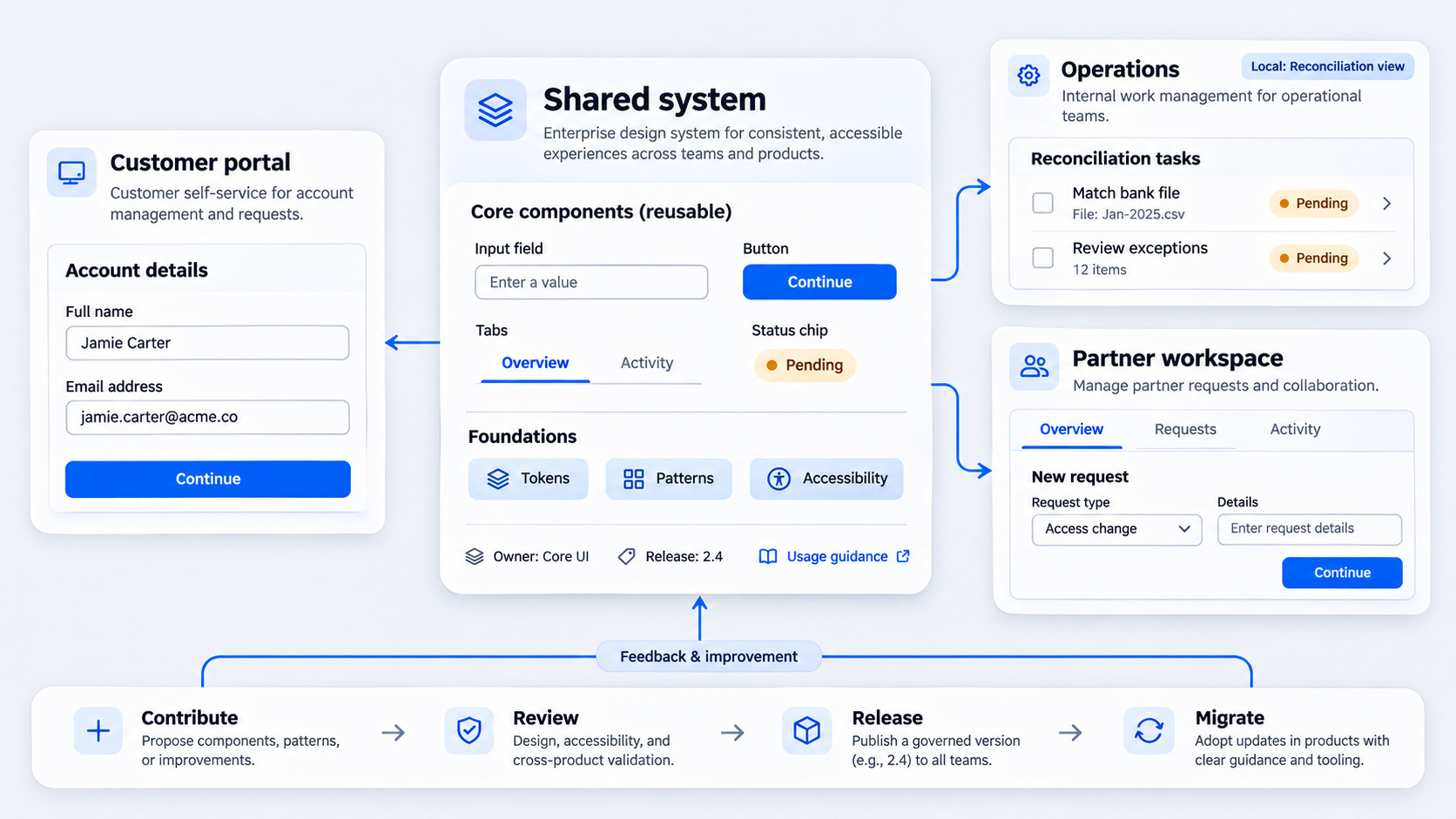 An enterprise design system is a governed collection of design decisions, tokens, components, patterns, documentation, tools, and contribution processes used across multiple teams. It connects reusable UX guidance with production code and clear organizational ownership.
Design system UX covers the shared interaction rules that shape an experience, not just a component library’s appearance. A style guide documents presentation, a UI kit supplies design assets, and a code library provides implementations. An enterprise system coordinates all three.
Salesforce describes design systems as a way to avoid rebuilding familiar UI while improving consistency. At enterprise scale, we extend that principle: shared foundations must allow controlled variation rather than enforce universal sameness.
Enterprise system vs. team-level component library
A team library often serves one product, platform, or release cadence. Ownership may be informal, and success usually means helping that team ship efficiently.
An enterprise system supports multiple products and platforms through explicit governance, versioning, contribution rules, accessibility requirements, and migration support. Copying components into individual products may seem faster, but each copy becomes another implementation to patch, document, and replace.
Teams assessing library quality can review these Figma design system examples for approaches to documentation, composition, token use, and maintenance.
What belongs in the system?
Shared components should address recurring, stable needs and have named owners. Buttons, forms, navigation patterns, feedback states, typography, and semantic color roles are common candidates.
Specialized workflows should remain local until wider demand justifies promotion. A finance reconciliation table should not enter the core simply because one team built it well. It needs evidence of reuse, a stable API, and a long-term maintainer.
Why universal consistency fails in enterprise design systems
The best enterprise design system strategy does not make every interface pixel-identical. Different users, workflows, devices, brands, and regulatory contexts can require meaningful variation.
Web, iOS, and Android products may share terminology, states, accessibility standards, and interaction intent while using platform-appropriate controls. Consistency should create predictable behavior and shared design intent, not forced visual duplication.
Intentional variation has constraints, documentation, owners, and review criteria. Accidental drift produces unexplained overrides, detached components, duplicated code, and unclear accountability.
Shared foundations, governed extensions
We recommend centralizing foundational decisions such as:
- Semantic color roles
- Typography and spacing scales
- Focus and interaction states
- Accessibility requirements
- Validation and feedback behavior
Product teams can extend these foundations through documented APIs, composition patterns, and approved variants. When a shared component cannot support a valid requirement, extending it is usually safer than detaching it.
When a component should stay product-specific
Keep a component local when its data model, workflow, or compliance context is unique. Logistics and finance tables might share sorting, selection, density, and accessibility foundations while retaining domain-specific columns and actions.
Review local patterns when several teams request them, duplication increases, or maintenance becomes difficult. A proven pattern can then become a governed extension or core component without overloading a universal component too early.
Build a token architecture teams can trust
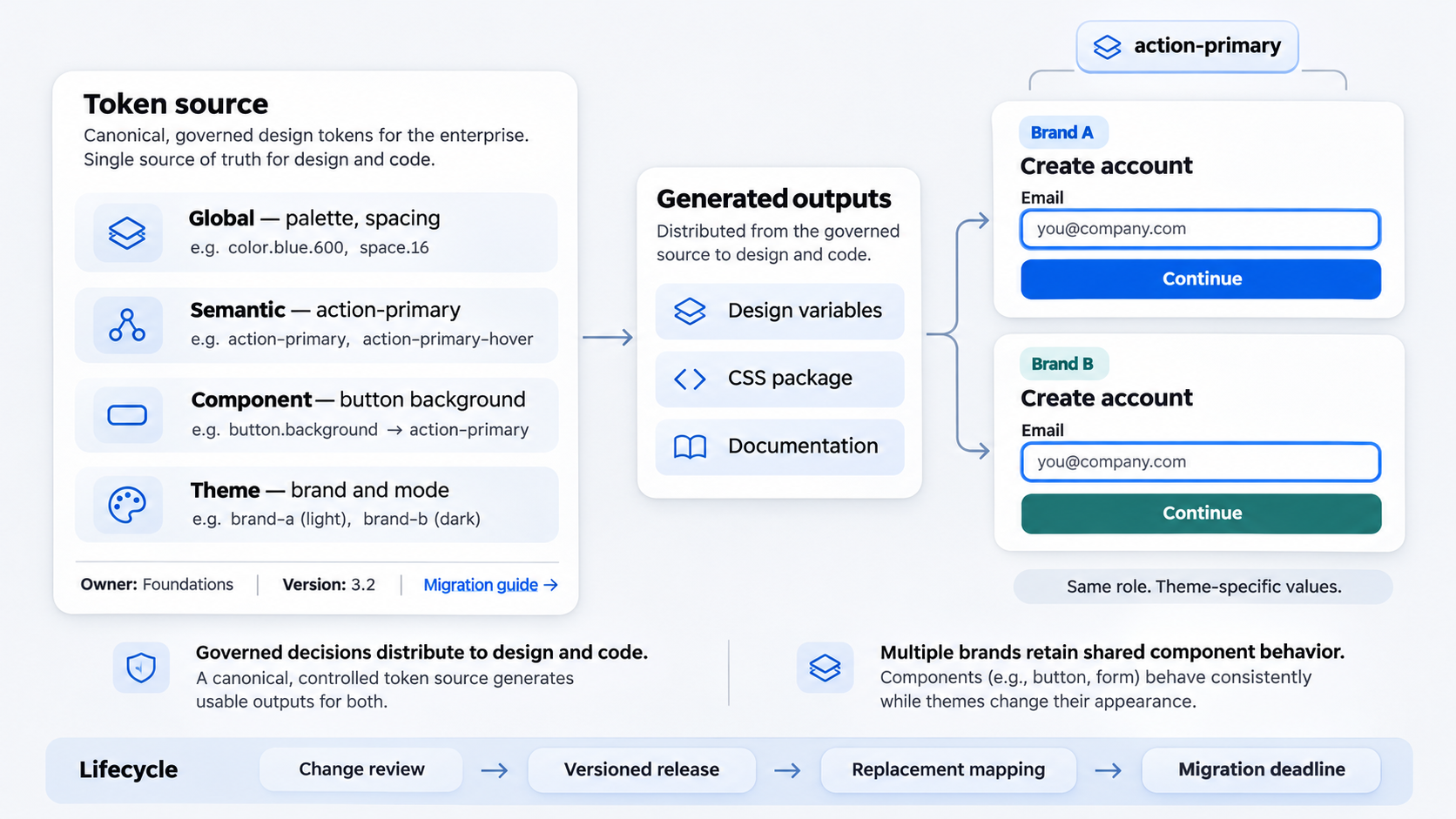 Enterprise design system tokens are governed product decisions, not convenient variables. Each token needs a purpose, owner, supported outputs, version history, and migration policy.
A canonical token source should feed design tools, code repositories, documentation, and platform-specific formats. Without one, teams cannot tell whether a design file, CSS package, native implementation, or documentation site is authoritative.
Global, semantic, component, and theme layers
A resilient architecture separates token responsibilities:
- Global tokens: Raw primitives such as palette values and spacing scales
- Semantic tokens: Roles such as
action-primaryortext-danger - Component tokens: Decisions scoped to buttons, inputs, or navigation
- Theme tokens: Brand, product, mode, or platform mappings
Interfaces should consume semantic intent rather than raw values. action-primary can evolve across themes; a local hex value hard-codes one appearance.
Naming, ownership, versioning, and deprecation
Name tokens by role, not appearance. color-action-primary remains useful after a rebrand, while blue-500-button exposes an implementation detail.
Assign an owner to each token group and document consequential decisions. Breaking changes require release notes, replacement mappings, deprecation periods, and clear deadlines.
A multi-brand token example
One semantic action-primary token can map to different brand colors while retaining requirements for contrast, focus visibility, disabled treatment, and interaction states. Products gain distinct brand expression without rewriting component logic.
A checkout built with local colors and arbitrary spacing cannot inherit those changes. It becomes visually stale and may preserve states that no longer meet current accessibility guidance.
Choose governance that does not become a bottleneck
Design system governance defines who decides, contributes, releases, and maintains. The right model depends on organizational structure, compliance needs, team maturity, and release practices.
Strict central approval can encourage drift. When a small system team delays delivery, product teams may detach components or create local alternatives, reducing visibility and control.
Centralized, federated, or hybrid?
A centralized model suits organizations where compliance and foundation consistency dominate. A federated model distributes ownership to teams with relevant domain expertise and maintenance capacity.
For larger organizations, we generally recommend a hybrid model. The central team owns standards, tokens, release infrastructure, and core components. Product teams own governed extensions and contribute patterns backed by evidence.
Create a contribution path designers and engineers will use
A practical contribution process covers:
- Proposal and evidence of demand
- Design, accessibility, and API review
- Implementation and testing
- Documentation and release
- Named ongoing maintenance
Small fixes need a fast path. New patterns and breaking changes need more scrutiny, but they should not disappear into an indefinite approval queue.
Set boundaries for core components and extensions
Assess candidates by reuse, product specificity, maintenance burden, API stability, and cross-platform relevance. Broad, recurring needs may belong in the core; narrow workflows are often better as supported extensions.
Every approved extension needs an owner. Otherwise, governed variation becomes orphaned debt with an official label.
Keep design and code aligned across platforms
Implementation depends on canonical sources, automated delivery, and disciplined releases. A polished design library is unreliable when production repositories contain older behavior.
Cross-platform parity should align purpose, terminology, states, and accessibility. It should not force web and native platforms to behave identically when established conventions provide better usability.
Connect design files, repositories, and documentation
Assign an authoritative source for every token and component, then automate synchronization where practical. Teams should be able to find design status, code status, supported platforms, owners, versions, and known limitations in one place.
Documentation is part of a release. Treating it as later cleanup allows guidance and implementation to diverge.
Publish releases teams can safely consume
Use semantic versioning, release notes, regression testing, usage guidance, and explicit breaking-change notices. Each release should explain:
- What was added, changed, deprecated, or removed
- Which products and platforms are affected
- What migration work is required
- When compatibility or enforcement changes take effect
A changelog should support decisions, not merely report modified files.
Embed accessibility in the system
Build contrast, focus treatment, keyboard behavior, reduced-motion support, labels, and error handling into component rules. This makes accessible implementation the default.
Component compliance alone is insufficient. A form can use accessible inputs and still fail through poor focus order, validation timing, instructions, or error recovery.
Migrate teams without disrupting active work
Adoption is a migration program, not a launch announcement. We recommend prioritizing high-risk drift, frequently reused components, and products with planned delivery work instead of demanding an immediate organization-wide rewrite.
Teams need compatibility periods, tooling, accountable owners, and escalation paths. Without that support, migration risk may outweigh the perceived benefit of a better component.
A practical deprecation lifecycle
Move changes through explicit states:
- Proposed
- Available
- Deprecated
- Blocked for new use
- Removed
For a major button update, publish replacement guidance and deadlines, provide a compatibility period, and prevent new use of the old version before removing it.
Reduce migration cost
Dependency reports, codemods, component audits, design-file swap tools, and office hours make migration more predictable. Where possible, align upgrades with planned feature work rather than funding a separate rewrite.
Track migration lag and exceptions
Measure the time between releasing a replacement and each product completing migration. Broad adoption can still hide risk if important products remain several versions behind.
Track approved exceptions separately from unmanaged drift. Leaders need to see which differences are intentional, temporary, or missing an owner.
Measure business impact, not just adoption
Adoption alone can mislead when teams detach components, override tokens, or use outdated versions. Useful metrics connect reach with integrity, product quality, delivery performance, and maintenance effort.
We recommend establishing baselines and tracking trends rather than making unsupported claims about time or money saved.
Measure reach and integrity
Track:
- Component and product coverage
- Active versions and migration lag
- Detachment and override rates
- Hard-coded values
- Duplicate local components
Segment findings by product, platform, and component. Organization-wide averages can hide concentrated areas of drift.
Measure quality and risk
Monitor accessibility defects, regression failures, support requests, unresolved exceptions, and severity-weighted drift. Also examine how widely shared defects propagate and how quickly fixes reach products.
Centralization creates leverage, but it also concentrates risk. Testing and dependable distribution are operational requirements.
Measure delivery and economic value
Compare prototyping time, production time, design-to-code rework, migration effort, and maintenance work before and after adoption. Pair these measures with defect and accessibility trends.
A credible return-on-investment case may show faster delivery and less duplicated work. Increased component usage alone does not prove either outcome.
Use AI to accelerate governed UI design
Generative AI can produce UI concepts, structures, content, and code. Enterprise-ready output still requires system-aware constraints and human review.
UXMagic helps teams describe, design & ship concepts faster, but speed cannot replace governance. Our guide to generating shippable AI UI explains how generation should account for structure, states, responsiveness, and implementation readiness.
Can ChatGPT create UI design?
ChatGPT can propose layouts, flows, interface copy, specifications, and code. A plausible interface is not automatically a validated enterprise experience.
Designers and engineers still need to verify hierarchy, workflows, edge cases, accessibility, content, platform behavior, and system alignment.
Anchor generated screens to approved foundations
Provide AI tools with approved component inventories, semantic token roles, pattern guidance, platform constraints, and examples of acceptable variation. Review outputs for responsive behavior, interaction states, accessibility, and product requirements.
Teams can use an AI-to-Figma workflow to move concepts into editable designs. Before wider adoption, enterprises should also assess AI security, privacy, governance, and scalability.
Governed versus hard-coded AI output
A hard-coded AI checkout may introduce arbitrary colors, spacing, unsupported controls, and incomplete error states. A governed version maps actions to semantic tokens and uses approved form components. It can inherit theme, accessibility, and component updates instead of accumulating isolated decisions.
An enterprise design system roadmap: audit, align & scale
An enterprise design system is a managed product with users, owners, releases, support needs, costs, and measurable outcomes. We advise starting with visible friction, establishing decision rights, proving the operating model, and scaling what works.
- Audit the current state
Inventory tokens, libraries, code components, local duplicates, detached instances, accessibility defects, owners, versions, and consuming products. Conflicting claims about the canonical source reveal governance gaps.
- Define foundations and decision rights
Agree on token layers, core-component criteria, extension rules, ownership, contribution paths, and release policies. Clarify who recommends, approves, implements, releases, and maintains.
- Pilot with measurable workflows
Choose representative products with active delivery work, visible pain, and committed owners. Capture baseline delivery, drift, migration, and quality measures so the pilot’s effect can be evaluated.
- Scale through tooling and feedback
Automate distribution, compliance checks, dependency reporting, and migration assistance. Expand only when ownership and support capacity can grow with adoption.
Describe, design & ship governed interfaces
Use the UXMagic AI UI generator to turn product ideas into Figma-ready concepts, then review each screen against approved tokens, components, accessibility rules, and product requirements.