TL;DR
A polished screen set is not automatically a working Figma prototype. Buttons, overlays, starting frames, and recovery paths all need deliberate interaction logic. We recommend wiring the critical path first, testing it in Present mode, adding key error states, and using animation only when it explains movement or change.
What is a Figma prototype—and what is it for?
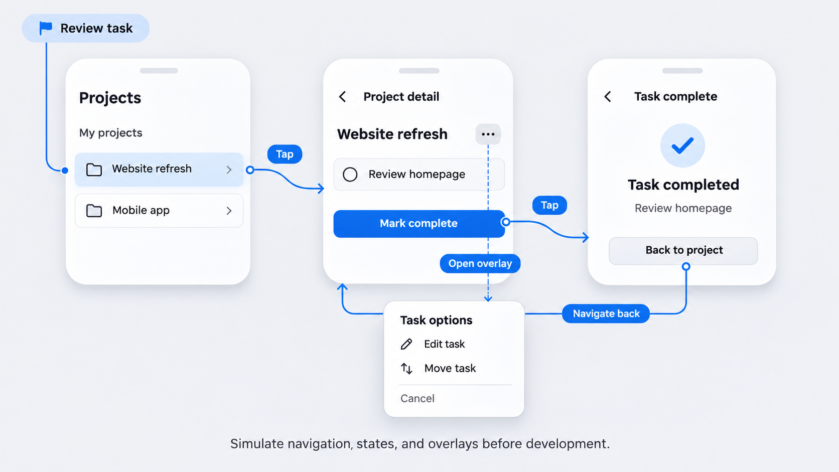 A Figma prototype is an interactive model used to test how people move through screens before development. It can represent navigation, interface states, overlays, scrolling, and transitions in the same file as the visual design.
Unlike a static mockup, a prototype responds to actions such as clicks, taps, drags, key presses, and timed triggers. It remains a simulation rather than production software.
The appropriate fidelity depends on the question being tested. Our guide to interactive prototypes and product testing covers how behavior, states, and transitions shape a useful test.
Prototype, mockup, and production product
Each deliverable answers a different question:
- Mockup: What should the interface look like?
- Prototype: How should someone move through it?
- Production product: Does the complete system work under real conditions?
A prototype can represent validation, navigation, loading, and errors. It cannot prove security, accessibility, performance, data accuracy, integrations, or technical feasibility.
When a Figma prototype is the right deliverable
We use Figma prototypes for concept validation, usability tests, design reviews, demonstrations, flow alignment, and developer handoff discussions. They work best when a team needs to assess a specific task before committing development resources.
Polish comes later. Smooth motion cannot repair a confusing flow.
Prepare your file before opening the Figma Prototype tab
Organize destinations before wiring interactions. Use top-level frames for screens, assign clear names such as Checkout / Payment / Error, and create a flow starting point for the intended opening screen.
Frames provide boundaries, viewport settings, overflow behavior, and dependable interaction destinations. Loose groups do not offer the same structure.
Frames versus sections, pages, groups, and components
- Pages separate broad work areas.
- Sections organize related flows.
- Frames represent screens or viewports.
- Groups bundle layers.
- Components define reusable elements and states.
Sections improve navigation around a file, but frames remain the primary screen destinations.
Create one or more flow starting points
Add named starting points for distinct tasks such as onboarding, checkout, account management, or error recovery. This helps Present mode open the intended screen.
For app projects, an app prototype template with screens and testable states can help teams account for important branches.
Generate the UI foundation before wiring it
UXMagic can generate editable UI screens from a product description or visual reference. An AI-to-Figma conversion workflow can accelerate setup, but we still recommend standardizing components, variants, and layer names before connecting the flow.
How to connect frames and build a clickable flow
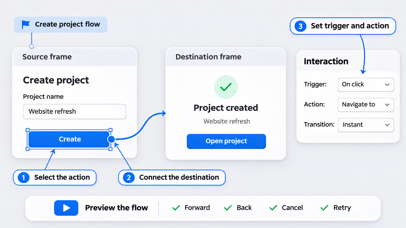 The core process is straightforward:
- Select a button, layer, component instance, or hotspot.
- Drag its prototype connector to a destination.
- Select a trigger and action.
- Configure the transition.
- Preview and test the result.
Build the critical path first. Add alternative routes and error states after the main journey works in both directions.
Connect a source to a destination
In Prototype mode, select an object and drag its circular connector to the target frame. Figma displays the relationship on the canvas.
For a focused test or presentation, apply the same principles as a clickable prototype for a startup: include the essential task rather than every possible screen.
Preview and test the flow
Open the correct named flow in Present mode. Test forward, back, close, cancel, and retry actions.
Check for overlapping hit areas. Transparent or invisible layers can intercept clicks even when a visible control appears correctly connected.
Build beyond the happy path
Include states that can affect decisions, such as loading, empty, focused, disabled, invalid, successful, and recoverable-error states.
For realistic detail without losing focus, follow a high-fidelity wireframe testing approach.
Choose the right trigger and action for each interaction
We recommend using the simplest action that represents the intended behavior.
| User intent | Recommended action |
|---|---|
| Move to another screen | Navigate to |
| Return to the previous screen | Back |
| Open temporary UI | Open overlay |
| Replace temporary UI | Swap overlay |
| Change a reusable control | Change to |
| Move within the same page | Scroll to |
| Visit an external destination | Open link |
Triggers: what starts the interaction
Use On click for most buttons, links, cards, and tap targets. Choose On drag when the gesture itself matters, such as a slider or swipe.
Keyboard flows can use Key press. Hover triggers suit desktop feedback but should not control essential mobile actions. Reserve After delay for purposeful timed events rather than core navigation.
Actions: what happens next
Use Navigate to between screens and Back for prototype history. Scroll to moves to a layer in a scrollable frame, while Open link points to an external destination.
Use overlay actions for modals, menus, sheets, and tooltips. Use Change to for component variants such as tabs, toggles, and expanded controls.
A simple action-selection rule
- New screen: Navigate to
- Temporary layer: Open overlay
- Reusable control state: Change to
- Same-page location: Scroll to
More interaction logic does not automatically make a prototype more realistic.
Prototype navigation, overlays, and reusable components
Build repeated navigation with components and variants rather than recreating it on every screen. Use overlays for temporary elements so the base screen stays intact.
Reusable tabs, menus, and navigation
Create only the states required by the task, such as default, active, expanded, or disabled. Adding Change to interactions within the main component can keep its instances consistent.
Modals, dropdowns, and tooltips
Use centered positioning for conventional dialogs, relative positioning for dropdowns and tooltips, and manual positioning when precise placement is necessary.
Configure background dimming and click-outside dismissal intentionally. Required or destructive decisions should not be easy to dismiss accidentally.
Drawers and bottom sheets
Open drawers and sheets as overlays. For a bottom sheet, position it from the bottom and use Move in when the direction helps explain its origin.
Always test at the intended viewport size to catch clipping and misplaced controls.
Create convincing slide-ins and Smart Animate transitions
Animation should explain continuity, direction, or state change. Figma includes Instant, Dissolve, Move in, Move out, Push, and Smart Animate transitions.
Choose motion based on spatial meaning
Use Move in or Move out for drawers and sheets entering from an edge. Push suits transitions where the incoming view displaces the current one.
Choose Dissolve for a light transition between unrelated states and Instant when motion adds no useful information.
Make Smart Animate predictable
Smart Animate relies on matching layer names, compatible hierarchy, and properties that can be interpolated. Keep source and destination structures consistent, especially within components.
Use consistent timing and easing for repeated patterns.
Fix jumps, fades, and unexpected movement
Check for mismatched names, changed nesting, missing layers, duplicate names, different object types, or competing interactions.
If the animation still obscures the behavior, replace it with Dissolve or Instant.
Build a Figma app prototype that works at device size
A Figma app prototype needs an intentional mobile viewport. We often begin with a mobile wireframe design system, then add navigation, gestures, drawers, and sheets where they support the test.
Set up the mobile viewport
Select a suitable device-category preset and configure overflow. Fix persistent navigation only when it should remain visible during scrolling.
Device chrome provides context but does not demonstrate compatibility across screen sizes.
Prototype tabs, gestures, and bottom navigation
Use component variants for repeated tabs and navigation states. Change to can represent state changes without duplicating entire screens.
Use drag triggers only when testing the gesture. Provide a visible alternative if an undiscovered gesture could block progress.
Test realistic mobile states
Cover relevant permissions, denied permissions, loading, empty content, validation, failure, success, and recovery states. Check tap areas, safe areas, form behavior, clipping, and bottom-sheet placement in preview.
Build a Figma website prototype with scrolling and anchor links
Website prototypes often depend on vertical scrolling, fixed navigation, anchors, hover feedback, external links, and representative breakpoint frames.
Our website prototype validation workflow can help teams decide which pages and breakpoints need detail.
Create scrolling pages and fixed headers
Set a viewport height, extend the content frame beyond it, and enable vertical scrolling. Fix the header only if the planned website will retain it while scrolling.
Confirm that fixed elements do not cover headings, fields, or calls to action.
Add anchor links and website navigation
Use Scroll to for sections on the same page, Navigate to for separate page frames, and Open link for external destinations.
Hover variants can provide desktop feedback, but essential content also needs keyboard- and touch-friendly access.
Prototype responsive breakpoints honestly
Create representative desktop, tablet, and mobile frames when responsive behavior matters. Each is a separate test context.
Connected frames do not prove fluid reflow, browser compatibility, or implementation quality. Development and technical validation are still required.
Troubleshoot common Figma prototype problems
Test after each small group of interactions. Problems are easier to isolate before the whole file is connected.
The prototype opens on the wrong frame
Confirm that the intended frame has a starting point and that Present mode launches the correct named flow. Remove or rename obsolete starting points.
Clicking does nothing or goes to the wrong screen
Review the source layer, trigger, action, and destination. Inspect the layer stack for transparent objects and check component instances for interaction overrides.
Overlays, scrolling, or device previews break
Check clipping, overlay position, overflow, fixed positioning, and viewport dimensions. Preview at the target size rather than relying on the unrestricted canvas.
Smart Animate behaves unpredictably
Compare names, hierarchy, object types, properties, and transition settings. Simplify the transition if fixing it would not improve the test.
Before sharing, we check starting points, destinations, recovery paths, overlays, scrolling, viewport dimensions, and relevant error states.
From AI-generated screens to a testable flow—and Figma’s limits
AI can accelerate screen creation, but teams still own the navigation logic, edge cases, research goals, and interaction choices. Figma remains a prototyping environment rather than a production runtime.
A faster AI-assisted prototyping workflow
Define the task, generate an editable UI foundation with UXMagic, standardize it in Figma, add missing states, and connect the critical path. Test before increasing fidelity.
Our guide to creating AI UI that is actually shippable explains why generated visuals still need product judgment and implementation review.
What are the downsides of using Figma for prototyping?
Complex logic is simulated. Responsive behavior, realistic data, system feedback, integrations, accessibility, security, and performance require additional validation.
Can a Figma prototype become a website or app?
A prototype can guide implementation, but it is not deployable software. Prototype-to-code output still requires developer review, accessibility checks, performance testing, and technical QA.
Describe, design & ship your next testable flow
Generate an editable UI foundation with UXMagic, connect the critical interactions in Figma, and validate the flow before development.