
TL;DR
The best design system tool is not the platform with the longest feature list. It is the one that makes approved reuse easier than detaching components, inventing styles, or rebuilding UI. We recommend evaluating tools through real workflows: governance, tokens, code synchronization, accessibility, AI compliance, adoption, security, and total ownership cost. A polished demo cannot show how a platform handles conflicting assets, releases, deprecations, or everyday delivery pressure.
What is a design system tool—and what is it not?
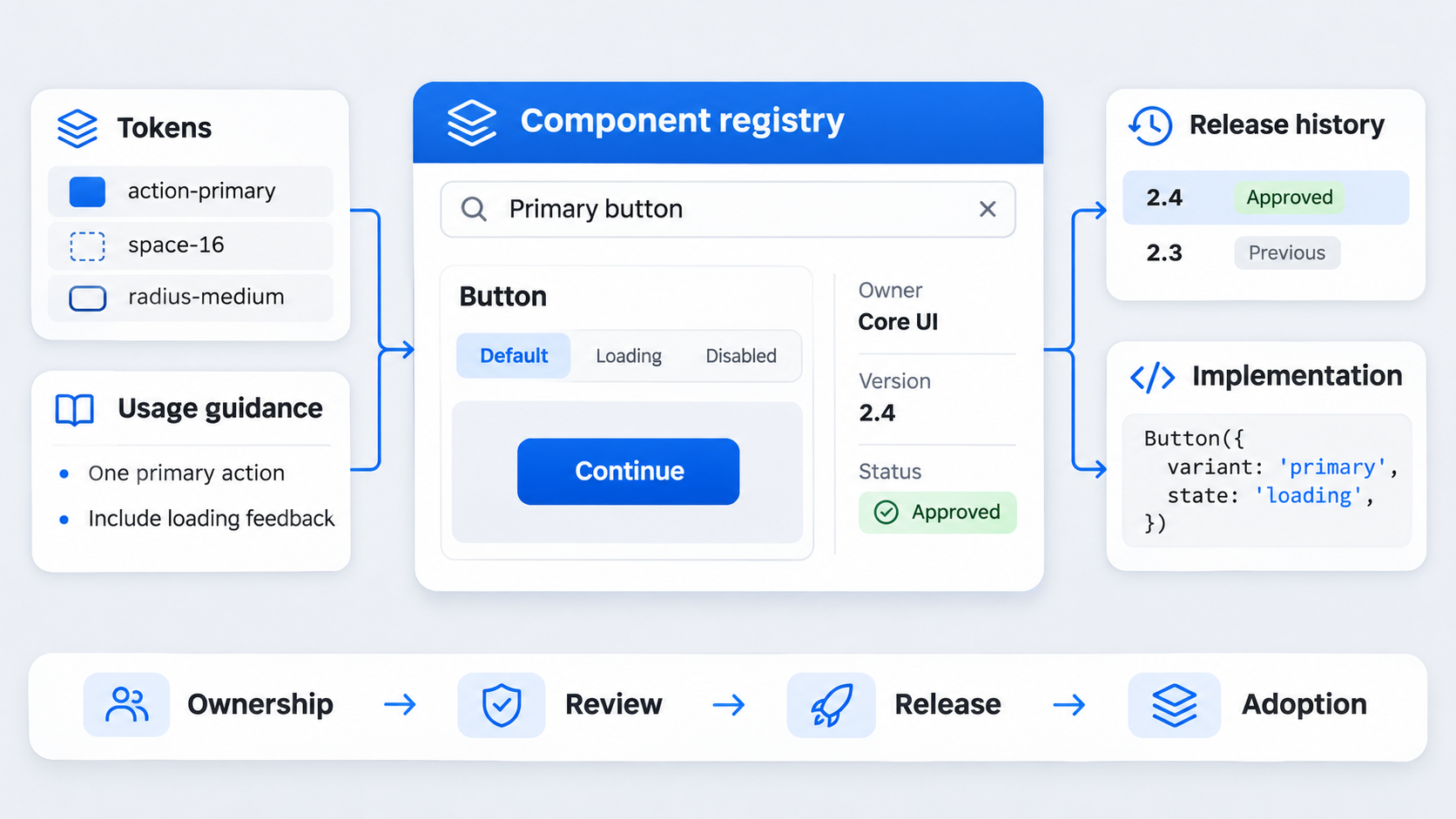
 design system tool manages or connects reusable UI decisions across design and implementation. Depending on its scope, it may support components, semantic tokens, documentation, governance, versioning, permissions, analytics, or code delivery.
The tool supports the system; it is not the system. People still need to define ownership, contribution standards, review rules, release practices, and escalation paths.
A component library can exist while designers continue searching old files, detaching instances, and asking which button is current. If rebuilding is easier than following the approved path, the system is not operating effectively.
Design system tool vs. UI kit, component library, pattern library, and documentation portal
These assets solve related but distinct problems:
| Asset | Primary purpose | Governance capability |
|---|---|---|
| UI kit | Provides reusable visual assets | Limited |
| Component library | Stores reusable components and variants | Moderate |
| Pattern library | Defines solutions to broader user tasks | Moderate |
| Documentation portal | Explains usage, rationale, and implementation | Moderate |
| Design system tool | Connects assets, rules, ownership, releases, and usage | Potentially extensive |
Documentation can identify the correct input without preventing someone from drawing another one or shipping an outdated implementation. Strong systems connect guidance to authoritative assets and production behavior.
Our review of what strong Figma design system examples get right shows why naming, composition, library structure, and maintenance matter as much as visual polish.
Which tools are used for designing?
Most teams use a connected stack rather than one universal platform:
- Interface design and prototyping
- Design-system management and documentation
- Token management and distribution
- Coded components, testing, and releases
- Issue tracking and approvals
- AI-assisted interface generation
We recommend identifying where decisions become disconnected before adding software. Otherwise, a new platform simply creates another place to update.
Is Jira a design tool?
No. Jira is primarily a work-management and issue-tracking platform.
It can support design-system operations by recording component proposals, accessibility defects, approvals, releases, and migrations. Designs, tokens, documentation, and coded components still require suitable authoring and delivery environments.
What belongs in a complete design system?
Before evaluating software, we define what the selected platform must represent or connect. Nielsen Norman Group describes a design system as standards for managing design at scale, reducing repeated work, and creating shared language and visual consistency.
That does not require collecting every component ever made. In our experience, a focused core with clear composition rules is easier to discover, maintain, and adopt.
Foundations and semantic tokens
Foundations usually cover color, typography, spacing, elevation, motion, grids, breakpoints, and iconography.
Raw values such as #C62828 or 16px describe implementation choices. Semantic tokens describe intent, using names such as text-critical, surface-brand, or border-disabled.
This distinction supports controlled changes. One semantic token can resolve to different approved values across light, dark, and high-contrast modes without requiring teams to edit every component.
Reusable components and interaction patterns
A useful component record covers variants, states, responsive behavior, dependencies, composition rules, ownership, implementation status, and supported versions.
Patterns work across components. Authentication, search, forms, navigation, and empty states combine layout, behavior, content, and accessibility decisions. A platform that stores buttons but cannot explain how a form behaves supports only part of the system.
Content and accessibility rules
System guidance should address labels, error messages, tone, localization, keyboard behavior, focus management, contrast, and assistive-technology expectations.
A generated form may use approved colors yet fail because its labels are vague, errors are not announced, or focus behaves unpredictably. Looking on-brand does not make an interface compliant.
The design system tool evaluation scorecard
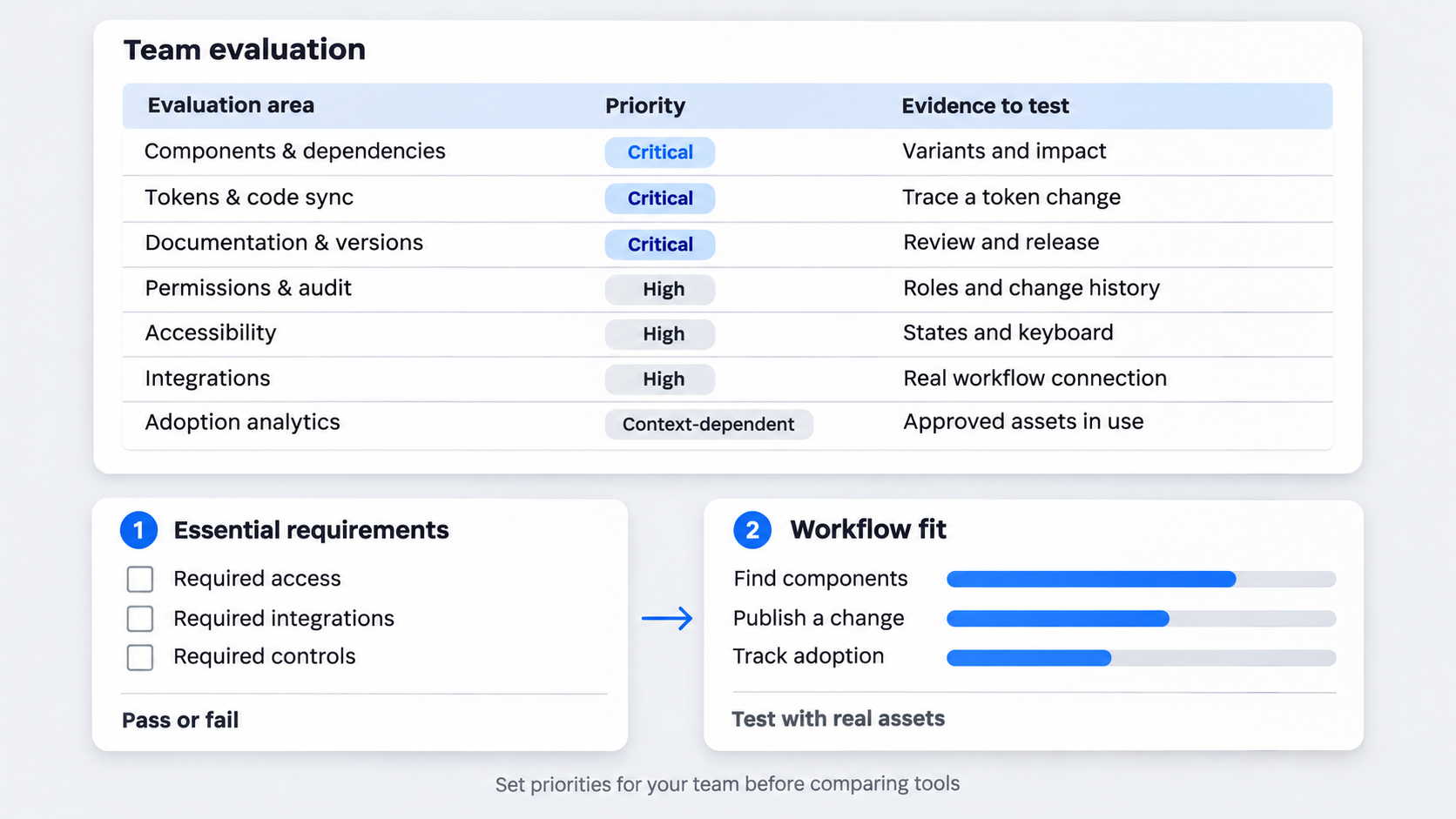
 We recommend using a weighted scorecard based on organizational needs, not copying a generic product ranking.
| Evaluation area | Suggested priority |
|---|---|
| Components and dependencies | Critical |
| Tokens, modes, and code synchronization | Critical |
| Documentation, governance, and versioning | Critical |
| Permissions, security, and auditability | High |
| Accessibility support | High |
| Integrations and extensibility | High |
| Adoption analytics | Context-dependent |
Treat essential capabilities as pass-or-fail requirements. Then assess workflow fit using real assets rather than a vendor’s sample library.
Component and dependency management
Check whether the tool handles variants, nested components, owners, lifecycle status, dependencies, and search. It should also help teams find duplicates and locate deprecated components still in use.
Test messy, representative assets with overlapping names, missing states, and multiple owners. Small demonstration libraries rarely expose discoverability or dependency problems.
Tokens, modes, and code synchronization
Assess semantic tokens, aliases, themes, modes, validation, transformations, and delivery to production. Determine whether arbitrary values can be identified or restricted.
Changes should be traceable: who changed a token, why it changed, which components consume it, and which release delivered it. Token export alone is weak if synchronization depends on undocumented manual work.
Documentation, governance, and versioning
Evaluate contribution intake, reviews, release notes, change logs, migration guidance, and deprecation policies. Guidance should connect to the relevant component and package versions.
Editable documentation is not automatically governed documentation. A mature workflow separates drafts from approved guidance, identifies reviewers, and preserves change history.
Permissions, analytics, accessibility, integrations, and extensibility
For enterprise use, we assess role-based access, approvals, audit logs, APIs, plugins, webhooks, code connections, and custom workflows.
Useful analytics reveal detached instances, duplicate components, outdated versions, adoption by team, unresolved accessibility issues, and deprecated-component usage. Page views alone do not prove that approved assets reached production.
Rethink the “single source of truth”
The phrase “single source of truth” can obscure how systems actually work. Design files, documentation, tokens, and production components may each be authoritative for different decisions.
A source-of-truth matrix makes those boundaries explicit:
| Decision | Authoritative source | Owner | Conflict rule |
|---|---|---|---|
| Semantic token value | Token repository | Foundations owner | Repository wins |
| Component anatomy | Approved specification | Component owner | Review required |
| Component API | Code repository | Engineering owner | Released code wins |
| Usage guidance | Documentation | System team | Approved guidance wins |
| Release status | Package registry | Release owner | Supported release wins |
Assign an owner to every type of decision
Assign owners for foundations, tokens, component APIs, accessibility behavior, usage guidance, and releases. “The design-system team” is too vague when a production defect needs a quick decision.
Conflict rules also matter. If design and production expose different button states, everyone should know which artifact is authoritative and who approves the correction.
Trace a decision from token to shipped interface
A traceable change follows a visible chain:
token definition → design component → documentation → coded component → package release → product adoption
Version identifiers and change histories help teams connect each stage. When surface-brand changes, maintainers should be able to find the relevant library release, package version, affected components, and migration guidance.
Diagnose token, component, and implementation mismatches
When a button color is wrong, we trace the chain:
- Is the semantic token correct?
- Does the design component reference it?
- Does the coded component consume the exported value?
- Is the product using a supported package?
- Has a local override replaced the style?
- Do the documentation and release notes match?
This keeps teams from debating a visible symptom while the cause remains upstream.
Design system tool + Figma: where the workflow starts and stops
A Figma-centered workflow can manage foundations, variables, components, variants, modes, and usage examples. Its proximity to interface design makes it a useful adoption surface.
Figma can be central without serving as the entire operating layer. Production parity, package releases, migrations, audit history, and cross-product analytics may require connected tools.
How to create a design system in Figma
We recommend a practical sequence:
- Audit interfaces for repeated or conflicting patterns.
- Define foundations and semantic variables.
- Build core primitives and frequently reused components.
- Add meaningful variants, states, and responsive behavior.
- Document composition rules and prohibited combinations.
- Test accessibility and content constraints.
- Publish controlled libraries with owners and release notes.
Start with a focused core. Migrating every historical pattern preserves inconsistency rather than resolving it.
When Figma alone is insufficient
Connected workflows may be necessary for coded-component parity, versioned documentation, package releases, formal audits, deprecation management, or analytics across products.
The threshold depends on organizational complexity, regulation, engineering integration, and maintenance capacity. Smaller teams may work well with a disciplined library and lightweight documentation; complex organizations often need stronger controls.
Figma-based vs. standalone workflows
| Criterion | Figma-centered | Broader standalone workflow |
|---|---|---|
| Designer adoption | Often easier | Requires new habits |
| Initial implementation | Typically lighter | Typically more involved |
| Governance depth | Moderate | Potentially extensive |
| Code connectivity | Usually integrated | May be code-led |
| Maintenance | Fewer platforms | More administration |
We would not add another platform without a named owner and a defined use case. Every integration and content surface creates ongoing work.
How AI should generate design-system-compliant UI
AI should accelerate approved decisions, not create novelty that teams must later untangle. At UXMagic, we frame the workflow as describe, design & ship.
Compliance means using approved components, semantic tokens, required states, content rules, and accessibility behavior while exposing exceptions. Our guide to creating AI UI that is actually shippable explains why attractive output is only the beginning.
Describe: turn intent into structured UI requirements
Capture the page goal, user task, content hierarchy, platform, responsive requirements, interaction states, and accessibility constraints.
Structured context narrows the solution space. “Create a modern checkout” invites arbitrary patterns. Requirements tied to approved fields, spacing, validation, keyboard navigation, and payment states provide useful boundaries.
Design: map output to approved components and tokens
Generated inputs, buttons, cards, layouts, and states should map to approved assets wherever possible. Those mappings must remain inspectable.
Unsupported patterns and token exceptions should be flagged, not silently invented. Valid exceptions can then enter review as explicit decisions.
Ship: review exceptions and prepare implementation
Human review remains necessary for interaction behavior, accessibility, content, responsive layouts, and component fit. Designers and engineers should be able to inspect component mappings, token references, missing states, local overrides, and unresolved questions.
Using AI with a Figma-based design system
Prepare structured libraries, provide system context, generate a first pass, map it to approved assets, and review exceptions before handoff.
An AI-to-Figma conversion workflow is most useful when the result stays editable and review-ready. Flattened output weakens reuse, inspection, and handoff.
Two examples that reveal whether the system really works
A polished gallery does not show how a system performs under delivery pressure. We prefer examples that connect changes to a component, token, rule, or owner.
Example 1: off-system signup flow vs. governed signup flow
| Off-system signup | Governed signup |
|---|---|
| Custom input rectangles | Approved input component |
| Arbitrary spacing | Semantic spacing tokens |
| Inconsistent primary buttons | Approved button variants |
| Errors communicated only by color | Documented error behavior |
| Placeholder used as label | Persistent approved label |
| Missing focus state | Tested focus behavior |
AI can create the initial hierarchy and map supported assets. A reviewer still needs to verify validation, focus order, content, responsive behavior, and novel requirements.
Example 2: one semantic token across three display modes
Consider text-critical:
Token definition: text-critical
├── Light mode: approved dark red
├── Dark mode: approved light red
└── High-contrast mode: approved contrast value
        ↓
Design components
        ↓
Coded components
        ↓
Package release
        ↓
Consuming products
The record should connect the token definition, design artifact, code value, affected components, and release entry. Editing raw colors component by component breaks that chain.
Governance that survives scale
Tools can enforce workflows, but they cannot provide ownership or decision rights. Without review criteria and release practices, expensive software becomes a component gallery.
Choose ownership and contribution models
- Centralized: one team controls the system.
- Federated: domain teams own relevant areas.
- Hybrid: a core team governs foundations while domain teams contribute reviewed components.
We recommend documenting contributor expectations, evidence requirements, review criteria, service levels, and escalation paths.
Review, release, and communicate changes
A mature change moves through appropriate design, engineering, accessibility, and release reviews. Release channels help teams distinguish routine updates from breaking changes.
Change logs should explain impact, while migration guidance tells teams what to do next.
Deprecate instead of accumulating
Every deprecated asset needs a replacement, owner, migration plan, implementation guidance, and remaining-usage report. Deprecation is a managed transition, not a label applied to an abandoned component.
Enterprise procurement, adoption, and ROI
The business case should include implementation and maintenance, not only licensing. We recommend piloting with representative assets, products, roles, and security requirements.
A design system case study framework can connect system decisions and adoption to measurable outcomes.
Enterprise requirements checklist
Assess identity management, role-based access, approvals, audit history, data handling, retention, support, administration, exports, and exit options.
For AI features, ask what data is processed, where it is stored, how it is retained, whether it supports model improvement, and which controls administrators receive. Our enterprise AI UI security and governance checklist provides a deeper assessment structure.
Integrations, migration, and maintenance costs
Inventory design files, token pipelines, repositories, documentation, delivery pipelines, issue tracking, and coded-component environments.
Then estimate migration, training, integrations, administration, content maintenance, and releases. Design-time savings can disappear if teams must constantly reconcile systems by hand.
Metrics that prove adoption
Track approved-component usage, detachment, duplicate creation, outdated versions, contribution turnaround, deprecation progress, delivery time, accessibility defects, rework, and release predictability.
We measure behavior rather than logins. Opening documentation does not prove that a team shipped an approved component.
How to choose the right design system tool for your team
Choose according to maturity, workflow gaps, risk, and maintenance capacity. Teams fixing inconsistent foundations need different capabilities from enterprises managing versioned libraries across products.
Run a workflow-based proof of concept
Test a common flow, a complex component family, a token change, an external contribution, a deprecation, and a production handoff.
Include designers, engineers, accessibility specialists, maintainers, and security stakeholders. Otherwise, the pilot tests only the product interface.
Score outcomes, not demo polish
Measure mapping quality, exception visibility, code parity, governance effort, manual reconciliation, and adoption.
We reject “single source of truth” claims unless a vendor can demonstrate authority, ownership, synchronization, versioning, and conflict resolution across design, documentation, tokens, and code.
Make the final decision with five questions
- Does approved reuse become easier than creating off-system UI?
- Can teams trace decisions across design and code?
- Can the tool support ownership, releases, permissions, and deprecations?
- Does its AI use approved assets and expose exceptions?
- Do the expected benefits justify migration and maintenance?
If an answer remains unclear, the evaluation is not finished.
Describe, design & ship with approved system context
Use the UXMagic AI UI generator to turn structured product requirements into editable, Figma-ready UI, then review component mappings, states, and exceptions before handoff.