
TL;DR
A website user flow connects every decision, screen, and system state between entry and conversion. We recommend defining the conversion promise first, choosing a suitable funnel pattern, and wireframing both successful and recovery paths. Fewer steps are not always better; each step should reduce uncertainty, support a decision, or enable progress.
What is a website user flow—and what is it not?
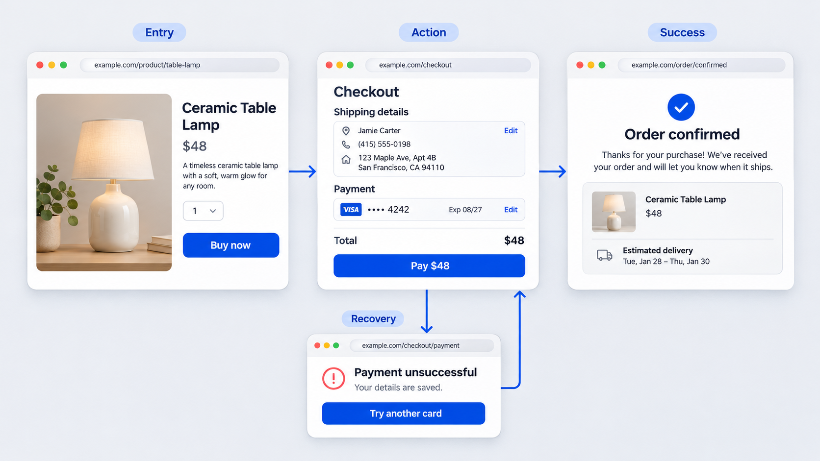 A website user flow is the sequence of screens, actions, decisions, and system responses that moves a visitor toward an outcome such as a purchase, signup, or demo booking. It is more than a collection of polished pages.
A sitemap documents available pages. A customer journey map covers the broader experience across channels. A wireframe represents an interface state. The flow explains what happens next, including branches, interruptions, and recovery.
Website user flow vs. sitemap
A sitemap answers, “What pages exist?” A website flow asks, “Which route might someone take, and what could interrupt it?”
Visitors may arrive through campaign landing pages, product pages, pricing pages, referral links, saved sessions, or account links. We therefore map real entry points instead of assuming every visit begins on the homepage.
The basic parts of a user flow diagram
A practical diagram includes:
- Entry points: Where visits begin
- Screens: What visitors see
- Actions: What they do
- Decisions: Where routes branch
- System states: How the interface responds
- Success states: What confirms completion
- Recovery states: What resolves interruptions
Consistent notation helps, but clear logic matters more than perfect shapes.
Start with the conversion promise, not the diagram
Before creating a flow, we define the promise behind the next action. A free-trial offer requires different screens and evidence from an enterprise quote request.
At each stage, consider relevance, value, trust, price, commitment, and the expected outcome. Smaller intent signals—such as viewing pricing or starting a form—can show progress toward the primary conversion.
When someone requests another field or screen, ask: Which user decision does this support? If there is no clear answer, reconsider it.
Define intent, evidence, and commitment
For every stage, document:
- What the visitor wants
- What they must believe
- What they must provide
- What the system must return
Keep the message consistent. If a CTA promises quick setup, the next screen should not introduce an unexplained sales review or lengthy form.
Why fewer steps are not always better
Shorter is not automatically simpler. Combining trust content, registration, plan selection, billing, and payment on one screen may create more effort than a focused sequence.
We prefer one clear decision per stage. Combine steps only when the result remains understandable, reversible, and manageable on mobile.
Choose the right conversion pattern for your website
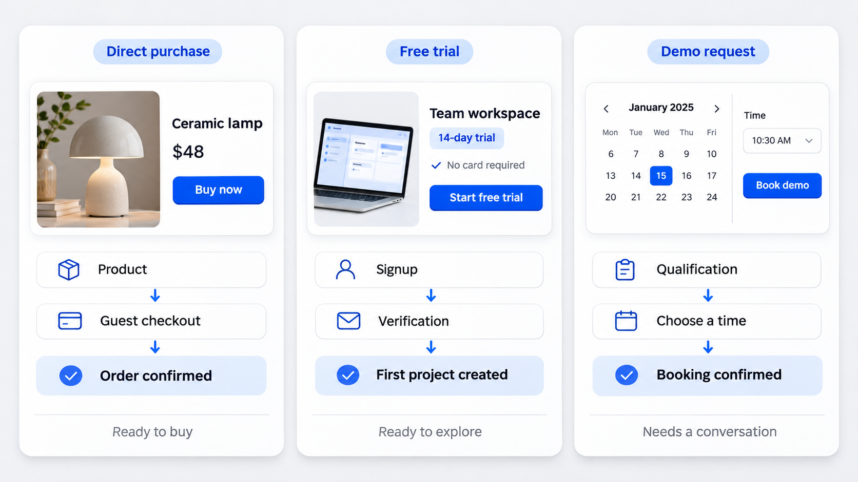 The right pattern depends on the offer, visitor intent, and required commitment.
Direct purchase, marketplace checkout, and account-required purchase
- Direct purchase: Product → cart or buy now → guest checkout → payment → confirmation.
- Marketplace checkout: Listing → option or seller selection → checkout → fulfillment confirmation.
- Account-required purchase: Product → requirement explanation → registration → checkout → confirmation.
Require registration only when it provides immediate value or supports access, security, saved progress, or ongoing service.
Free trial, freemium signup, and subscription upgrade
- Free trial: Value and plan context → signup → verification → onboarding.
- Freemium signup: Use-case page → account creation → activation task → dashboard.
- Subscription upgrade: Paywall or limit → plan comparison → payment → access confirmation.
For trials and freemium products, meaningful product use is a stronger success state than account creation alone.
Demo request, lead magnet, and quote request
- Demo request: Solution page → qualification → scheduling → confirmation.
- Lead magnet: Campaign page → minimal form → delivery → optional follow-up.
- Quote request: Service page → requirements → contact details → review → confirmation.
Form length should reflect the value and complexity of the exchange.
Use this website user flow template
Start with:
Visit → intent signal → identification or signup → conversion → confirmation
Then add entry assumptions, branch rules, exit risks, recovery states, and success signals. This structure can transfer into Figma or another collaborative workspace. Our app prototype template for testable screen states offers a complementary way to organize them.
Annotate every screen and state
Record each screen’s visitor intent, required information, primary action, exit risk, and success signal. Label assumptions and unresolved questions.
This keeps reviews focused on conversion logic. A high-fidelity wireframe testing process can then identify which assumptions require realistic representation.
Map actions, decisions, and recovery paths
Separate visitor actions from system responses. “Submit payment” is an action; authorization, decline, and confirmation are responses.
Also map invalid entries, timeouts, back actions, and interrupted sessions. A flow that covers only success is incomplete.
Design for every entry point—not just the homepage
Create relevant paths for campaign, search, pricing, product, referral, and returning-user traffic. Each source provides different context, so we supply the missing evidence rather than forcing every visitor through introductory content.
Cold and campaign traffic
Cold visitors may need problem context, proof, pricing guidance, and risk reduction. Campaign traffic also needs message continuity between the original promotion and landing page.
Preserve specific plan or outcome details through signup. A generic form can weaken confidence.
High-intent and returning traffic
Pricing- and product-page visitors need a direct next step. Returning visitors should not repeat completed work.
Recognize existing accounts, restore valid sessions, and return people to a meaningful state. Reconfirm information that may have changed, such as price or availability.
Wireframe the minimum screens—and the states between them
A flow may include offer details, signup, verification, plan selection, payment, confirmation, and recovery. Not every funnel needs every screen.
Treat handoffs as designed states. Our guide to interactive prototypes and behavioral states explains how to test transitions, errors, and responses.
The minimum viable conversion flow
Keep a screen only if it increases motivation, enables a decision, collects necessary information, or confirms an outcome.
Remove redundant pages carefully. A website prototype validation workflow helps us test the complete route before production.
Guest checkout, account creation, or free trial?
We recommend guest checkout when an account offers no immediate value. Request an account when it enables secure access, saved progress, collaboration, purchase management, or ongoing service.
Trials and freemium plans work best when product experience can build confidence more effectively than additional marketing.
Design the branches that protect conversion
Map invalid input, duplicate emails, expired links, unavailable plans, failed coupons, declined payments, back navigation, and abandoned sessions. Prioritize branches by frequency, severity, business impact, and recoverability.
Every error should preserve valid input, explain the problem, and provide a practical next step.
Account and verification branches
Detect existing accounts before allowing repeated signup attempts. Offer sign-in and password recovery where appropriate.
Verification should support resending, changing an email address, and recovering from expired links while preserving the original conversion context.
Payment and plan branches
After a decline, retain valid checkout data and offer retry or alternative payment routes. If a plan or coupon is unavailable, explain why and show valid options.
Navigation and session recovery
Define back-button behavior so visitors can review choices without losing information or duplicating payment. Restore interrupted sessions to a valid step, then reconfirm anything that may have changed.
Improve the handoffs between CTA, signup, plan, and payment
We assess each transition for message continuity, information cost, trust, reversibility, progress visibility, and mobile effort.
CTA to signup
A weak transition sends a specific CTA to a generic form. A better signup screen repeats the promised outcome and requests only what is needed to begin. A clickable startup prototype makes this transition testable before implementation.
Signup to plan selection
Show enough pricing and plan context before signup. Preserve the selected option through registration and keep it editable before payment.
Payment to confirmation
Confirmation should summarize the transaction, timing, support route, and next action. It should also explain what to do if an expected email or entitlement does not arrive.
Diagnose drop-off with analytics and usability testing
Analytics show where a flow breaks; research helps explain why. Causes may include weak intent, unclear value, forced commitment, trust concerns, technical failure, or interaction friction.
What funnel analytics can reveal
Track entry-point performance, step completion, errors, repeated attempts, abandonment, recovery, and downstream activation. Segment results by device, traffic source, plan, and new versus returning visitors.
What usability testing must explain
Observe hesitation, incorrect expectations, commitment concerns, and responses to errors. Test transitions and messages, not just isolated screens.
Turn evidence into a flow revision
Match the change to the cause:
- Low intent: Improve targeting or qualification.
- Unclear value: Add relevant evidence.
- Forced commitment: Delay registration or allow guest access.
- Trust concern: Clarify pricing, policies, security, or outcomes.
- Interaction friction: Improve controls, validation, and recovery.
Describe, design and ship a stronger flow with UXMagic
Define the audience, conversion promise, entry point, evidence needs, and funnel pattern. Then use the AI UI generator for Figma-ready designs to compare flow decisions without manually wireframing every variation.
Generated screens speed up comparison but do not replace validation. Our guide to shippable AI UI covers the path from generated concepts to coherent interfaces.
Describe the decision logic
Specify visitor intent, required evidence, traffic source, device context, account requirements, conversion goal, and known edge cases. Strong prompts describe decisions and states, not only visual style.
Generate and compare flow variants
Compare direct checkout, guest checkout, account-first, trial, freemium, and sales-assisted routes against trust, information cost, reversibility, progress visibility, and mobile effort.
Refine the complete path
Add invalid input, duplicate accounts, payment failures, returning-user behavior, and confirmation states. Sharing the complete path keeps feedback focused on completion risks rather than isolated screens.
Turn your website user flow into testable screens
Generate your website UI with UXMagic, compare conversion patterns, add recovery states, and bring a complete, reviewable flow into Figma.