
TL;DR
The best website wireframe templates reduce blank-canvas work without forcing every page into the same layout. We recommend choosing a template based on the decision under review, then adapting it with realistic content, responsive rules, accessibility requirements, edge cases, and handoff notes.
Website wireframe templates you can actually use
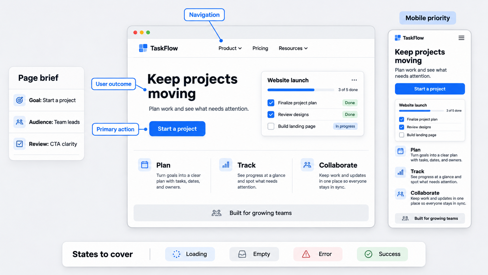 We need working files, not another gallery of polished screens. A useful template helps our teams structure landing pages, homepages, pricing pages, dashboards, blogs, ecommerce experiences, and contact pages around real requirements.
Good templates standardize coverage across navigation, hierarchy, states, responsiveness, accessibility, and handoff. They do not dictate the final design.
When assessing free website wireframe templates, we look beyond the number of included blocks. A small, purposeful framework is often easier to adapt than a large kit of generic sections.
What a useful template should include
We recommend looking for:
- Purposeful regions for navigation, content, actions, and trust signals
- Prompts such as “state the user outcome” rather than placeholder copy
- Notes for behavior, constraints, dependencies, and open decisions
- Desktop, tablet, and mobile planning guidance
- Space for goals, audience needs, risks, and approval criteria
- Loading, empty, error, success, and restricted states
Together, these elements turn a blank file into a practical decision-making tool.
What these templates are not
Templates are not inspiration galleries, rigid page builders, or substitutes for product thinking. They cannot validate user needs, define business intent, or establish the correct hierarchy without judgment.
We expect a good template to leave important decisions open. If it produces the same page every time, it is too prescriptive.
Choose the right web wireframe template
The right web wireframe template depends on what our team needs to review. Format should follow the task rather than personal tool preference.
| Page or task | Fidelity | Useful format | Review focus |
|---|---|---|---|
| Homepage | Low | PDF or editable file | Hierarchy and routes |
| Landing page | Low to mid | Editable file | Content and CTA logic |
| Pricing page | Mid | Editable file or HTML | Comparisons and states |
| SaaS dashboard | Mid | Editable file or HTML | Data and permissions |
| Blog | Low to mid | Editable file or HTML | Reading and discovery |
| Ecommerce | Mid | Editable file or HTML | Inventory and purchase flow |
| Contact form | Mid | Editable file or PDF | Validation and routing |
Editable design files support collaborative iteration. PDFs suit workshops, while HTML helps teams inspect browser flow, width constraints, and keyboard order.
Website and app wireframes also have different priorities. Websites often require fluid content and broad viewport support, while apps may rely more on persistent navigation and task sequences. Our mobile wireframe design system addresses those app-specific concerns.
Editable design file
We use editable files when teams need rapid rearrangement, shared critique, annotations, or component mapping. Preserve a blank master and create page-specific copies so previous decisions do not become accidental defaults.
Teams can also review Figma design system examples when defining variants, ownership, and state coverage.
Printable PDF
PDFs work well for workshops, sketching, and early content planning. We include space for the page goal, intended audience, primary action, content notes, responsive exceptions, risks, and open questions.
The layout should invite revision. An overly polished worksheet can make participants reluctant to mark it up.
Browser-friendly HTML
HTML is useful when teams need to test content flow, width constraints, basic responsiveness, or keyboard order. It can reveal issues that fixed canvases obscure.
However, structural HTML remains a planning artifact. It does not replace production components, application logic, accessibility testing, or engineering review.
Match wireframe fidelity to the decision
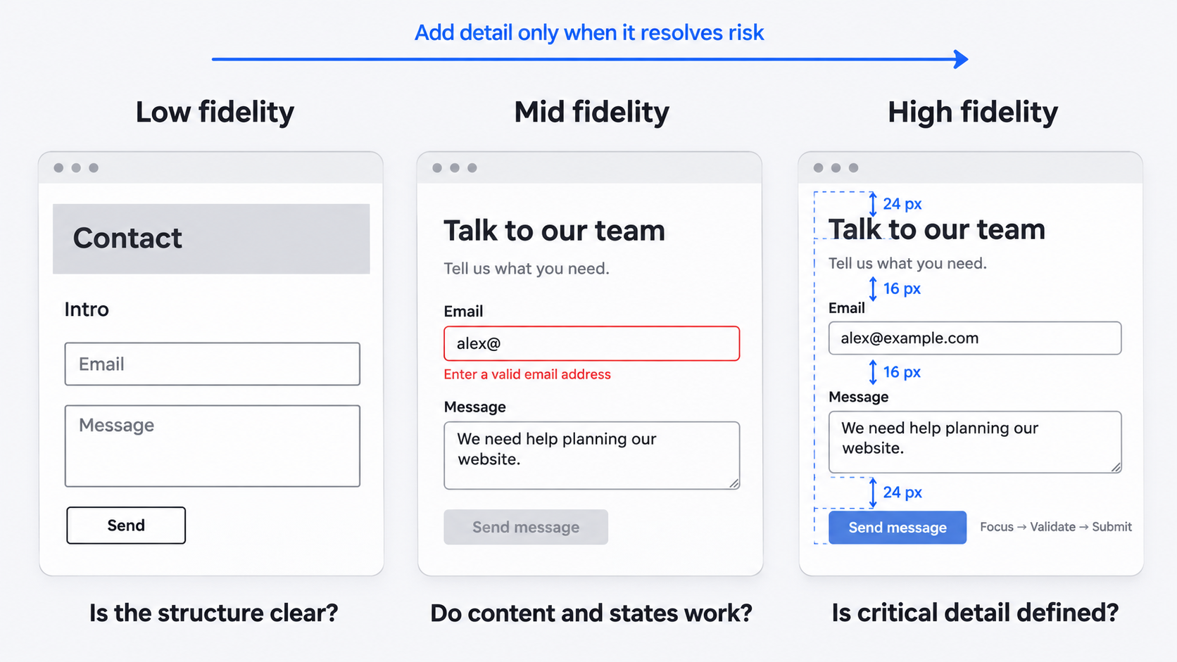 Fidelity should reflect the question under review:
- Low fidelity: flow, hierarchy, navigation, and broad structure
- Mid fidelity: realistic content, data density, states, and behavior
- High fidelity: precise layout or interactions where ambiguity creates risk
Once reviewers focus on colors, shadows, and decorative details, the wireframe may no longer be serving a structural review.
Use low fidelity to align quickly
We use low fidelity to discuss sequence, priority, navigation, and task completion. Neutral boxes and limited styling keep feedback focused.
Visual detail should resolve a specific question, not merely make the presentation look finished.
Move to mid fidelity when details affect the experience
Mid fidelity becomes useful when copy length, form fields, errors, permissions, data density, or component behavior affects the layout.
State coverage matters more than polish. A login form wireframe with errors and recovery paths shows why a default state is not enough.
Know when the wireframe phase is over
We move forward once hierarchy, core content, primary flows, critical states, and responsive behavior are clear enough for the next stage.
Unresolved structural issues should remain in wireframing. Brand and visual-system decisions can move into UI design. Depending on the remaining risk, the next artifact may be a mockup or a website prototype built for validation.
Adapt one blank template to seven website types
A flexible template can support different pages by changing the goal, user intent, essential information, edge cases, and mobile priorities.
Landing page and homepage
A landing page typically needs a focused progression: value proposition, audience context, product explanation, relevant proof, objection handling, and a primary action.
A homepage often needs stronger route-finding because it may serve several audiences or products. On mobile, we preserve the main proposition and action before supporting material rather than retaining every desktop section unchanged.
Pricing page and SaaS dashboard
Pricing wireframes may need billing controls, plan comparisons, feature limits, eligibility rules, current-plan states, and enterprise routes.
Dashboard wireframes often cover navigation, metrics, filters, tables, permissions, loading, and empty states. Instead of shrinking a dense desktop layout, we prioritize urgent information and common actions for smaller screens.
Blog, ecommerce, and contact pages
Blog wireframes should test long titles, metadata, related content, author details, and deep article structures.
Ecommerce pages may require filters, inventory status, delivery details, product options, trust information, and purchase actions. Contact pages need realistic labels, help text, validation, confirmation states, and alternative contact routes.
Wireframe with real content—not lorem ipsum
Placeholder text can hide weak propositions, poor labels, awkward line lengths, and unrealistic content density. We start with the page goal, target user, primary action, and minimum information needed to act.
Then we add plausible headings, instructions, prices, errors, empty states, and content variations.
Write enough copy to test hierarchy
Specific labels such as “Compare plans” or “View security features” communicate more than “Learn more.”
We also test long headings, uneven descriptions, realistic navigation labels, and potential content expansion. A layout that works only with perfectly balanced copy is fragile.
Include states, not just the happy path
Relevant states may include:
- Loading
- Empty
- Error
- Success
- Disabled
- Permission-restricted
- Unavailable
We annotate each trigger and the available recovery action. When behavior drives the experience, interactive prototypes to test states and transitions are clearer than static frames alone.
Plan responsive behavior without drawing everything three times
We do not need a complete canvas for every viewport. First, define whether each block should reflow, stack, wrap, collapse, scroll, hide, or change priority. Separate frames are most useful when an exception requires review.
Define stacking and priority rules
Document column order, navigation changes, persistent actions, table treatment, and media behavior. A pricing comparison might become plan-by-plan views on mobile, while a dashboard table might show priority columns before secondary details.
Document responsive exceptions
Complex navigation, comparisons, dashboards, filters, and checkout flows may justify dedicated mobile or tablet frames. Notes beside each exception help developers understand the intended behavior without reverse-engineering disconnected layouts.
Run accessibility and design-system checks early
Wireframes can establish heading order, landmarks, keyboard sequence, persistent labels, error placement, focus requirements, and touch-target intent before visual design begins.
Accessibility checks at wireframe stage
We check that reading and keyboard order match the visual hierarchy. Controls need persistent labels, while errors need explanations and recovery actions.
The structure should also allow for longer text, validation feedback, visible focus, assistive instructions, and status indicators that do not rely only on color.
Map blocks to reusable components
Repeated cards, forms, alerts, tables, navigation patterns, and modal flows should map to likely design-system components.
We flag whether a block uses an existing component, needs a new variant, introduces a new component, or depends on unresolved content or technical behavior.
Use the website wireframe checklist before handoff
Our checklist keeps key decisions visible between design, approval, and implementation. Annotations should explain intent, behavior, constraints, dependencies, or unresolved questions—not restate what the canvas already shows.
Structure and content
Before review, we confirm:
- The page has a clear goal and audience
- Hierarchy and navigation are understandable
- Content is realistic enough to test
- The primary action is visible
- Supporting information appears where needed
- The intended task can be completed
Behavior and edge cases
We also cover interactive states, errors, recovery actions, loading, permissions, conditional logic, responsive exceptions, and external dependencies. Every unresolved product, content, accessibility, or technical question should have an owner.
Review and handoff
We state the feedback required before presenting. If the review concerns hierarchy and flow, we defer color and typography discussions.
Handoff should connect components, requirements, source content, acceptance criteria, and decision owners. An AI-to-Figma workflow can help preserve editability when generated output enters the design process.
Describe, design & ship with UXMagic
We use AI to reduce repetitive setup, not to make unchecked product decisions. A template can become a structured brief for an AI UI design generator.
Describe the goal and constraints
Define the audience, task, page type, required content, primary action, essential states, and responsive risks. Separate fixed requirements from areas open to exploration.
Generate and refine the structure
We treat generated output as a direction to evaluate. Remove generic sections, test content order, and review density, states, component behavior, and edge cases.
Our guide to generating shippable AI UI explains how to assess the first output rather than accept it unchanged.
Review and ship
Ask stakeholders to review hierarchy, flow, content placement, and missing requirements before adding polish. Carry annotations, states, responsive rules, and component decisions into design and handoff.
Turn your brief into a review-ready website wireframe
Define the goal, content, states, constraints, and responsive risks, then Start generating with UXMagic to create an editable direction your team can review and refine.