
TL;DR
A low fidelity prototype should expose weak navigation, unclear labels and broken recovery paths before a team invests in visual polish or engineering. We recommend prototyping one critical task, connecting only the essential states and testing the path with representative users without coaching.
What is a low fidelity prototype?
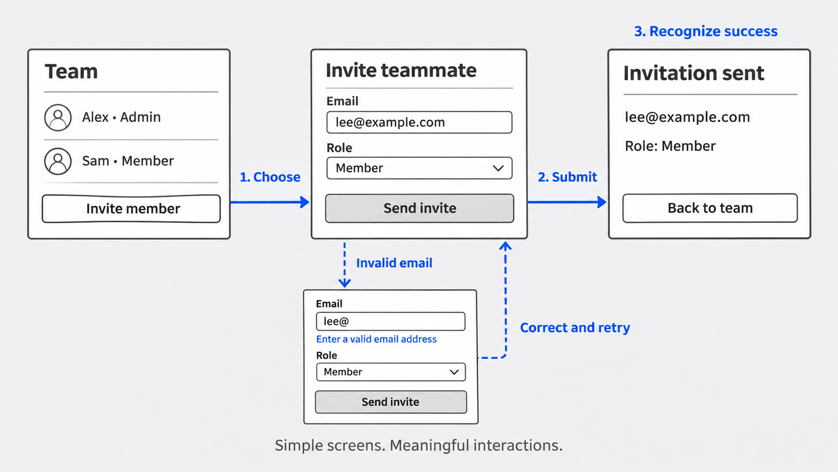 A low fidelity prototype is an intentionally rough model used to explore a product’s structure, behavior or task flow before substantial visual or technical investment. It helps teams test whether users understand what to do, how the system responds and whether they have reached the intended outcome.
Low fidelity sits at the rough end of a spectrum. It prioritizes how a product works over how finished it looks. Depending on the research question, it may be a paper sketch, a basic wireframe or a clickable flow.
For behavioral testing, interaction matters. Users need to take relevant actions and encounter meaningful consequences. Grayscale screens, basic components and limited styling keep feedback focused on decisions, labels and paths rather than colors or fonts.
Low fidelity prototype vs. wireframe
A wireframe describes screen structure. It shows where content, controls and navigation might appear, but it does not necessarily simulate a task.
A wireframe can become part of a prototype when its screens, actions, states and outcomes are connected. Selecting “invite member,” for example, might open a form; invalid input might trigger feedback; and a valid submission might produce confirmation.
Teams designing for smaller screens can start with a mobile wireframe design system for usable app flows before connecting the essential interactions.
How interactive should a low fidelity prototype be?
Include only the interactions needed to answer the research question. If we are testing whether users can invite a teammate, navigation, form completion, validation, role selection and confirmation matter. Unrelated account controls do not.
Inputs may be simulated, and data does not need to persist. Build real mechanics only when they affect the task under study.
When to use low fidelity prototyping
We use low fidelity prototyping when the main uncertainty is whether users can find, understand and complete a path. Common applications include:
- Onboarding journeys
- Checkout and feature activation
- Navigation changes
- Permission and role setup
- Approval workflows
- Internal enterprise tools
Low and high fidelity answer different questions. Low fidelity examines basic structure and behavior; higher fidelity supports research into realistic hierarchy, content and detailed interactions. Our high fidelity wireframe guide explains when more realism becomes useful.
When low fidelity is not enough
Increase fidelity when the research question depends on:
- Visual hierarchy or brand perception
- Responsive behavior
- Animation or complex transitions
- Realistic data density
- Detailed content comprehension
- Technical feasibility
High fidelity is not automatically better. We recommend choosing the simplest artifact that can answer the current question without creating misleading shortcuts.
Why a stakeholder walkthrough is not usability testing
Stakeholders already know the intended logic. They may fill navigation gaps, understand internal terminology and overlook missing feedback because they know what the design should do.
Representative users do not share that context. Give them an uncoached task and observe what they select, misunderstand or abandon.
How to make a low fidelity prototype: Map one critical task
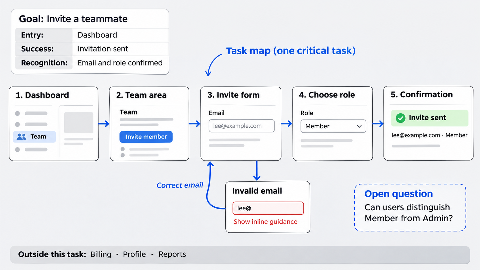 Start with one user goal in plain language. Avoid prototyping an entire product when the uncertainty concerns a single journey.
Define:
- Entry: Where the task realistically begins
- Success: What must happen for completion
- Recognition: What shows the user that completion occurred
Map the primary path first. Record other branches as assumptions or research questions rather than building them automatically.
Choose the smallest useful journey
Choose a frequent, risky or strategically important task. A SaaS team might test inviting a colleague; an enterprise team might test submitting an approval request with the correct permissions.
Exclude adjacent features unless they are necessary for realistic completion. A focused clickable prototype for a startup flow is more useful than a broad demo filled with shallow interactions.
Map the happy path and recovery paths
For each step, document the user’s action, the system’s response, likely wrong turns and the evidence of progress.
Do not model only the happy path. A realistic validation or recovery state may reveal problems that ideal-state screens conceal.
Generate the minimum screens and essential states
Create only the screens required to move from entry to recognizable success. An app prototype template for screens and states can help teams spot gaps without expanding the scope unnecessarily.
Relevant states may include:
- Default
- Selected
- Loading
- Empty
- Error
- Success
- Back navigation
Keep labels realistic enough to test comprehension. Omit branding, complex animation and production-ready components unless the research question depends on them.
What not to include
Avoid visual-polish prompts, speculative branches, complete component libraries and interactions without a research purpose.
We also recommend marking assumptions in the working file. Generated screens can look convincing even when their structure, labels and requirements remain untested.
Accessibility at low fidelity
Use meaningful control labels and do not communicate status through color alone. Where the format allows, establish a logical focus order and write error messages that make sense in context.
A rough prototype cannot establish accessibility compliance. It can reveal structural barriers, but teams still need dedicated review and production-level testing.
Build a testable path with UXMagic
Our workflow is straightforward: describe, design and test, then ship.
Describe the user, task and required path. Use the free AI UI generator to create rough screens, connect critical interactions and revise the journey before increasing fidelity.
UXMagic accelerates initial screen creation and disposable iteration. Its value is not producing more UI. It gives teams more time to assess behavior and gather user evidence.
AI does not replace research, interaction-design judgment, accessibility review or production engineering.
A focused UXMagic prompt structure
Specify the target user, task, starting point, required states, likely error condition, success condition and exclusions.
For example: “Create a rough grayscale SaaS flow for an account administrator inviting a teammate from the dashboard. Include team settings, an invite form, invalid-email validation, role selection and explicit confirmation. Exclude branding and unrelated settings.”
Paper, presentation and design-tool formats
Paper interfaces, linked slides and design-tool frames are valid when they are the simplest way to answer the question. The format matters less than whether users can act and receive meaningful feedback.
Digital flows are useful for remote testing, repeatable navigation and quick iteration. For deeper behavior planning, see our guide to interactive prototypes, states and transitions.
Run low fidelity prototype testing without coaching
Write a scenario that states the goal without naming the control or path. Instead of “Open team settings and click invite member,” say: “A new colleague needs workspace access with an editor role. Show us how you would add them.”
Observe without pointing at controls, explaining labels or confirming the correct route. Start with representative participants and continue until the team has enough evidence to make a decision.
Moderated testing supports follow-up questions. Unmoderated testing can work when the path is stable, the prompt is clear and live probing is unnecessary.
What to observe and measure
Record task completion, wrong turns, hesitation, backtracking, dead ends, moderator rescue, error recovery and recognition of success.
Separate behavior from preference. “The participant selected billing before team settings” is evidence. A color preference is not relevant unless visual treatment is part of the research question.
Turn failures into revisions
Revise the flow when evidence shows that users cannot find an action, interpret a label, recover from an error or recognize completion.
Log isolated aesthetic comments separately so they do not distract from the behavioral question.
Low fidelity prototype example: Invite a teammate
Consider a SaaS flow that begins on a dashboard. The user must find the team area, start an invitation, enter an email address, recover from invalid input, assign a role and recognize that the invitation was sent.
The minimum flow could contain a dashboard, team area, invite form, error state, role selection and confirmation.
In a flawed version, an ambiguous “add” control may lead users toward projects or records instead of teammates. Without invalid-email feedback, users may also repeat the same action or abandon the form.
A revision could rename the control “invite member,” add inline validation and show a confirmation containing the invited person and assigned role.
What this example proves
A static wireframe can appear logical while hiding action, feedback and recovery problems. A clickable path shows whether labels lead users forward and whether system responses support correction.
The prototype does not need persistent data or a working invitation service. It needs enough simulated behavior to test comprehension and completion.
Apply the pattern to other teams
Product teams can apply this method to onboarding, checkout, activation and permission setup. Enterprise teams can use it for approval flows, role-based access and governed internal tools.
Revise the flow or increase fidelity
Revise the structure when users repeatedly choose the wrong entry point, misunderstand a label, reach a dead end, fail to recover or miss the outcome.
Retest the changed path. A clearer label or new validation state remains a hypothesis until users demonstrate that it works.
Exit criteria for moving forward
Consider increasing fidelity when participants can find the starting action, complete the task without rescue, understand key labels, recover from common errors and recognize success.
These are decision criteria, not proof that the final product is usable. New questions will emerge as visual, content and technical detail increases.
Handoff after validation
Document validated decisions, unresolved assumptions and prototype limitations. Include the research question, task prompt, observed breakdowns and resulting revisions.
Then proceed to design-system alignment, accessibility review, technical validation and engineering. Do not present a low fidelity prototype as finished UI or implementation-ready requirements.
Low fidelity prototype checklist
Use this compact workflow:
- Define one critical task
- Identify the entry and success points
- List required screens and states
- Include a likely recovery path
- Generate the minimum UI
- Connect essential interactions
- Test without coaching
- Log behavioral failures
- Revise and retest
- Increase fidelity only when the next question requires it
Turn one critical journey into a testable flow
Use UXMagic to create disposable screens, connect the essential interactions and validate behavior before investing in higher fidelity.