
TL;DR
Mid fidelity wireframes make hierarchy, realistic content, navigation, components, states, and core interactions testable without suggesting that the visual design is finished. We treat them as an optional decision gate, not a mandatory deliverable. Use them when sketches are too vague but high-fidelity UI would be premature. Add only enough detail to resolve structural risk, then advance, revise, or return to concept exploration based on evidence.
What is a mid fidelity wireframe?
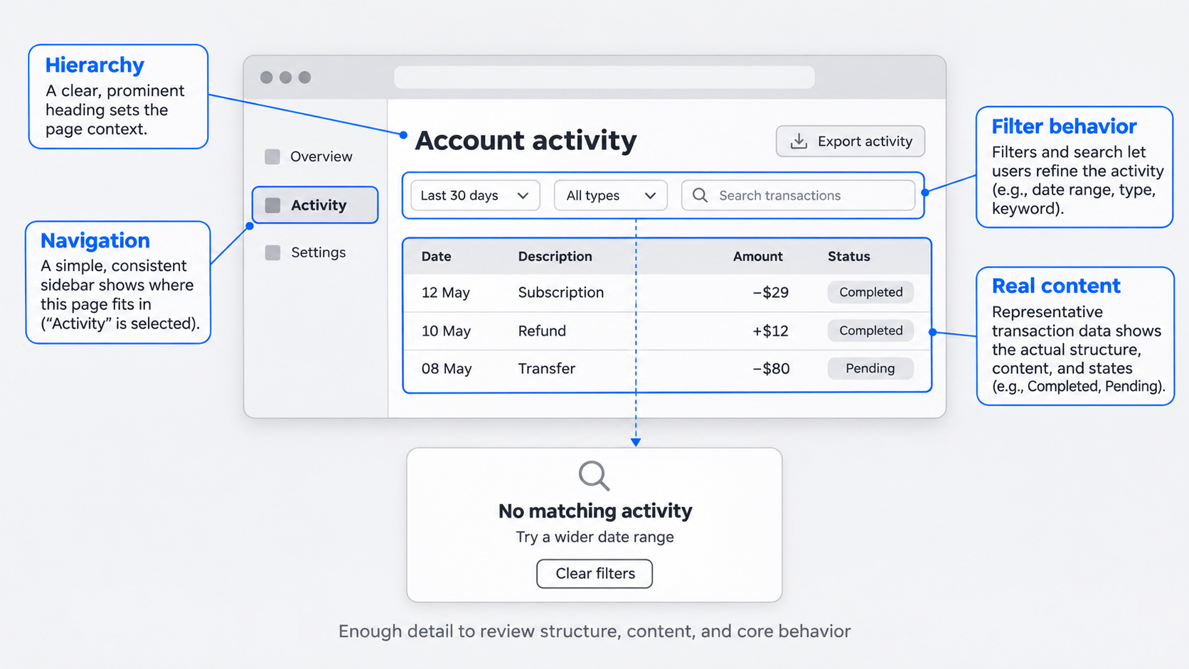 A mid fidelity wireframe is a structured interface representation used to test hierarchy, content, navigation, components, and core behavior without committing to final visual design. It sits between rough concept exploration and detailed interface design.
Fidelity is not defined by whether a screen is grayscale. It reflects which product decisions are represented clearly enough to evaluate. A colorful screen can remain structurally vague, while a neutral, clickable wireframe can expose navigation logic, content priority, validation, and recovery behavior.
We recommend treating medium fidelity wireframes as an optional decision gate. They are useful when structural uncertainty remains but sketch-level artifacts can no longer support a productive review.
What mid fidelity makes testable
A mid fidelity artifact can help us evaluate:
- The purpose of each screen and its place in the wider flow
- Information hierarchy and content priority
- Realistic terminology, sequencing, length, and density
- Navigation relationships and task progression
- Forms, filters, menus, cards, tables, and other components
- Loading, empty, error, success, disabled, and restricted states
- Assumptions that need stakeholder agreement or user validation
- Responsive changes that affect task completion
This level is valuable when a low-fi screen receives broad approval but fails once real labels, values, permissions, or error states appear. Mid-fi work replaces abstract agreement with concrete decisions.
The artifact should be only as detailed as the review question requires. If we need to learn whether people can find and compare account activity, we need realistic labels, values, filters, and navigation—not final chart colors.
What mid fidelity does not mean
A mid fidelity wireframe is not simply a cleaner sketch. Tidier boxes add little value if content, behavior, and states remain unspecified.
It also does not require:
- Final brand colors
- Production typography
- Finished imagery or iconography
- Pixel-perfect spacing
- Decorative shadows and effects
- Fully resolved microinteractions
- Complete implementation specifications
Interactivity does not automatically make an artifact high fidelity. A clickable, visually restrained flow can remain mid-fi when it represents sequence and behavior while deliberately leaving visual treatment unresolved.
Mid fidelity vs low fidelity vs high fidelity
Fidelity levels are best distinguished by purpose and remaining uncertainty. Treating them as a mandatory sequence encourages teams to create deliverables because the process expects them, not because a decision needs evidence.
| Dimension | Low fidelity | Mid fidelity | High fidelity |
|---|---|---|---|
| Primary purpose | Explore concepts and broad flows | Validate structure, content, states, and logic | Validate visual treatment and detailed behavior |
| Remaining uncertainty | Problem, audience, model, or workflow | Hierarchy, content, navigation, components, states | Styling, accessibility treatment, implementation details |
| Content realism | Rough labels and placeholders | Representative copy, values, and data lengths | Final or near-final content |
| Interaction coverage | Key transitions or storyboard | Critical path, branching, validation, recovery | Detailed, production-like behavior |
| Visual commitment | Minimal | Intentionally restrained | High |
| Relative cost of change | Lowest | Moderate | Highest |
A low fidelity prototype represents a broad interaction or sequence with little visual and content detail. It may connect sketches to test whether a task model makes sense, but it usually lacks the realistic content and state coverage needed to evaluate detailed interface behavior.
Low-fi remains the better choice while we compare fundamentally different concepts. Converting one direction into a medium fidelity wireframe too early can make an unproven idea feel more credible than it is.
Choose fidelity by remaining uncertainty
Use low fidelity to explore:
- Competing product concepts
- Different task models
- Broad information architecture
- Alternative entry points
- Major workflow variations
- Whether a proposed feature should exist
Use mid fidelity when the concept is stable enough to test its structure. Representative content, component behavior, responsive intent, and important states should reveal whether the direction works.
Use high fidelity when the unresolved questions concern visual language, detailed interactions, accessibility treatment, design-system alignment, or implementation specifications. Our practical guide to realistic, testable high-fidelity wireframes covers that stage without turning mid-fi work into a premature mockup.
We choose fidelity according to risk, not visual ambition. The key question is: what could we still discover that would force a structural change? We then select the least expensive artifact capable of producing credible evidence.
When to skip mid fidelity
Skip mid-fi when uncertainty is either too high for a stable structure or low enough to proceed directly into detailed UI.
Stay low-fi if the team is still debating:
- Who the product serves
- Which problem matters
- What the core workflow should be
- Whether users understand the task model
- Which concept deserves further investment
Move directly to high fidelity when an established design system resolves most visual decisions and the structure has already been validated. A small extension to a proven flow may not need a separate mid-fi deliverable.
We recommend documenting why the phase was skipped. Record which risks are resolved, which remain, and how the team will test them. Otherwise, “moving faster” can conceal uncertainty rather than reduce it.
Wireframe vs mockup vs prototype: align the team before review
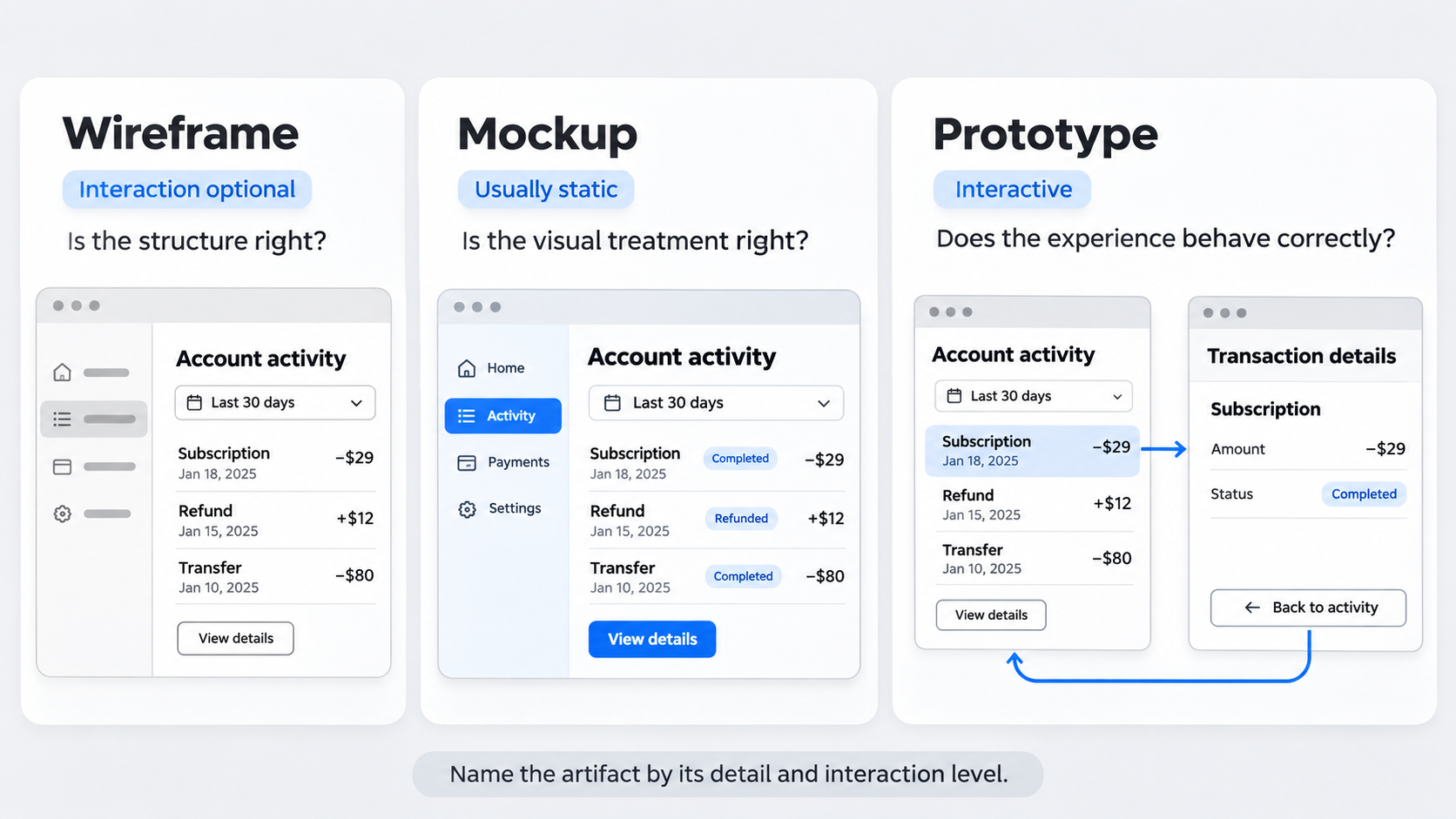 A wireframe represents structure and functional priority. It communicates what belongs on a screen, how information is organized, and which actions matter.
A mockup is a static representation of visual treatment, usually covering color, typography, imagery, spacing, and intended appearance.
A prototype represents interaction. It shows how an interface responds to input or moves between states, and it can have low, medium, or high visual fidelity.
“Prototype” and “high fidelity” are therefore not synonyms. A connected set of neutral screens may be a mid fidelity prototype, while a polished but static composition remains a mockup.
A practical terminology matrix
| Artifact | Primary question | Typical detail | Interactivity | Common review audience |
|---|---|---|---|---|
| Wireframe | Is the structure right? | Hierarchy, content regions, components | Optional | Product, design, research |
| Mockup | Is the visual treatment right? | Brand, typography, imagery, spacing | Usually static | Design, marketing, stakeholders |
| Prototype | Does the experience behave correctly? | Depends on fidelity | Required | Users, research, product, engineering |
We name artifacts by both visual detail and interaction level. Useful labels include:
Low-fi static account conceptsMid-fi clickable checkout flowMid-fi responsive dashboard reviewHigh-fi interactive onboarding testHigh-fi static visual-direction mockup
These names tell reviewers what the artifact represents and what feedback it can support.
When sequence, states, and transitions carry the greatest risk, use an interactive prototype approach focused on behavior rather than assuming polish will make the test more credible.
Set the review contract
Every review should begin with a short contract covering:
- Open decisions: Questions the review should resolve
- Fixed decisions: Choices already validated or constrained
- Assumptions: Beliefs that still need evidence
- Out of scope: Topics that should not consume review time
- Audience: The stakeholders, users, or specialists involved
- Objective: The decision expected at the end
Place this contract on the file cover and repeat it in the invitation. Add the relevant question and decision owner beside each screen.
If someone comments on color during a structural review, redirect the discussion: “Visual styling is intentionally unresolved. We need to decide whether the hierarchy and action priority support the task.”
Requests for more polish often expose unclear review planning. Without a defined scope, reviewers naturally respond to whatever is most visible.
What medium fidelity wireframes should include—and exclude
Medium fidelity wireframes need enough structure, content, behavior, and state coverage to answer a defined product question. They should omit details that create false confidence or redirect discussion toward unfinished visual design.
Realistic content matters more than decorative precision. Placeholder text can conceal wrapping, truncation, localization pressure, empty states, uneven cards, and confusing terminology.
Include: structure, content, components, and core states
A review-ready mid fidelity wireframe typically includes:
- Page hierarchy and screen purpose
- Persistent and contextual navigation
- Primary and secondary actions
- Forms, tables, cards, filters, menus, and repeated patterns
- Representative headlines, labels, values, helper text, and data
- Realistic content lengths and vocabulary
- Key interactions and validation rules
- Responsive changes that alter the task
- Annotations for rules that are inefficient to show
- Relevant loading, empty, error, success, disabled, and permission states
Not every screen needs every state. Include those that block completion, change available actions, create uncertainty, or test whether the structure holds up.
Responsive intent belongs in mid-fi when it changes priority or sequence. A mobile layout is not merely a narrow desktop frame: content may reorder, navigation may collapse, and supporting actions may move behind progressive disclosure. Our mobile wireframe flow system shows how to connect those decisions across an app journey.
Exclude: decisions that imply false finality
Deliberately leave out:
- Final brand colors and gradients
- Production typography
- Decorative imagery
- Refined shadows, textures, and effects
- Pixel-perfect spacing unless spacing is being evaluated
- Cosmetic animation
- Edge cases unrelated to the current decision
- Unreviewed generated patterns presented as approved solutions
A mature design system can make mid-fi work look finished. If its components introduce too much production styling, simplify or detach them so reviewers can see that structural choices remain open.
Visual restraint should not create ambiguity. Selected, disabled, invalid, and loading states still need distinct treatments, even when those treatments are provisional.
Use realistic content without overdesigning
Use representative language and data in a neutral presentation. Label sample content when stakeholders might mistake it for approved copy.
Stress-test the interface with:
- Long navigation labels
- Multi-line headings
- Missing values
- Large or negative numbers
- Localized text expansion
- Restricted or redacted content
- Unexpected user-entered values
- Empty collections
- Similar-looking item names
Avoid lorem ipsum when meaning, order, or length affects comprehension. “Request administrator access” tests both priority and available space; “Button” tests neither.
Representative content does not need to become a complete content-design project. Add enough realism to expose assumptions, then record unresolved copy decisions separately.
Review-readiness checklist: move from low-fi to mid-fi
The entry criterion for mid fidelity is not “the sketches look clean.” We need a structural direction worth testing and a question that rough artifacts cannot answer reliably.
Use this checklist on the critique cover:
- [ ] The target user and primary task are understood.
- [ ] The main success path can be described.
- [ ] A structural direction has been selected for validation.
- [ ] Major screens and navigation relationships are known.
- [ ] The review requires evidence about hierarchy, content, behavior, or states.
- [ ] The team is not comparing fundamentally different concepts.
- [ ] The audience and decision owner are named.
- [ ] Unresolved assumptions are visible.
If several boxes remain unchecked, stay low-fi. Mid-fi should reduce specific uncertainty, not compensate for an unclear product direction.
Entry criteria for mid fidelity
The user, task, and outcome should be stable enough to shape a coherent flow. The team does not need certainty about every screen, but it should be able to name the major steps and explain why the selected structure deserves testing.
Suitable review questions include:
- Can users distinguish primary and secondary actions?
- Does realistic content break the hierarchy?
- Can users recover from a failed submission?
- Is navigation understandable across roles?
- Does the mobile sequence request permission at the right point?
- Are empty and restricted states still useful?
A clickable mid-fi flow works well when the central risk concerns sequence, navigation, validation, or recovery. It can provide behavioral evidence without requiring production styling.
Before stakeholder review or usability testing
Before presenting or testing the flow:
- Replace placeholders when meaning or length affects decisions.
- Connect the critical path from entry to completion.
- Include recovery from an important failure.
- Label assumptions and open questions.
- Identify accepted and fixed decisions.
- Mark visual styling as out of scope.
- Distinguish disabled, selected, loading, error, and success states.
- Write the questions the session should answer.
- Check links, back behavior, and branches.
- Remove irrelevant dead ends.
Rather than asking whether participants like the wireframe, give them a realistic task. Observe where the interface supports or blocks progress, then connect the findings to the review contract.
Annotated mid fidelity wireframe examples
Useful mid fidelity wireframe examples act as decision maps, not image galleries. Each should show what is represented, what remains unresolved, and what evidence would allow the work to advance.
An annotation block beside each screen can contain:
- Review objective
- Assumptions
- Open questions
- Accepted decisions
- Decision owner
- State coverage
- Out-of-scope topics
This context prevents an isolated frame from looking like a finished recommendation.
Dashboard example
A dashboard wireframe should include persistent navigation, metric hierarchy, date filtering, realistic labels and values, data recency, and role-sensitive actions. Use believable variations in the data rather than identical placeholder cards.
Represent:
- Initial loading
- No data for the selected period
- Partial data failure
- Restricted metrics
- Filter application and reset
- Last-updated information
- Role-based actions
Leave chart colors, decorative visualization styling, and final density unresolved. The review should determine whether users can locate, interpret, filter, and act on the right information. Our dashboard design decision framework provides a deeper structural method.
Landing page example
A landing-page wireframe should test headline length, value-proposition order, proof placement, CTA hierarchy, navigation, and responsive section sequence.
Include:
- A representative headline and supporting statement
- Primary and secondary CTA labels
- Plausible proof or credibility content
- Navigation and mobile-menu behavior
- Section order at important viewport changes
- A realistic long-form content block
- Footer paths relevant to the task
Exclude final imagery, brand typography, decorative transitions, and polished effects. Advance when users understand the offer, identify the primary action, and can find the evidence they need.
Mobile onboarding example
A mobile onboarding wireframe should map progress, back and skip behavior, permission timing, validation, and interrupted-session recovery.
Annotate assumptions about:
- Whether account creation is required
- When consent is requested
- Why a permission is needed
- Whether progress is saved
- What happens after interruption
- Which steps can be skipped
- How users return to an earlier answer
Include a critical error path instead of showing only an uninterrupted happy path. A reusable app prototype screen-and-state framework can keep sequence and recovery visible without turning the artifact into finished UI.
Form example
A form wireframe should show realistic labels, helper text, required and optional fields, conditional sections, and submission behavior.
Include:
- Inline validation
- Invalid formats and required-field errors
- Disabled submission
- Loading after submission
- A server-side failure
- Preservation of entered data
- Confirmation and next steps
The key question is whether users understand what is required, can correct mistakes, and know what happened after submission. If the facilitator must explain the structure, it is not ready.
Represent interactions and edge states without overdesigning
We can communicate mid-fi behavior through linked screens, component variants, concise annotations, and state tables. The representation should remove relevant ambiguity without becoming more elaborate than the risk requires.
Interaction completeness and visual fidelity are separate dimensions. A neutral prototype can cover a complete critical path, while a polished mockup may show no meaningful behavior.
Choose the right representation
Use linked screens for:
- Multi-step sequences
- Navigation changes
- Branching paths
- Overlays and dialogs
- Back and exit behavior
- Cross-screen error recovery
Use variants for local changes such as selected, disabled, expanded, invalid, loading, and confirmed states. Use annotations for timing, business rules, permissions, data dependencies, and behavior that would be inefficient to prototype.
A compact state table can document shared logic:
| State | Trigger | Interface response | Available recovery |
|---|---|---|---|
| Loading | Request submitted | Disable repeat action; show progress | Wait or cancel |
| Empty | Valid request returns no records | Explain condition; offer next action | Reset filter or create item |
| Error | Request fails | Preserve context; state the problem | Retry or choose another path |
| Success | Action completes | Confirm result and next step | Continue or view result |
Prioritize states by risk
Start with the happy path, then add failures that could prevent completion or damage trust. Forms, uploads, edits, purchases, and submissions usually need explicit validation and recovery.
Prioritize:
- Invalid or missing input
- Network or server failure
- Empty results
- Permission restrictions
- Partial data
- Interrupted sessions
- Duplicate actions
- Expired or unavailable content
Represent latency when delayed feedback could cause repeated actions or abandonment. Defer cosmetic transitions unless motion affects comprehension, orientation, or accessibility.
Mid fidelity wireframe templates and reusable component patterns
A useful mid fidelity wireframes template accelerates decisions across a flow. It should not merely produce isolated, visually consistent screens.
For a Figma-style file, we recommend:
- Cover and review contract
- Flow map
- Neutral foundations
- Reusable components
- State variants
- Screen templates
- Annotated flows
- Decision log
- Archive of rejected directions
Consistency makes behavior easier to inspect. Excessive polish can make reviewers assume that components and patterns are already approved.
A practical template structure
The cover should contain the objective, artifact label, review date, participants, and decision owners. State open, fixed, and out-of-scope decisions before showing screens.
The flow map should connect:
- Entry points
- Critical and alternate paths
- Failures and recovery
- Exits
- External dependencies
Build neutral components for layout, navigation, forms, feedback, and data display. Name variants by behavior—such as Input/Error, Button/Loading, or Table/Empty—rather than appearance alone.
Place an annotation block beside each frame so its assumptions, questions, accepted decisions, and state coverage remain clear outside a live presentation.
Guardrails for reusable components
Use a limited neutral palette and restrained type scale. Tokens can support consistency without importing final brand styling.
Our guardrails are:
- Name variants by state and behavior.
- Simplify components when polish distracts reviewers.
- Keep final brand assets out of the mid-fi library.
- Avoid pixel-level tuning unless it answers the review question.
- Do not let available components dictate product structure.
- Mark provisional components clearly.
- Preserve alternatives when a pattern remains unresolved.
Templates should speed up representation, not standardize untested assumptions.
From prompt to approved structure with UXMagic
AI-assisted wireframing can shorten the path from a rough concept to consistent, review-ready screens. It cannot determine whether the hierarchy, task model, or interaction logic is correct.
Our workflow is guarded: describe, generate, simplify, challenge, review, and refine. The UXMagic AI UI generator creates a structured starting point, while the design team remains responsible for testing its assumptions.
Describe, generate, and simplify
Start by describing:
- The target user and goal
- The purpose of each screen
- Required content and actions
- Product and technical constraints
- Relevant roles and permissions
- Critical states and recovery paths
- Responsive requirements
Generate related screens as a coherent flow rather than isolated compositions. Then reduce color, typography, imagery, and effects until the artifact clearly communicates mid-fi status.
Replace generic generated copy with representative content. A layout may appear balanced only because every label is short and every card contains the same amount of text.
Teams planning further refinement can use an AI-to-Figma conversion workflow to keep generated UI editable and reviewable.
Challenge, review, and refine
Before stakeholders see the output, ask:
- Does the hierarchy support the main task?
- Are repeated patterns consistent?
- Is the most prominent action also the most important?
- Which assumptions did the generated layout introduce?
- Does realistic content break the composition?
- Are roles, permissions, and responsive behavior represented?
- What happens when data is missing or an action fails?
Add the necessary validation, loading, empty, error, success, and permission states. Record assumptions, questions, and decisions beside each screen.
Refine only approved screens into high-fidelity UI. Restructure unresolved areas instead of polishing them, following the discipline used to create AI-generated interfaces that are actually shippable.
AI-assisted wireframing guardrails
Treat every generated output as a hypothesis, not a recommendation. Familiar patterns may look credible while conflicting with user priorities or product constraints.
Check manually:
- Accessibility requirements
- Keyboard and focus behavior
- Responsive changes
- Content realism and localization pressure
- Edge states and data dependencies
- Permissions
- Technical feasibility
- Design-system compatibility
Keep a decision log recording what changed, why it changed, and what evidence supports the choice. Speed should reduce production effort, not erase design rationale.
Exit criteria: when to advance to high fidelity or handoff
The endpoint of mid-fi is resolved structural risk, not a perfect-looking wireframe. Advance when the questions that justified mid fidelity have credible answers.
Readiness for high-fidelity design is different from readiness for implementation. Mid-fi can support early technical review, but it rarely replaces final visual, interaction, accessibility, content, and responsive specifications.
Advance to high fidelity when
Move forward when:
- The primary flow has been validated.
- Navigation and hierarchy are understood.
- Representative content works within the model.
- Critical states and recovery paths are represented.
- Responsive intent is clear.
- Stakeholders have accepted the structural decisions.
- Remaining questions concern visual treatment or implementation refinement.
- Decisions and unresolved risks are recorded.
The exit gate should reflect the risks attached to the current product decision, not every theoretical edge case.
Return to low fidelity or revise mid-fi when
Return to low-fi if testing reveals that the team selected the wrong concept, audience, task model, or information architecture. Fundamental uncertainty needs exploration, not more detailed screens.
Revise the mid-fi flow when:
- Realistic content breaks the hierarchy.
- Responsive layouts lose essential actions or context.
- Major screens rely on unvalidated assumptions.
- Participants cannot complete the primary task.
- Error recovery creates a dead end.
- Reviewers need explanations the interface should provide.
- Roles or permissions change the structure.
Structural failure calls for reconsideration, not greater polish.
Prepare for developer collaboration
Share the flow map, state coverage, assumptions, dependencies, and unresolved questions with developers early. Technical feedback can expose constraints before detailed visual work begins.
Clarify that neutral spacing, typography, and components are not production specifications. Label provisional behavior and distinguish confirmed requirements from hypotheses.
Before implementation, create the final interaction, visual, responsive, accessibility, and content specifications required by the approved direction. Mid-fi informs handoff; it rarely completes it.
Turn rough concepts into review-ready wireframes
Use UXMagic to describe the user, task, content, constraints, and critical states, then generate a coherent flow and simplify it to mid fidelity. Start creating with UXMagic and test the structure before investing in polish.