
TL;DR
Copying components and changing colors does not create a shadcn design system. We consider it a system only when shared components are governed by semantic tokens, documented APIs, accessibility checks, clear ownership, controlled distribution, and release rules.
What is a shadcn design system?
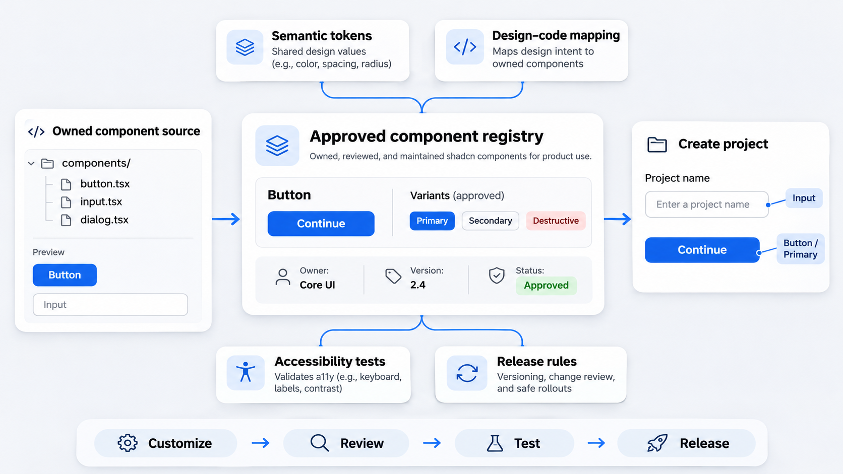 Shadcn/ui provides adaptable component source rather than hiding implementation behind a conventional dependency. Teams own the code, gaining control over styling, structure, and behavior. They also own every inconsistency they introduce.
We expect a working system to include:
- Governed design tokens
- Documented component variants
- Design and engineering owners
- Accessibility and regression testing
- Controlled distribution
- Versioning and migration rules
Visual consistency alone is insufficient. Figma and coded components can look identical while using different tokens, variant names, states, or behavior. A reliable system aligns both appearance and meaning.
Source code is the starting point
Local ownership lets teams customize components without waiting for a package maintainer. Shadcn implementations for other frameworks follow the same foundation-first approach.
That flexibility requires discipline. An unreviewed utility class, prop, or copied primitive can become an unofficial API that other teams depend on.
The design system readiness checklist
We assess readiness across several areas:
- Foundations: Semantic color, spacing, typography, radius, and motion tokens
- Components: Documented variants and supported combinations
- Design: Figma variables and properties mapped to code
- Ownership: Maintainers who approve and deprecate changes
- Accessibility: Defined checks across behavior and themes
- Distribution: One approved consumption channel
- Releases: Versions, notes, and migration guidance
A visual asset collection is a kit. Reusable coded elements form a library. Governance, testing, releases, and maintenance turn them into an operational system.
Build the shadcn design system architecture
We organize a scalable architecture into four layers:
- Primitives: Foundational elements such as Button and Dialog
- Shared components: Reusable combinations with stable rules
- Product patterns: Domain workflows such as payment confirmation
- Pages: Product-specific layouts and content
Stability should decrease as context increases. We promote patterns only when products share the same semantics, behavior, and API—not merely similar visuals.
Primitives and shared components
Button, Input, Dialog, and Select belong in the shared layer when they have stable behavior, accessibility, tokens, and narrow APIs. Maintainers should protect those contracts.
Product-specific action arrangements should remain compositions rather than expanding a primitive with one-off variants.
Product patterns and page compositions
A billing cancellation flow may combine content rules, permissions, analytics, validation, and follow-up actions. That makes it a product pattern, not another Dialog variant.
Keeping workflows outside primitives preserves understandable APIs and lets product teams evolve without destabilizing every consumer.
Draw the ownership boundaries
We define who can change primitives, approve variants, publish registry updates, and synchronize Figma. Shared-system owners decide whether requests belong in tokens, variants, compositions, or product code.
Every exception needs an owner and review date. Otherwise, temporary overrides become permanent architecture.
Create semantic tokens for every theme
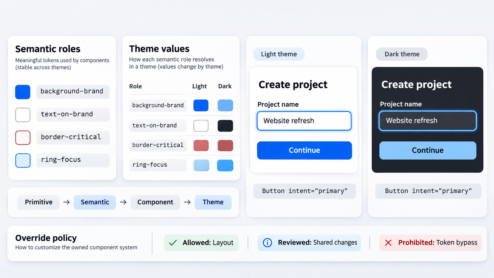 Shadcn design tokens should describe purpose rather than literal values. We replace raw color utilities with roles such as
background-brand, text-on-brand, border-critical, and ring-focus.
Start with semantic roles
Our preferred model includes primitive values, semantic aliases, component-specific tokens where necessary, CSS variables, and Tailwind mappings.
Names such as background-surface preserve intent as themes change. Hue-based names such as blue-600-button tie the system to one implementation.
Layer themes without rewriting components
Themes should change semantic variable values while preserving component APIs. A Button can retain intent="primary" while each brand supplies its own background and text values.
We keep status colors and data-visualization palettes separate from brand expression so their meanings remain stable.
Set override rules
We classify overrides as:
- Allowed: Layout changes that preserve the contract
- Reviewed: Reusable visual or state changes
- Prohibited: Changes that bypass tokens, accessibility, or approved variants
When a visual decision repeats, we convert it into a token or supported variant instead of building an undocumented theme from utilities.
Map Figma variables and properties to code
The goal of shadcn Figma-to-code work is semantic parity, not screenshot imitation. Figma variables, CSS variables, Tailwind utilities, and component props should express the same intent.
Our review of what effective Figma design system examples get right explains why broad component coverage is not enough.
Map tokens by meaning
Use an auditable mapping:
| Figma mode | CSS variable | Tailwind utility | Usage |
|---|---|---|---|
| Light / Surface | --background-surface | bg-background-surface | Container background |
| Dark / Surface | --background-surface | bg-background-surface | Same role, dark value |
| Critical / Border | --border-critical | border-border-critical | Error or destructive status |
| Focus / Ring | --ring-focus | ring-ring-focus | Keyboard focus |
We flag every Figma alias without a code equivalent and every CSS variable absent from Figma.
Map properties to component APIs
A Figma intent property should use the same values as its coded variant. The same rule applies to size, density, and emphasis.
Hover and focus are interaction states, not consumer-selected variants. Figma can demonstrate them without implying that developers set state="hover".
Automate within constraints
AI can accelerate design and implementation once constraints are encoded. At uxmagic.ai, we generate editable UI that teams can review against approved components, tokens, and composition rules.
Our AI-to-Figma workflow shows how generated interfaces can remain editable. We recommend rejecting unsupported variants, arbitrary spacing, and one-off colors before production.
Govern variants with a narrow, shared language
Unlimited customization creates ambiguity at scale. We define a compact API shared by design and engineering, including defaults, allowed values, invalid combinations, and behavior.
Use one variant taxonomy
Useful categories include:
- Intent: primary, secondary, destructive, quiet
- Size: small, medium, large
- Density: compact, standard, comfortable
- Emphasis: strong, subtle
We avoid overlapping terms when they represent the same role. One concept should have one name.
Do not model every state as a variant
We separate environmental states such as hover and focus, internal states such as loading, and consumer-controlled states such as disabled or invalid. Code should own environmental behavior.
Add a variant approval rule
A new variant needs a repeatable use case, Figma-to-code mapping, accessibility review, test coverage, and clear differentiation. If a request describes a workflow, we prefer composition.
Choose when to extend, wrap, compose, fork, or freeze
Customization should be a recorded architecture decision.
| Change | Preferred approach |
|---|---|
| Token or approved styling | Extend |
| Enforced cross-cutting rule | Wrap |
| Product workflow | Compose |
| Different structure or behavior | Fork |
| Stable version awaiting review | Freeze |
Extend when the existing contract still works
We extend through tokens and approved variants when structure and behavior remain intact. Extensions must stay within documented boundaries.
Wrap or compose to enforce a real rule
A wrapper should enforce analytics, permissions, content requirements, or another meaningful contract. We compose primitives for workflows instead of inflating shared APIs.
Fork or freeze deliberately
We fork when structure or behavior materially diverges, documenting why and assigning an owner. Freezing can also be safer than importing upstream changes without review.
Protect accessibility across modes and customizations
Accessibility remains our release responsibility. Local styles, wrappers, and structural changes can break an accessible baseline.
Check behavior, not screenshots alone
We test focus order, focus return, dismissal, keyboard navigation, accessible names, errors, loading, disabled states, and reduced motion. Screenshots cannot verify keyboard or assistive-technology behavior.
Test every semantic theme
Light, dark, high-contrast, and branded themes must preserve readable text, visible focus, status meaning, and usable controls. We fix contrast problems in semantic tokens rather than patching components with raw values.
Distribute approved components and manage upstream change
An internal registry can distribute approved source, tokens, dependencies, examples, and guidance. We treat upstream changes as review inputs rather than automatic upgrades.
Design the internal registry contract
Each registry item should declare its source, version, dependencies, required tokens, examples, accessibility expectations, and migration notes. Teams should not publish incompatible components under the same primitive name.
Review upstream changes safely
We compare behavior, accessibility, API stability, styling, dependencies, and local modifications. Each update is then adopted, adapted, deferred, or rejected.
Release like an owned product
Meaningful API and token changes need release notes, migration instructions, maintainers, and deprecation timelines. Shared components are internal products, not occasional cleanup projects.
Document and test the owned implementation
Documentation should describe the components teams actually use. We expose supported variants, themes, states, behavior, and boundaries through Storybook or an equivalent tool.
Document decisions and boundaries
For each item, we document props, defaults, valid combinations, tokens, accessibility notes, examples, anti-patterns, ownership, and architectural layer.
Build a high-value test matrix
We prioritize interaction, accessibility, and visual regression tests around consequential failures: broken overlays, inaccessible focus, unreadable themes, incorrect status semantics, and unsupported combinations.
Set the definition of done
A component is complete when Figma properties, code APIs, documentation, accessibility checks, and regression coverage agree. We apply the same standard to generated work outlined in our guide to creating AI UI that is actually shippable.
Roll out the shadcn design system in phases
We recommend starting with duplicated components and a small semantic token contract rather than rebuilding everything at once.
Phase 1: audit and constrain
Inventory duplicated components, raw values, conflicting names, and product forks. Then select the first primitives and token categories to govern.
Phase 2: map and migrate
Align Figma properties with CSS variables, Tailwind utilities, and coded variants. Consolidate duplicates incrementally and provide compatibility paths.
Phase 3: distribute and improve
Publish approved components through the registry, monitor exceptions, and review upstream changes regularly. Our operating rhythm is simple: constrain, map, distribute, and ship.
Turn your shadcn components into a system
Use uxmagic.ai to design and ship editable interfaces that follow approved tokens, components, and design rules. Start generating at uxmagic.ai.