
TL;DR
Our approach to how to use Figma AI to create wireframes is simple: define the user task, choose the right starting tool, request low-fidelity screens and states, then edit the result in Figma. The best output is not the prettiest. It is the easiest to question, rearrange, test, and discard.
How to use Figma AI to create wireframes: the quick workflow
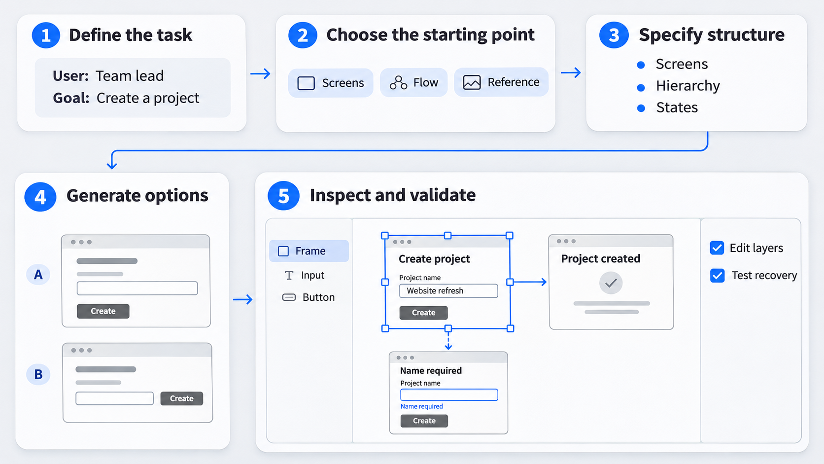 Follow five steps:
- Define the user task and success condition.
- Choose Figma Design, FigJam, Figma Make, or screenshot-to-UI.
- Specify screens, hierarchy, constraints, states, and fidelity.
- Generate one or two structural options.
- Inspect, edit, and validate the flow.
Treat the result as a structural hypothesis, not a final product decision. Feature names, access, and menu locations may vary, so we recommend learning the workflow rather than relying on a fixed sequence of buttons.
The five-step answer
Document what the user must accomplish and what confirms success. Use text-to-wireframe when starting from requirements. Choose screenshot-to-UI when a reference already captures a useful structure.
Request connected screens and alternate states explicitly. Select the clearest result, then move into direct editing before adding visual polish.
What a useful AI wireframe should contain
Look for:
- Clear navigation and content hierarchy
- An obvious primary action
- Realistic content regions
- Connected screens
- Relevant loading, empty, error, validation, and success states
- Editable layers with understandable layout logic
A convincing image is not enough. Flattened or disorganised output may require substantial rebuilding before it supports product work.
Figma Design vs. FigJam vs. Figma Make: choose the right starting point
The best starting point depends on whether we are mapping a journey, creating screens, exploring behaviour, or adapting a reference.
| Starting point | Best input | Expected deliverable |
|---|---|---|
| Figma Design | Screen requirements | Editable interface frames |
| FigJam | Journeys and workshop ideas | Flow map and screen inventory |
| Figma Make | Behavioural concept | Interactive exploration |
| Screenshot-to-UI | Visual reference | Reconstructed, editable structure |
Start in Figma Design for editable screen structure
Choose Figma Design when the wireframe needs to become a layered interface. Keep the first pass plain: grayscale, simple type, clear regions, and minimal decoration.
For mobile work, establish the whole journey before styling individual screens. Our practical system for mobile wireframe flows covers navigation, recovery, and screen purpose.
Start in FigJam for flows and collaborative exploration
FigJam suits journeys, screen inventories, decision branches, and workshops. It lets us settle what must happen before debating visual details.
Once the sequence is stable, bring the approved inventory into Figma Design. A flow diagram clarifies logic, but it is not an editable interface.
Use Figma Make when behaviour matters more than a static wireframe
Consider Figma Make when interaction is central to the concept. We would not default to it for every low-fidelity wireframe: functional behaviour can make weak information architecture feel more resolved than it is.
If the work must become a maintainable design file, plan the Figma Make-to-Figma Design migration.
Start with UXMagic when a strong reference already exists
Screenshot-to-UI can reduce repetitive reconstruction when a reference demonstrates suitable navigation, density, grouping, or action placement.
The aim is not duplication. We preserve useful patterns while adapting the content, states, accessibility, brand, and product logic.
Use this prompt formula to get low-fidelity wireframes—not polished mockups
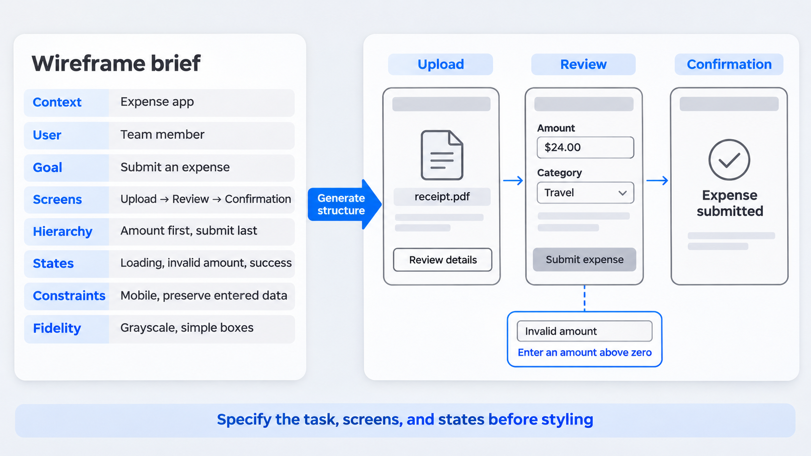 Use this formula:
Product context + target user + user goal + required screens + hierarchy + states + constraints + fidelity.
“Make a modern app” says little about product logic. For flow validation, explicitly exclude gradients, final imagery, decorative effects, and marketing sections.
Copy-ready prompt template
Create a low-fidelity wireframe for [product], used by [target user] to complete [task]. Include [screens in order]. Prioritise [content], with [primary action] as the main action.
Use [navigation model] and include [relevant states]. Design for [device or width] with clear labels and a logical reading order. Use grayscale, placeholder imagery, simple boxes, and no invented features.
Prompt for screens and states, not just a page
List screens in sequence and state what happens on each. For checkout, that might include cart, identity, shipping, delivery, payment, review, and confirmation.
Add relevant empty, loading, error, validation, permission, and success states. These often reveal problems hidden by a polished default screen.
Control hierarchy and constraints
Specify the primary action, subordinate actions, required content, persistent navigation, and responsive expectations.
Prohibit unsupported features and unrelated landing-page sections. Otherwise, generic promotional content may replace the product structure we need to test.
Create a low-fidelity wireframe in Figma with AI, step by step
Generate a coherent flow rather than disconnected screens. We want frames that can be reviewed as a sequence.
- Define the user task and screen inventory
Write down the entry point, intended outcome, and minimum required screens. Separate essential steps from optional ideas.
For example: “A new administrator succeeds when the workspace is configured and the team reaches the dashboard.”
- Generate the first structural draft
Request the target device, persistent navigation, core regions, and repeated patterns. Ask for one or two hierarchy options rather than multiple visual themes.
Choose the clearest task path. An AI-to-Figma conversion workflow can help move generated concepts towards editable designs.
- Strip premature visual polish
Remove brand colours, final imagery, shadows, expressive typography, and decoration. Retain only styling that communicates hierarchy, state, or interaction.
High fidelity can make untested structure appear approved.
- Connect and test the critical path
Connect the primary journey and check whether each next action is clear. Test from the genuine entry point, including recovery paths.
Use interactive prototypes to test behavior, states, and transitions after the sequence makes sense.
Turn a reference screenshot into an editable wireframe with UXMagic
When a reference has the right hierarchy, screenshot-to-UI may provide a useful starting point. Our workflow is: capture, simplify, and refine.
- Choose a reference for structure, not decoration
Assess its navigation, grouping, density, repeated patterns, and primary-action placement. Reject attractive references that do not support the intended task.
- Convert the screenshot into editable UI with UXMagic
Use the AI UI generator for Figma-ready designs to create a working starting point. Review how it interpreted the major regions and repeated elements before polishing anything.
- Simplify the output into a wireframe
Remove source branding, colours, imagery, decorative effects, and irrelevant content. Replace labels with product-specific language and realistic examples.
Keep only patterns that improve the task.
- Refine the structure in Figma
Normalise spacing, repair resizing behaviour, rebuild repeated elements as components, and add missing states. The result must serve the current product rather than merely resemble the reference.
Three AI wireframe examples: SaaS, ecommerce, and analytics
Prompts should reflect the decisions within each product task.
SaaS onboarding flow
Request welcome, workspace details, team invitations, integrations, and completion. Include validation, failed invitations, skipped steps, and saving states. Then ask whether administrators can understand progress and recover from problems.
Ecommerce checkout flow
Request cart, identity, shipping, delivery, payment, review, and confirmation. Include an empty cart, invalid address, unavailable delivery option, and declined payment. Check whether shoppers retain context and entered data.
Analytics dashboard
Request navigation, filters, key indicators, charts, alerts, and a detail table. Include loading, empty, partial-data, error, and narrow-screen states. Test whether users can investigate a change and reach supporting detail.
Clean the AI output: Auto Layout, components, variables, and constraints
Editable output is not necessarily maintainable. We review layout behaviour, reuse, spacing, naming, and responsiveness before applying polish.
Our guide to generating AI interfaces that are actually shippable covers the broader transition to dependable UI.
Repair layout behaviour first
Apply Auto Layout where it supports rows, cards, forms, navigation, and sections. Set padding, gaps, alignment, sizing behaviour, and constraints intentionally.
A frame that works at one width may fail when its content or viewport changes.
Convert repeated patterns into components
Create components for recurring navigation, buttons, fields, cards, alerts, and table rows. Use variants for meaningful states rather than minor cosmetic differences.
These Figma design system examples illustrate how reusable patterns can preserve design logic.
Normalise variables and naming
Add spacing, colour, typography, and radius variables once the direction is stable. Avoid building a detailed token system for a disposable concept.
Name frames, components, groups, and significant layers so colleagues can understand the file without a guided tour.
Test responsiveness and content stress
Test narrow viewports, long labels, dense data, empty content, and localisation. Confirm that navigation, tables, buttons, and cards reflow instead of overflowing.
Know when to stop prompting and start designing
Stop prompting when the draft has a usable hierarchy and flow. Direct editing is usually better for local changes to labels, spacing, order, or components.
Regenerate only when the underlying concept is wrong
Regenerate when the information architecture, navigation, or task flow requires fundamental change. Edit directly when the concept works but its execution does not.
Use a wireframe kit when the pattern is already known
A wireframe kit offers predictability for familiar forms, tables, navigation, and mobile patterns. AI generation is more useful when exploring unfamiliar structures or interpreting detailed requirements.
Move from low fidelity to high fidelity deliberately
Confirm the critical path and edge states before introducing brand tokens, final type, imagery, and motion.
We still own prioritisation, accessibility, content, interaction logic, and failure handling. AI speeds up exploration; it does not make product decisions for us.
Evaluate an AI wireframe before you ship the concept
Review product logic and file quality separately so visual polish cannot conceal structural problems.
Hierarchy and task completion
Confirm that the primary action is clear, every screen has a purpose, and the task can be completed without guessing. Navigation and progress should remain consistent.
States and edge cases
Represent relevant loading, empty, error, validation, success, permission, and cancellation paths. Users should be able to recover without losing work.
Accessibility and responsiveness
Document reading order, labels, focus expectations, keyboard behaviour, contrast, zoom, and touch assumptions. Test realistic content across relevant widths.
Editability and system readiness
Check layers, Auto Layout, constraints, components, variables, and naming. Resizing should not break the interface, and repeated patterns should behave consistently.
Turn your reference into an editable Figma starting point
Use UXMagic to capture the useful structure from a reference, simplify the result, and refine it in Figma. Start your editable wireframe at uxmagic.ai.