
TL;DR
A high-fidelity prototype must reflect the components, tokens, states, and constraints used in production. We recommend judging quality by approved-component usage, correct variants, state coverage, accessibility, responsive behavior, and the corrections required at handoff—not by screenshot polish alone.
What is a prototype in UI/UX design?
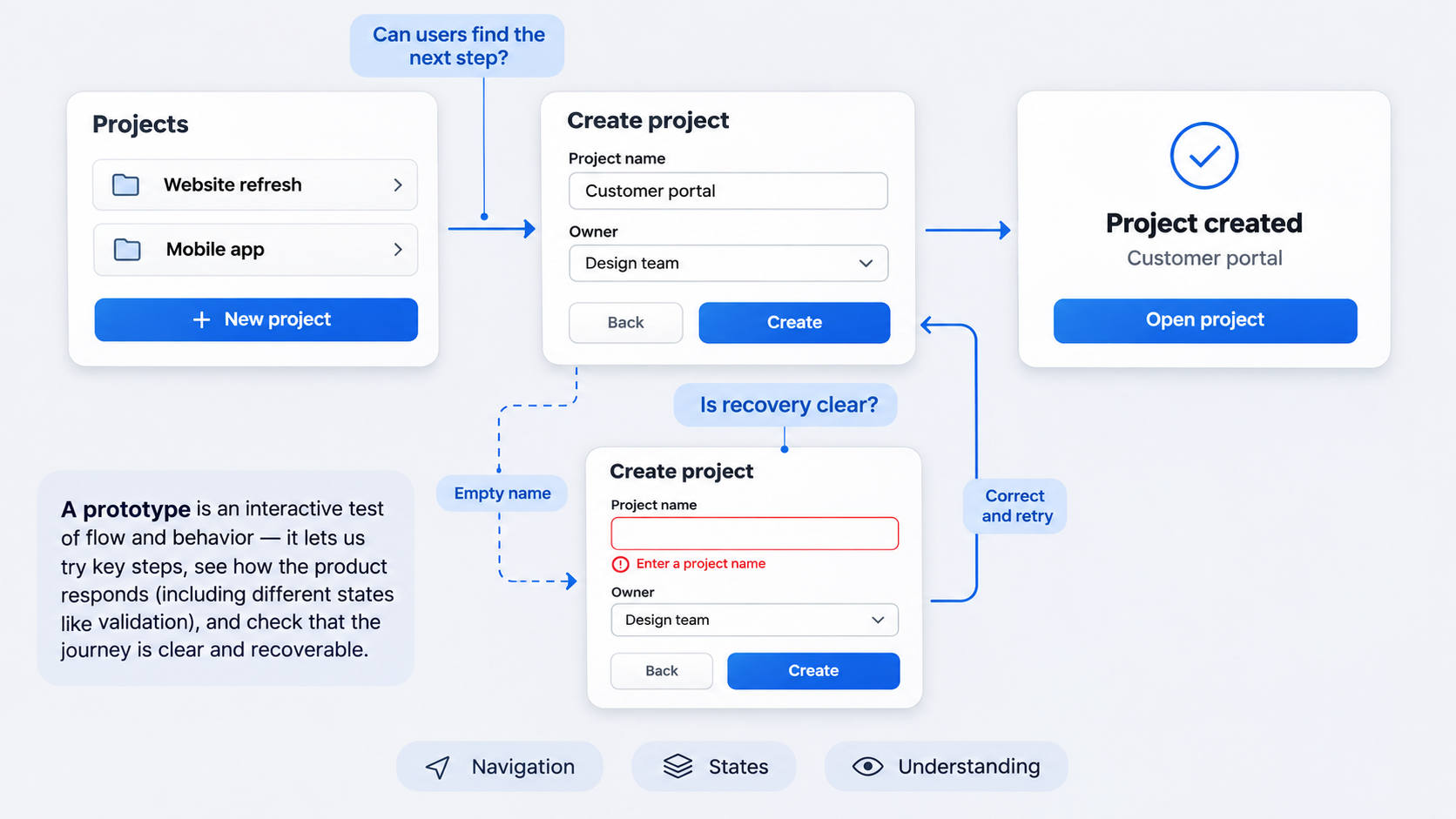 A prototype is an interactive representation used to test a product flow, behavior, or assumption before production. The Ocean Community Challenge similarly defines it as an early product sample built to test a concept or process and gather feedback.
In software engineering, prototypes may test technical feasibility. In UI/UX design, they usually test navigation, interactions, content, states, and user understanding.
Fidelity involves more than appearance. A polished screen with incorrect components, missing error states, or impractical responsive behavior may be visually detailed but operationally weak.
This article covers software prototypes, not the unrelated Prototype video game.
Prototype vs wireframe, mockup, proof of concept, and MVP
Each artifact answers a different question:
| Artifact | Primary purpose | Interactivity | Typical audience |
|---|---|---|---|
| Wireframe | Test structure and hierarchy | Limited | Design and product teams |
| Mockup | Review visual direction | Usually static | Stakeholders and designers |
| Prototype | Test flows and behavior | Interactive | Users and product teams |
| Proof of concept | Test feasibility | Functional where needed | Engineering and product leaders |
| MVP | Deliver usable customer value | Fully functional | Real customers |
The right term depends on intent. We use interactive mockup for a visual flow, proof of concept for technical feasibility, demo for a guided presentation, and pilot for a limited real-world release.
What makes a prototype production-relevant?
We judge a prototype by whether it can survive design review and engineering handoff. Strong signals include feasible implementation, complete states, few corrections, and alignment with the real component library.
A clickable design can still be disconnected from production. It may contain hand-drawn controls, arbitrary spacing, detached instances, or interactions the design system cannot support.
The fastest prototype is not necessarily the first one generated. It is the one that creates the least avoidable rework.
How to build a prototype with an existing design system
We recommend this sequence:
- Define the flow and assumptions being tested.
- Identify approved system sources.
- Generate or compose the required screens.
- Map elements to approved components.
- Validate variants, properties, tokens, and states.
- Test responsiveness and accessibility.
- Classify exceptions.
- Prepare a traceable handoff.
Early exploration can use placeholders. Before approval, replace them or disclose the unresolved exceptions. An app prototype template built around screens and states can help teams move beyond the happy path.
Start with the flow, not the screens
Document the target users, entry points, decisions, success conditions, recovery paths, permissions, dependencies, and required loading, empty, validation, and error states.
Prompts should describe intent without inventing visual patterns. For example: “Create an account setup flow using our approved form, progress, alert, and button patterns. Include validation, submission, service-error, and success states.”
Set prototype acceptance criteria before generation
Set criteria for approved-component usage, variant selection, token compliance, state coverage, responsive behavior, accessibility, and handoff readiness.
Define approval boundaries too. A spacing adjustment may need design review, while a new input pattern should involve design-system and accessibility owners.
Connect the prototype to the real design system
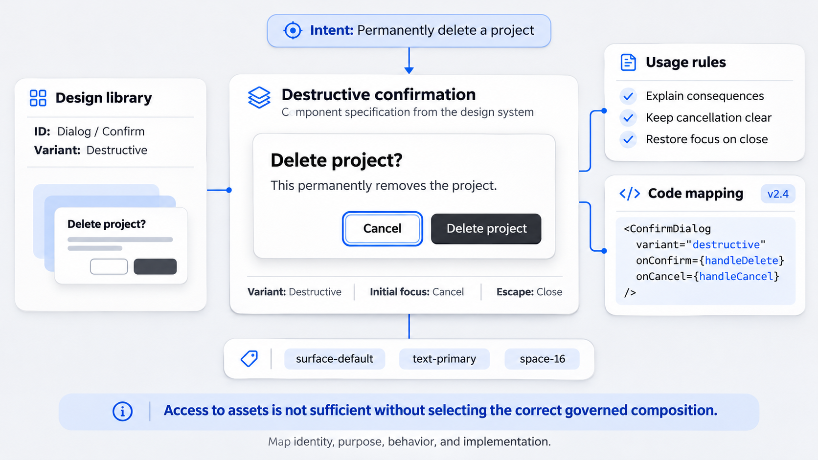 A design system may span Figma libraries, documentation, tokens, coded components, accessibility guidance, and usage examples.
Name the source of truth for each concern. If design files, documentation, and code disagree, resolve the conflict rather than allowing the prototype to choose silently.
Reviewing what strong Figma design system examples get right can help teams assess naming, variants, library structure, and governance before introducing AI generation.
Import is not the same as semantic mapping
Asset access does not prove that a tool understands when to use each asset.
“Destructive confirmation,” for example, requires more than a generic dialog. It may involve an approved destructive variant, button hierarchy, warning treatment, content pattern, focus behavior, and cancellation path.
Semantic mapping connects user intent to an approved composition.
Map components across Figma, documentation, and code
For each component, track its Figma identity, documented purpose, restrictions, variants, properties, token references, production name, and implementation reference.
Flag missing or conflicting mappings. A convincing substitute can still conceal a production blocker.
Use approved components, variants, properties, and nested instances
Approved-component usage is a practical quality measure for AI-assisted UI design. A tool that invents components by default may speed up initial output while creating design debt.
Preserve component identity and relationships where possible. Editable instances are easier to review, update, and hand off than flattened copies.
Choose the right variant—not merely the closest-looking component
Validate hierarchy, intent, size, density, icon placement, content length, context, and interaction state.
Use component properties instead of detaching instances or applying cosmetic overrides. A secondary button restyled to look destructive is not equivalent to an approved destructive variant.
Preserve nested instances and composition rules
A field may contain a label, input surface, icon, helper text, validation message, and status indicator. That composition encodes behavior, not just appearance.
Flattening these elements weakens update paths, accessibility, and developer traceability.
Measure the approved-component usage rate
Use this calculation:
Approved-component usage rate = approved component instances requiring no replacement ÷ all component-eligible elements × 100
Track invented components, incorrect variants, and detached or overridden instances separately. This shows whether the underlying issue is library coverage, semantic mapping, or designer control.
Validate tokens, states, responsiveness, and accessibility
Pixel similarity is a weak measure of design-system fidelity. We validate visual tokens, component semantics, behavior, responsive constraints, and accessibility together.
A prototype with matching colors but no focus, loading, or error behavior is incomplete.
Check token fidelity beyond color matching
Audit semantic colors, typography, spacing, corner radius, elevation, layout grids, and density modes.
Hard-coded values and local overrides create a parallel visual language. The result may resemble the product while remaining disconnected from the system that maintains it.
Prototype every consequential state
Where relevant, include default, hover, focus, pressed, selected, disabled, loading, empty, success, warning, validation, and error states.
Connect states to approved variants instead of duplicating one-off frames. Our guide to designing interactive prototypes with credible states and transitions explains why behavior changes what teams can learn from testing.
Test responsive behavior and layout constraints
Validate reflow, wrapping, stacking, overflow, density changes, and breakpoint behavior. Mobile should not be treated as a scaled-down desktop screenshot.
Layout changes should follow established constraints rather than depend on manually redrawn screens.
Preserve accessibility encoded in the system
Check focus visibility, target size, contrast, labels, error association, reading order, and keyboard behavior.
Approved components often contain accessibility safeguards. Detaching or overriding them can remove those protections without creating an obvious visual defect.
Before and after: generic AI UI vs design-system-native prototypes
The useful comparison is not which version looks more impressive. It is which one requires fewer corrections before implementation.
We recommend annotating component sources, variants, properties, tokens, states, responsive rules, accessibility behavior, and exceptions.
Example 1: an AI-generated analytics dashboard
A generic dashboard may invent card styles, arbitrary gaps, and unsupported filters. It may include a page-level spinner while omitting empty, permission, and error states.
A system-native version uses approved navigation, cards, charts, tables, filters, statuses, and responsive patterns. Any unsupported elements are classified as exceptions rather than hidden.
A strong dashboard design framework also keeps system fidelity connected to clear decisions instead of consistent decoration alone.
Example 2: an onboarding and validation flow
A generic onboarding prototype may show only default inputs and an active primary button. Focus, invalid values, disabled submission, loading, success, and service errors are often overlooked.
A system-native version composes approved fields, labels, helper text, progress indicators, alerts, and buttons. Each state maps to a documented variant, giving engineering clearer implementation guidance.
Manage design-system gaps without letting AI create hidden debt
AI should not silently fill gaps in a design system. Proposed additions need an owner, rationale, review status, and final decision.
Experimentation should remain possible, but experiments must not be presented as approved production patterns.
Classify every exception
Label exceptions as incorrect mappings, approved local patterns, temporary prototype elements, or proposed design-system additions.
Record where each exception appears and which requirement created it.
Assign ownership and a path to resolution
Route exceptions to the appropriate product, design-system, accessibility, or engineering owner.
Before handoff, decide whether to adopt, revise, approve locally, replace, or remove each item. “The AI generated it” is not an ownership model.
Explore without creating a parallel design system
Keep experimental patterns marked and traceable. Avoid undocumented styles and detached components that appear production-ready.
A prototype may challenge the design system, but it should not imply that unsupported patterns already exist.
Prepare the prototype for production handoff
Production parity means alignment with implementable components, states, tokens, responsive rules, and accessibility requirements. It does not mean the prototype contains production code.
Give engineering references rather than expecting developers to infer behavior from screenshots. Recheck alignment after stakeholder edits, when drift often appears.
Create a component and exception manifest
Record each significant component’s system source, variant, properties, tokens, state behavior, code reference, responsive rules, and accessibility requirements.
Include unresolved exceptions, owners, decisions, and blockers in the same handoff package.
Measure handoff quality
Track component replacements, variant corrections, token overrides, missing states, and engineering questions.
Feed those findings back into future mapping. Repeated errors may signal unclear documentation, weak semantic mapping, or a genuine system gap.
How to evaluate an AI prototyping tool for design-system fidelity
Do not select an AI prototyping tool from demo screenshots alone. Test it with real components, difficult variants, responsive rules, and non-happy-path states.
Treat documented functionality separately from roadmap promises.
Score fidelity, coverage, and controllability
Assess whether the tool uses approved components, selects correct variants, applies tokens, covers consequential states, preserves responsive behavior, supports accessibility, and limits unwanted invention.
Designers must also be able to correct mappings and constrain output. Automation without control produces inconsistency faster.
Score traceability and handoff quality
Check whether the output retains component identity, properties, tokens, exceptions, and implementation references.
Then assess editability, export quality, developer usability, and correction effort. An AI-to-Figma conversion workflow should produce review-ready designs rather than flattened output that must be rebuilt.
Validate the UXMagic workflow before publication
Our intended workflow is to describe the flow, generate UI, align it with approved patterns, review exceptions, prototype interactions, and prepare handoff.
Teams should verify capabilities against current UXMagic behavior. If automatic mapping, exception governance, code traceability, or state coverage is not explicitly supported, those tasks remain human responsibilities.
Describe, design & ship with a more credible prototype
Use the UXMagic AI UI generator to turn an idea into UI, then validate every screen against your components, states, tokens, constraints, and governance process before approval.