
TL;DR
The best prototype maker is not the one with the longest feature list. It is the one that moves our team from an idea to an editable, testable, handoff-ready flow with minimal rework. We recommend comparing tools against a specific validation goal, including the states that could change a product decision, and counting downstream cleanup—not just initial generation speed.
What is a prototype maker—and what should it actually produce?
 A prototype maker is software or a workflow used to represent and validate an experience before full production. It can help us demonstrate feasibility, communicate a concept, and collect design feedback.
Digital prototype maker software creates interfaces for apps, websites, and software products. Physical prototyping services fabricate objects, enclosures, or mechanical models and require a different selection process.
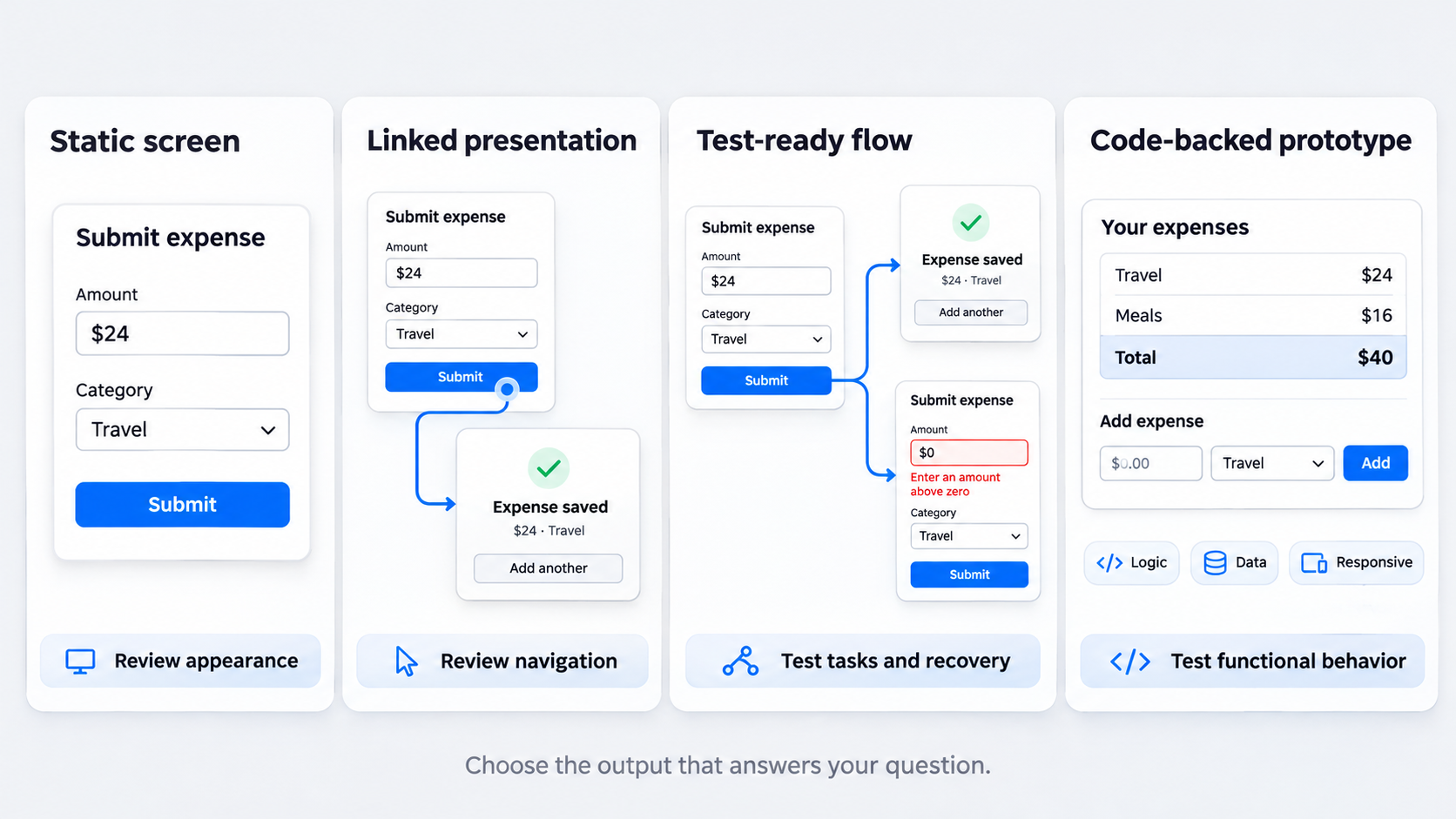
For digital products, we group outputs into four levels:
- Static screen: A visual concept without functional navigation.
- Linked presentation: Screens connected through basic hotspots.
- Test-ready flow: Realistic tasks, feedback, branches, and alternate states.
- Code-backed prototype: An experience with functional logic, data, or responsive behavior.
Polished visuals alone do not prove that a prototype is editable, responsive, interactive, or ready for handoff.
Static UI generation versus clickable prototyping
Static generation speeds up visual exploration. It lets us compare hierarchy, layout, density, and styling, but it cannot validate navigation or task completion.
A clickable prototype connects screens through triggers and transitions. Basic links may still omit form validation, loading feedback, permissions, recovery paths, and other important behavior.
Clickable does not automatically mean testable
Connected screens can make a persuasive presentation while hiding the conditions that determine whether a product works. A testable prototype gives participants enough context, feedback, and state coverage to complete a realistic task.
We judge a prototype by what it helps us learn, not by how closely it resembles a finished product. Our guide to interactive prototypes explains how behavior, states, and transitions support stronger testing.
Where code-backed prototypes fit
We use code-backed output when the question depends on realistic data, technical feasibility, complex input, or responsive behavior. It can reveal constraints that screen-based simulations cannot.
Extra technical complexity needs a clear purpose. If a short, focused flow can answer the question, building a pseudo-product slows the learning cycle.
Choose prototype fidelity based on the decision—not the demo
Low-, mid-, and high-fidelity prototypes support different decisions. We recommend using the minimum fidelity needed to answer the current product question.
Premature polish can weaken feedback. Reviewers may debate colors and spacing while we still need to validate the workflow, terminology, or value proposition. Fidelity also covers content, behavior, and state realism—not only visual detail.
Low fidelity for structure and direction
Low-fidelity prototypes help us assess information architecture, task order, navigation, and competing concepts. Plain boxes and labels keep attention on structure rather than finish.
Mid fidelity for usability and flow
Mid-fidelity work adds realistic hierarchy, labels, controls, and core interactions without final styling. Participants can understand the intended experience while our designers retain room to revise it.
High fidelity for confidence and edge cases
We use high fidelity when branding, representative content, responsive layouts, or detailed feedback affect the decision. A high-fidelity wireframe can add realism without implying that every production detail is resolved.
Visual completeness is not production readiness. Components, accessibility, responsive rules, and handoff quality still need inspection.
App prototype maker vs. product prototype maker: which scope do you need?
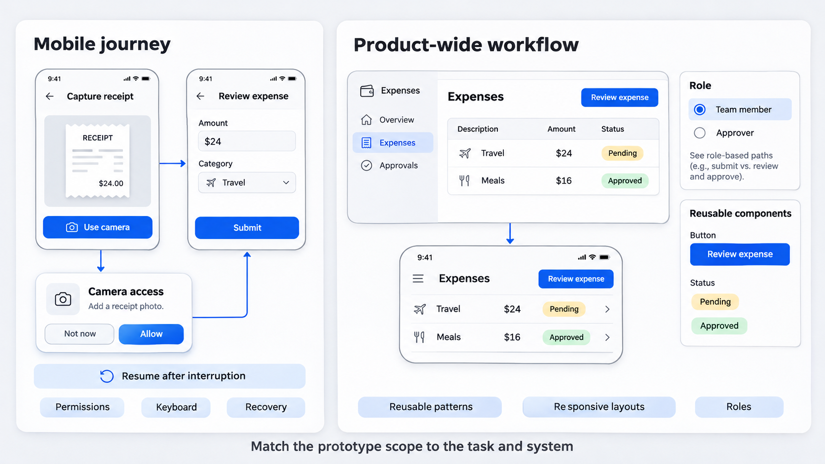 An app prototype maker should support coherent mobile journeys, device conventions, gestures, compact navigation, input behavior, and permission states.
A product prototype maker may cover SaaS platforms, web apps, responsive interfaces, dashboards, and multi-role systems. Free mobile tools can suit narrow concept reviews but may restrict collaboration, exports, project size, or handoff.
Choose app-first depth when mobile behavior drives the test
We check for:
- Device frames and mobile breakpoints
- On-screen keyboard behavior
- Gestures and native navigation
- Permission prompts
- Interrupted and resumed flows
- Validation and recovery
A complete task is more useful than disconnected mobile screens. A practical mobile wireframe system can keep the journey coherent before visual polish.
Choose broader product coverage for systems and platforms
For larger products, we prioritize reusable components, responsive variants, complex navigation, dashboards, and role-based journeys. We also check whether generated screens genuinely reuse patterns or merely look similar. Minor inconsistencies become costly across a broad product surface.
How to evaluate a prototype maker: the complete selection checklist
Feature-count comparisons create false confidence. Instead, we run the same representative task in every tool and record the results.
The useful measure is time to an editable, testable, handoff-ready flow—not time to the first attractive screen.
Input quality and generation control
Give each tool the same brief: audience, platform, task, required screens, content constraints, visual direction, and alternate states. Then assess whether its output follows those requirements.
We also test whether individual screens or sections can be refined without regenerating the whole experience.
Editability and design-system reuse
Inspect:
- Layer structure and naming
- Editable text and controls
- Components and variants
- Spacing and layout behavior
- Styles, tokens, and responsive rules
Our team should be able to preserve the product’s identity rather than inherit a generic template. Flattened output simply shifts work downstream.
Interaction, testing, and state support
Test interactions relevant to the goal, such as navigation, overlays, branching, inputs, validation, scrolling, and responsive changes.
A forced happy path may be clickable, but it cannot show how people interpret errors or recover from them.
Collaboration, export, and handoff
Evaluate comments, permissions, reviewer access, version control, developer inspection, and export formats. Confirm that stakeholders can open the prototype without unexpected account requirements.
For teams working in Figma, we test the full AI-to-Figma workflow, including editability and review readiness.
Use a weighted scorecard to compare prototype makers fairly
We recommend a weighted scorecard tailored to the decision. Score tested evidence rather than marketing claims, and document workarounds.
Separate generation speed, visual quality, editability, interaction depth, collaboration, handoff readiness, security, and total cost. The best prototype maker changes with the goal.
Example weighting for early concept validation
Emphasize generation speed, breadth of directions, basic editability, and low setup effort. Advanced interactions and developer handoff matter less if they will not affect the concept decision.
Example weighting for a mobile usability test
Prioritize flow completeness, realistic content, input behavior, validation states, and straightforward test sharing. Use the same task and failure conditions for every candidate.
Example weighting for enterprise handoff
Prioritize reusable components, design-system compatibility, access controls, collaboration, exports, data handling, and procurement readiness. Verify capabilities through current vendor documentation, security materials, and contractual terms.
How to build a test-ready prototype with AI and Figma
AI can accelerate design exploration, but it does not replace product thinking, UX writing, accessibility review, or interaction design.
Our preferred model is simple: describe, design, and ship. We use UXMagic for first-pass generation, then refine and execute the work in Figma or the team’s established design stack.
- Describe the product, user, and target flow
Specify the user, task, platform, entry point, success outcome, required screens, brand cues, and constraints. Include important alternate states. A request for a dashboard is vague; a request that names empty, loading, error, filtered, and restricted-access states is actionable.
- Generate candidate UI directions in UXMagic
Use the AI UI generator to produce first-pass directions. We compare hierarchy, layout, density, and interaction patterns before selecting one.
Generation should widen exploration. Choosing the first polished result replaces blank-canvas bias with first-output bias.
- Refine hierarchy, content, and reusable patterns
Replace placeholder copy with realistic labels, values, errors, and calls to action. Confirm that components remain consistent across the flow and retain the product’s identity.
- Connect, validate, and hand off
Connect the minimum screens and branches needed for the test, then run an internal walkthrough. The prototype is ready when it can answer the chosen validation question—not when every possible feature has been simulated.
Prototype the states that determine whether the product works
State coverage makes end-to-end flows believable. Consider happy, empty, loading, error, success, permission, edge-case, and responsive states.
We do not need every theoretical state. We need those capable of changing the decision, especially alternate paths and recovery.
Example: onboarding from wireframe to test-ready flow
A structural wireframe can test task order and information architecture. A test-ready onboarding flow may also cover invalid input, password requirements, verification delays, denied permissions, back navigation, and completion feedback.
An app prototype template built around screens and states can help our team avoid missing these scenarios.
Example: SaaS analytics dashboard under real conditions
Do not assess only a populated desktop view. We test empty data, loading and failed requests, active filters, no-result searches, drill-downs, role restrictions, and smaller breakpoints.
A compact prototype coverage checklist
Document:
- Main task and success criterion
- Entry and exit points
- Alternate routes
- System feedback and error recovery
- Permission conditions
- Responsive expectations
We also assign ownership for copy, behavior, accessibility, and handoff.
Free prototype makers: calculate total cost before committing
Free prototype makers can support early exploration and limited tests. Restrictions may emerge around projects, collaborators, exports, integrations, or usage.
We verify current pricing and plan limits directly. A free tool becomes expensive if approved work must later be rebuilt.
Common upgrade gates to check
Review project caps, private files, sharing, comments, exports, version history, design-system support, and commercial-use terms. Ask stakeholders to access a trial prototype before committing.
The hidden cost of poor editability
Estimate the work needed to reconstruct flattened screens, normalize components, repair responsive behavior, and prepare developer-ready files. Subscription price alone does not represent total cost.
Enterprise costs and risk criteria
Enterprise reviews should cover private workspaces, role-based access, data handling, retention, security documentation, support, design-system compatibility, and procurement fit. Confirm these points in current documentation and contracts.
Build an editable, test-ready prototype
Start with one critical task and the states that could change the product decision. Use UXMagic to generate credible UI directions, refine the strongest flow, and move validated work into your established design process.