• Libraries
  • Community
  • Pricing
  • Affiliate
  • Resources

Libraries

Community
Pricing
Affiliate

Resources

Follow us on:
Help center
  • 🚀Get started
    • What is UXMagic?
    • Create your first project
    • The canvas, projects and screens
    • Writing a prompt that gets what you want
    • Keyboard shortcuts
    • Your account and profile
  • ✨Generate designs
  • 🎨Design & edit
  • 📦Export & handoff
  • 🌐Publish a live site
  • 🤝Share & collaborate
  • 🔌Integrations & developers
  • 💳Plans, credits & billing
  • 🛠Troubleshooting

Still stuck?

Our team answers from inside the product.

Contact support →
  1. Help center/
  2. Design & edit/
  3. Component libraries and design systems

Component libraries and design systems

Use the built-in Figma and React libraries, or bring your own components into a project.

Last updated 27 August 2026
On this page

  • Built-in libraries
  • Bringing your own design system
  • Keeping generated screens on-system
  • On Enterprise
uxmagic.ai/dashboard/figma-component-library
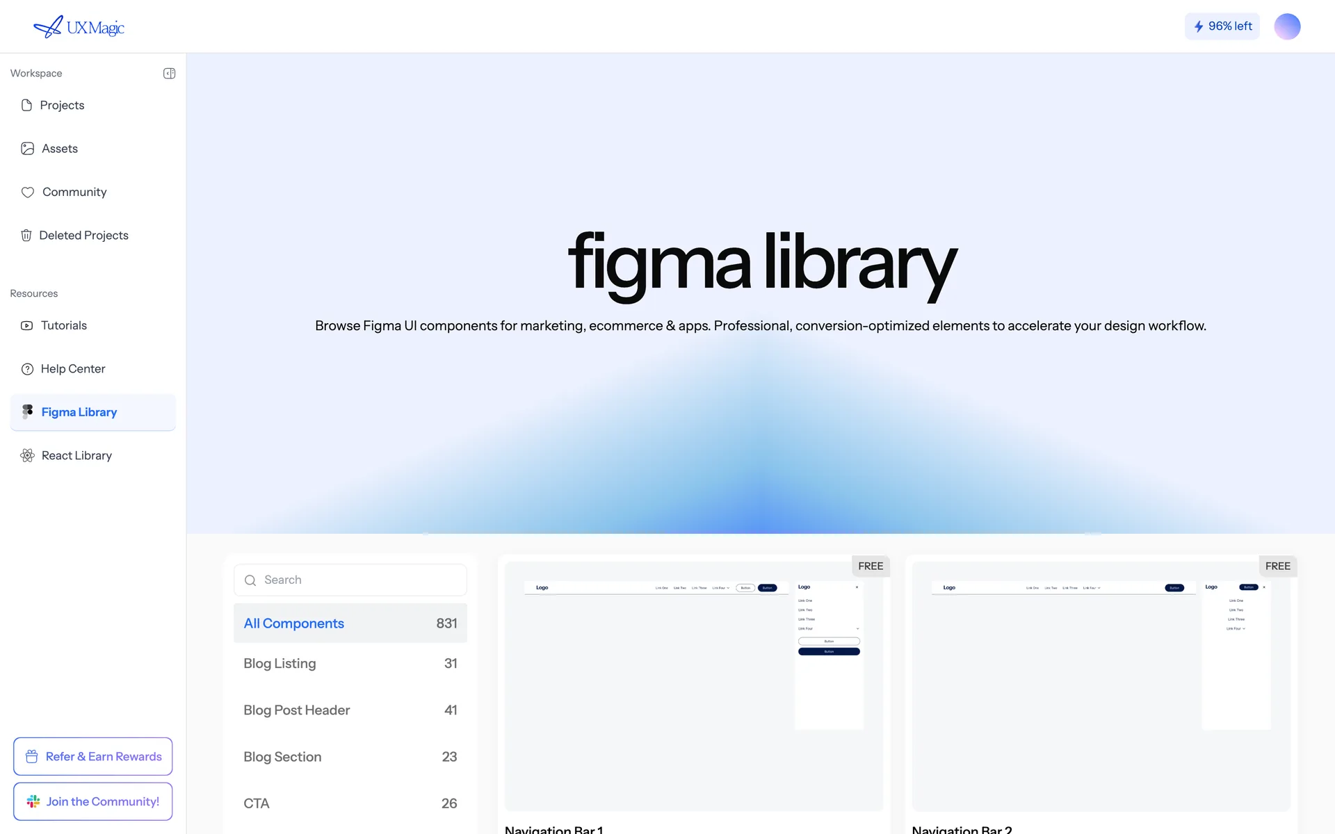
The built-in Figma component library, showing categories of ready-made components.
The built-in Figma component library.

Built-in libraries#

UXMagic ships two browsable libraries you can pull from while designing:

  • Figma component library — components ready to drop into a Figma file.
  • React component library — code components matching the same patterns.

Both are organised by category, and each component has variants.

Bringing your own design system#

Import your Figma components or design system into a project so generated screens use your components rather than generic ones. See Import from Figma.

Once imported, mention them by name:

Use our Button and Card components for the pricing tiers.

Keeping generated screens on-system#

Two things do most of the work:

  1. A theme that matches your brand, so colours and type are right by default. See Themes and style guides.
  2. Explicit instructions when the AI starts improvising: "Use only components from our imported library."

On Enterprise#

Enterprise plans include a shared design system and component library across the team, so everyone's generated screens start from the same components.

Was this article helpful?

Related articles

Import from Figma

Bring an existing Figma frame into UXMagic and keep editing it with AI.

Themes and style guides

How the project theme works, how to change it safely, and why colours should never be edited screen by screen.

Export code (HTML, React, Tailwind)

Export a single screen or a whole project as production-ready front-end code.

← PreviousResponsive and device variantsNext →Export to Figma

On this page

  • Built-in libraries
  • Bringing your own design system
  • Keeping generated screens on-system
  • On Enterprise

your next idea
deserves to exist

stop thinking about it. just type it out. Badly, half- formed, whatever. We'll turn it into something real.

Product

  • Community
  • Pricing Plans
  • Affiliate Program
  • UXMagic MCP
  • Claude MCP
  • AI info

Resources

  • Help Center
  • Figma Library
  • React Library
  • Mobile App Templates
  • Documentation
  • Tutorials

Features

  • Prompt to UI
  • Image to UI
  • Sketch to UI
  • Clone website
  • Import from Figma
  • All Features

Compare

  • vs UX Pilot
  • vs Relume
  • vs MagicPath
  • vs Magic Patterns
  • vs Banani
  • vs Galileo AI
  • All Competitors

Blogs

  • AI in UX Design Workflow: What Actually Works
  • Prompt Templates for SaaS Dashboards
  • Real Prompts We Use to Generate Product Flows
  • Prompt Engineering for UX Designers
  • Best Wireframing Tools in 2026: 10 Free & Pro Options Compared
  • All Blogs

Company & Support

  • Careers
  • Contact Us
  • Privacy Policy
  • Terms of Use
  • Cookie Settings

© 2026 UXMagic AI Technologies Inc.